SPEC OPS
SXSW Data Narratives
Making Art from Data
Print, VR Experience
THE CHALLENGE
Too Much Data is Never Enough
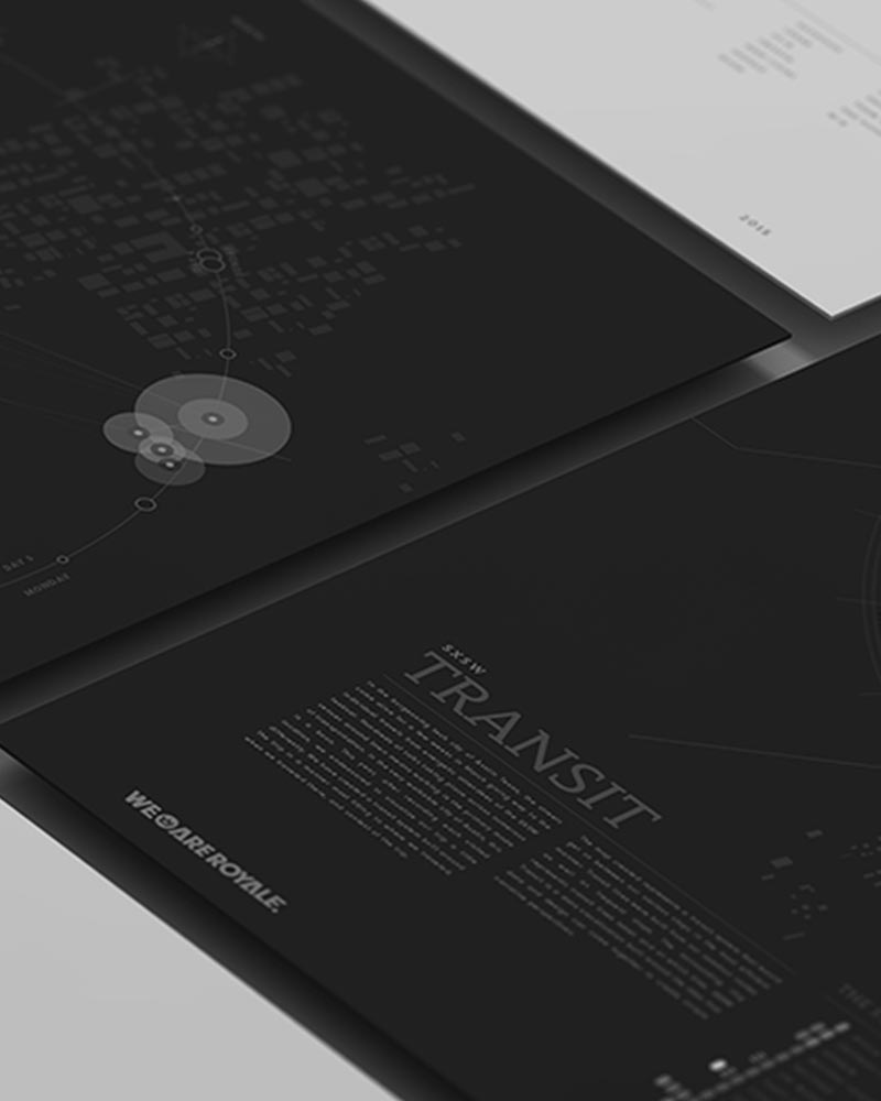
Like any mysterious organization that deals in ephemeral nostalgia, We Are Royale has its own even more mysterious Skunk Works. You name it, we’re working on it. Like taking a tour of Q’s infamous foreshadowing room, stepping into the Royale Labs often requires a flak vest and sunglasses. In one of our more approachable and tame studies, we set out to collect vast amounts of personal data on our employees while they attended SXSW for multiple years.
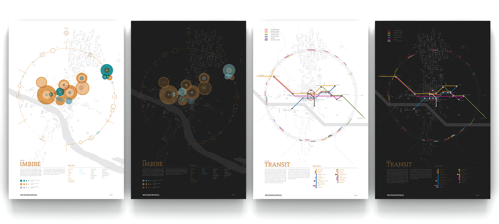
We ended up making two Data Visualizations that explored our beverage and social activity as well as one that tracked our traveling and designed a narcissistic transit system that would only benefit us. The takeaway is two unique data narratives that explore what a data visualization can be and just how far we can push our own exploration of data narratives.

TRANSIT MAP
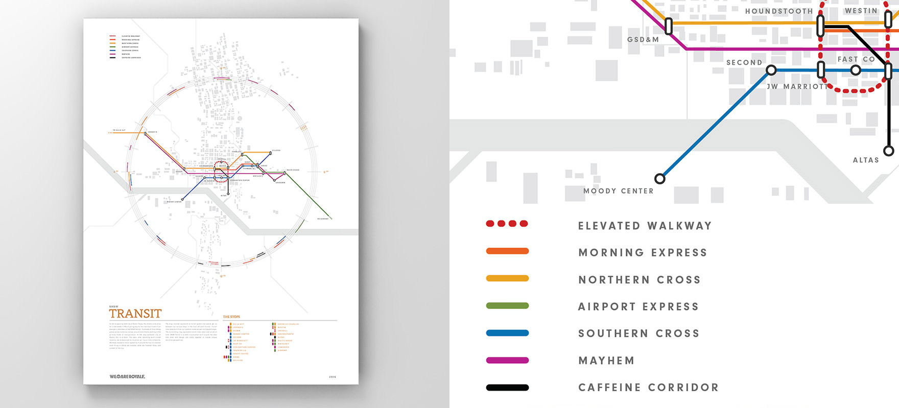
Narcissistic Transit Map
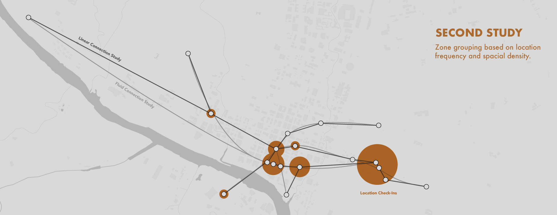
When our festivities at SXSW came to a close, we started organizing and collating our data. Our process involved a number of quick visualization systems that rapidly show various mapping types. What we found was a pattern in a few prominent locations that ended up making the map all about the conference. Knowing we ventured well beyond the doors of the convention center, we set out to organize and design our data in a way that helped convey just our exploratory our trip was.
QUANTIZE IT
Hey Look, Our Own Transit System
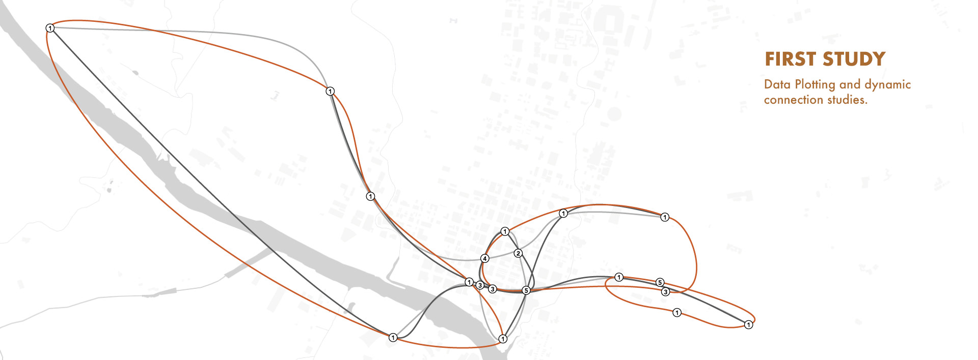
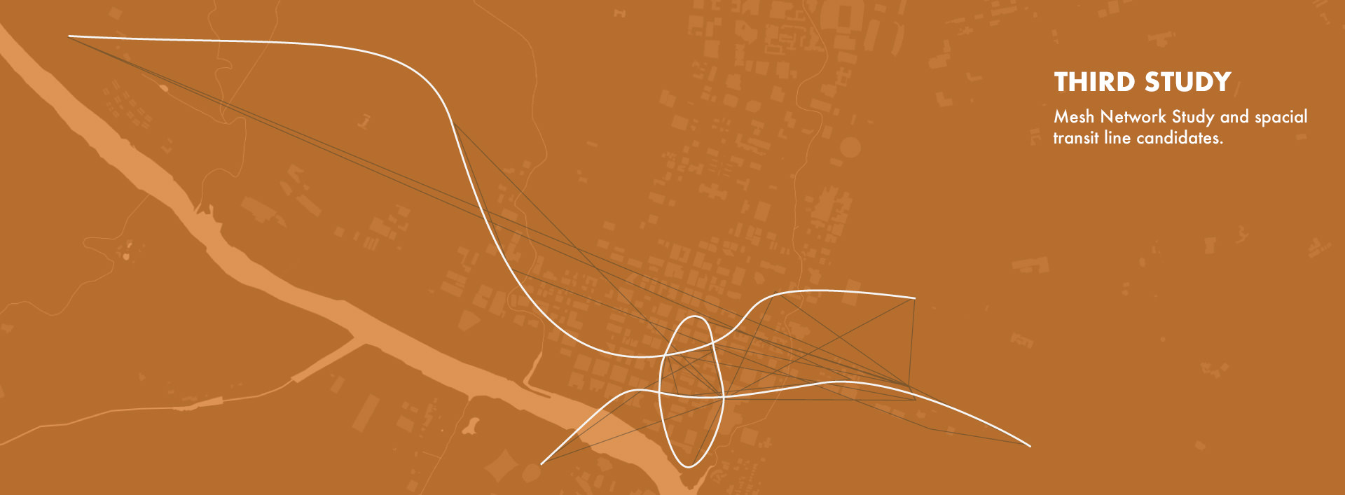
Ending up on designing a transit map may not seem like the obvious solution for our data but it’s also an exploration in narrative devices. In this case, the turning point was a simple comment around the lunch table; looking at this data, it would have been nice if we had our own bus that went from the house to the coffee shop. Yeah, that would have been nice. And that got us thinking, what other lines would be created based on this data?
Developing our own transit system wasn’t a simple process; we wanted to do it right. So we turned to urban planning and transit structures and studied the processes and considerations that go into actual transit planning. Our data set is considerably smaller than what a municipality might require for planning but we knew we had enough to start building context.
IMBIBE MAP
Mapping The Spirit of SXSW
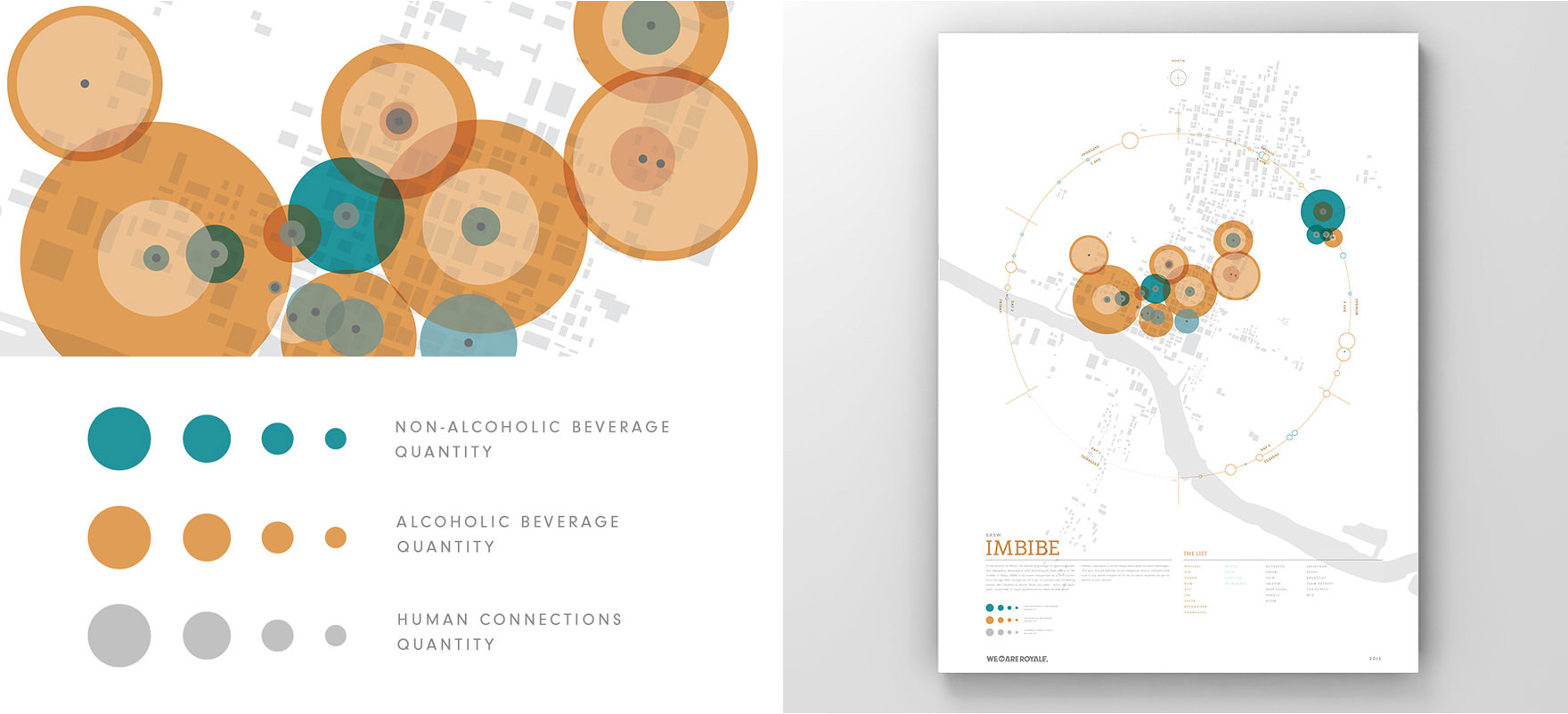
In the spirit of, well, spirits, we wanted to collect and visualize just how much indulging we took part in while meandering the after hours of SXSW. Austin Texas certainly makes it easy to find a drink so we made it harder on ourselves. Not only are we recording alcoholic beverages, but we would record ALL beverages and categorize them as they are. In addition, we want to compare this with how many people we meet up with while partaking in said beverages. So yeah, plenty to record. We gave ourselves a simple logging system where, once underway, we could quickly log drinks by type, quantity, and who we were with. The fun part was deciphering this data when the whole experiment was done. As you can imagine, around 4am, the data set gets a little iffy.
IMMERSIVE DATA
Making an Experience, of the Experience
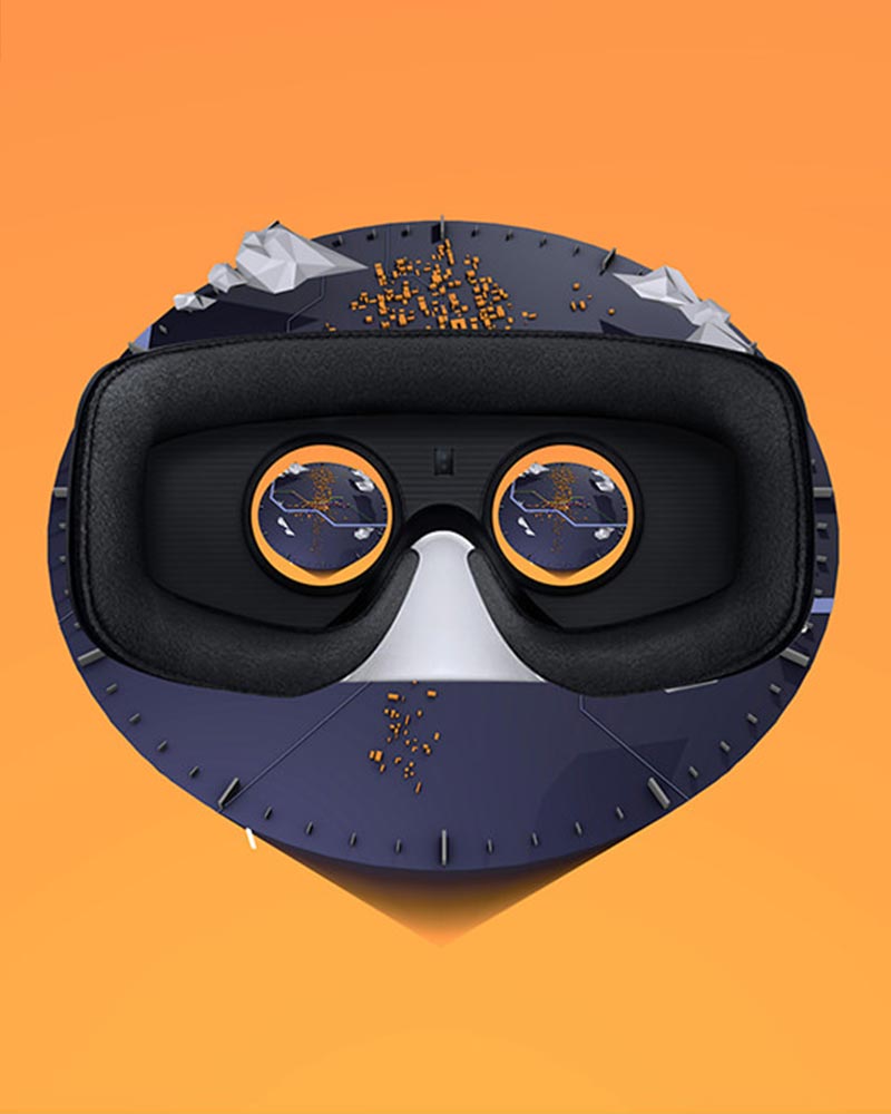
Since we’ve been exploring various narrative devices, we tossed the map into a VR experience and took it for a spin. Pretty cool and ultimately just the tip of the iceberg. How can we merge VR experiences with Data Narratives? Don’t worry, we’re still working on that.
