Activision Blizzard
Overwatch League Marketing Toolkit
New Season,
New System
Graphics System


THE CHALLENGE
Distinguish & Expand
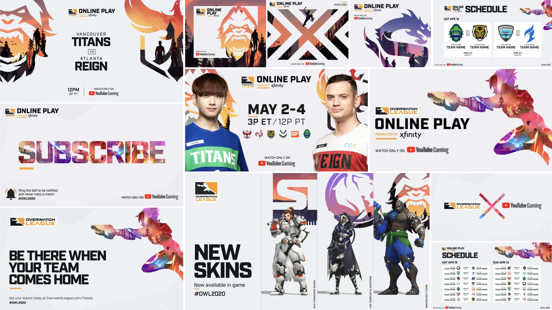
While already working together on the Call of Duty League’s new identity, Activision Blizzard thought: hmm, maybe we should also partner up to create a graphics system for Overwatch League’s new season? Yes, yes we should. We were tasked with designing a wide-ranging toolkit that differentiates the two Esport leagues while reflecting Overwatch’s teams, cities and more optimistic tone.
Still loyal to D&D, but thrilled to be of service.






THE APPROACH
Bold, Bright, Fierce
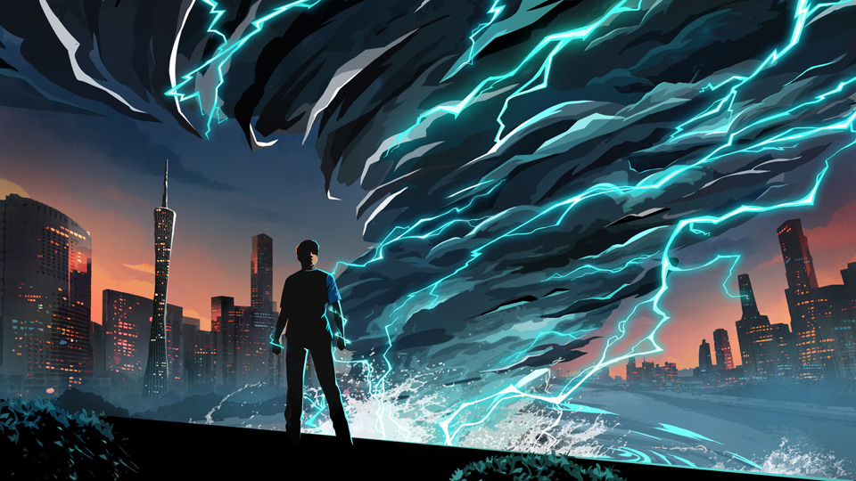
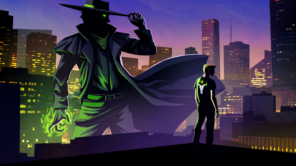
Much like our own offices, Overwatch features a cast of skilled yet colorful characters fighting for a better future…like a hamster in a giant high-speed wrecking ball. Our goal was to progress the Esport beast’s unique appeal by weaving the feel of each team, its players and diverse locales throughout.
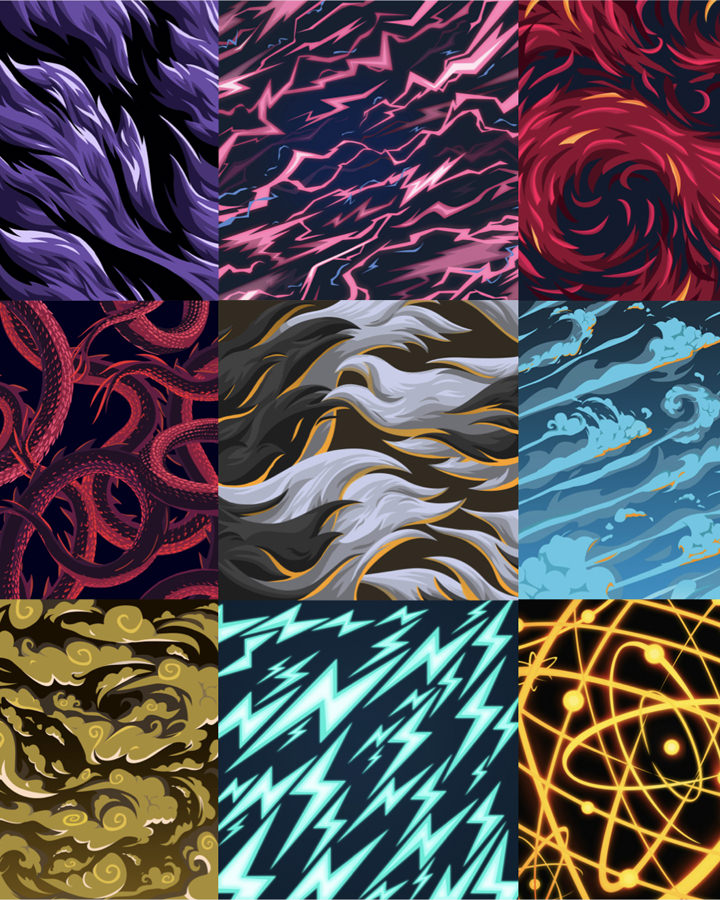
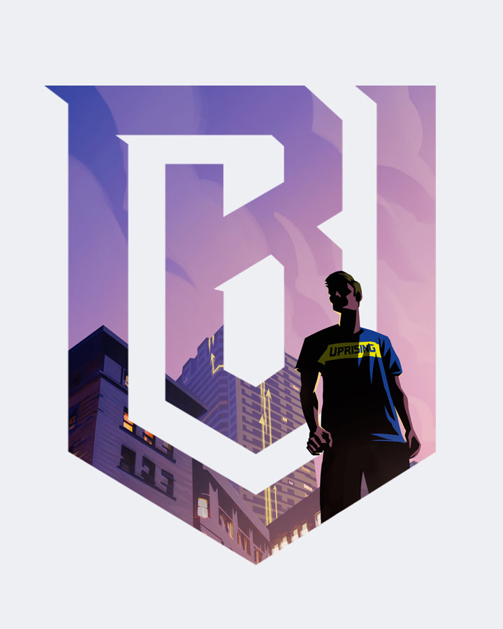
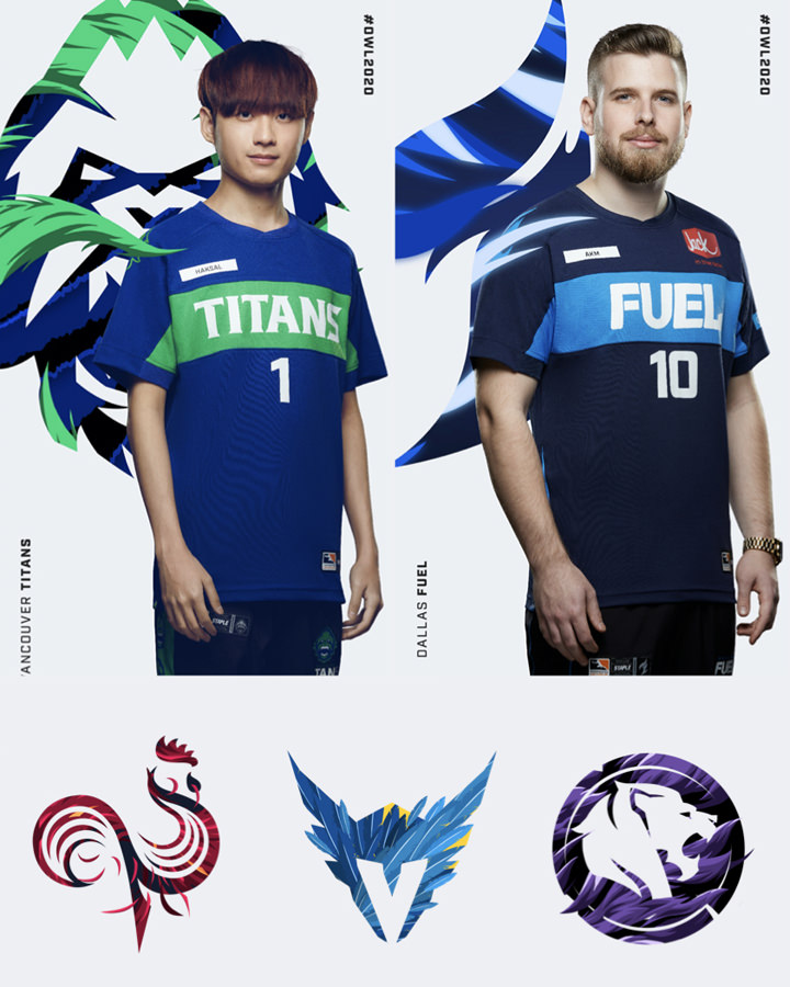
A vibrant edge of hope infuses the numerous marketing assets, including mosaic art within the Overwatch emblem and original logos and graphic illustrations for eight new teams.
THE PAYOFF
Let the Games Begin
Taking assets that needed a more consistent approach and coming up with a full new set of tools helped unlock the potential of the league’s teams. The creative liberties allowed in the design process for this ultra-popular franchise has helped build a long-term, trusting partnership with Activision, and we’re pretty stoked about it.
20
# of Overwatch
League Teams
21
# of Games in
the reg season
+100
# of assets
delivered
+50 million
# of Overwatch
players
