Electronic Arts
Burnout Paradise Remastered Key Art
Taking it Back to Paradise City
Key Art


THE CHALLENGE
Remastering an Icon
When speed is the goal no matter the cost. When crashing is both encouraged and rewarded. When you set the whole thing to Guns N’ Roses, well, that’s our kinda video game. We loved the original Burnout Paradise, and we shall throw our love, once more, at the screen when we get our hands on the Remaster. Being fans, when EA gave us the opportunity to create new artwork for Burnout Paradise: Remastered we knew just where to take it.

OUR APPROACH
Give it a Crash Course
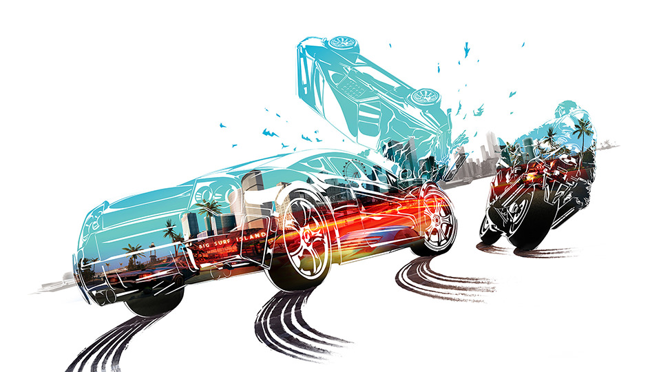
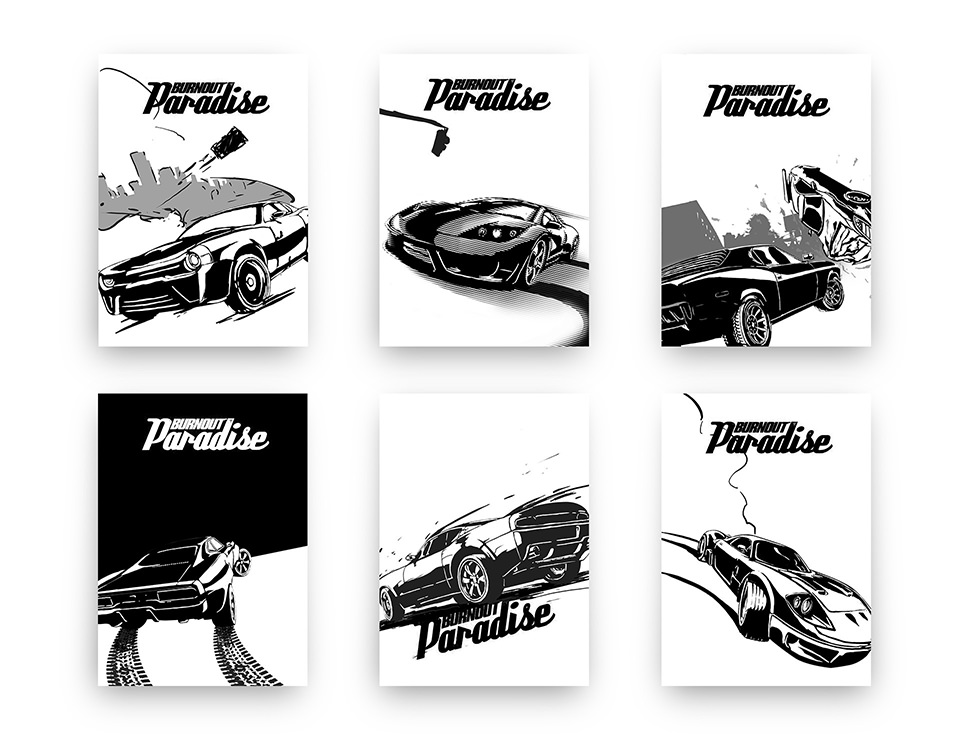
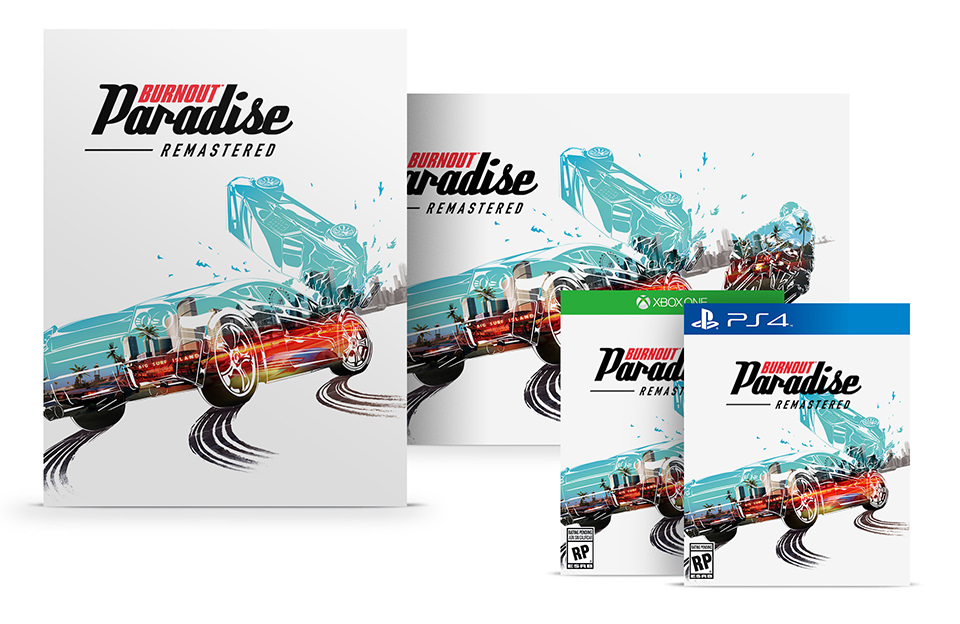
We worked with the team at EA to find the right mixture of new vs. old–just the right amount of crash vs. speed. Modernizing the lines and iconic double exposure of the original artwork. The key art for our remaster is an homage to the cover art of the original Burnout Paradise. Literally, a snapshot of the same scene, but 15 seconds in the future.

THE OUTCOME
Skidding into the Finish
A sleek modern sports car frozen in time at the exact moment of collision. A peek inside the palm tree lined streets of LA. Our adaptable artwork is a modern take that still feels like a throwback. It reflects the same concept around Burnout Paradise: Remastered. A sleeker look than the original, but with the same chaotic gameplay that made it a phenomenon in our seemingly not-so-distant youth.