Google Fi Campaign
Hello, Everything That Can
Commercial Spots (TVC + OLV), Social Content, Print, OOH

SPACER
SPACER

THE CHALLENGE
(Tech) Man With a Plan
Ranging from small business resources to collaborative teaching and learning tools, to a leading internet browser, to an unparalleled map system of the globe and not to mention, the most popular search engine in the world — Google has proven time and time again that they are the Nick Offerman of tech companies within the digital age. So, with all that and a bag of chips under their belt, what is their next conquest? Phone plans, of course. Introducing Google Fi, the phone plan that can. Our job was to actualize various storylines into a series of commercial spots that would be dispersed over social, print outlets and out-of-home advertising (OOH), which includes everything from billboards to bus shelters.

THE APPROACH
Livin’ On a Phone Plan
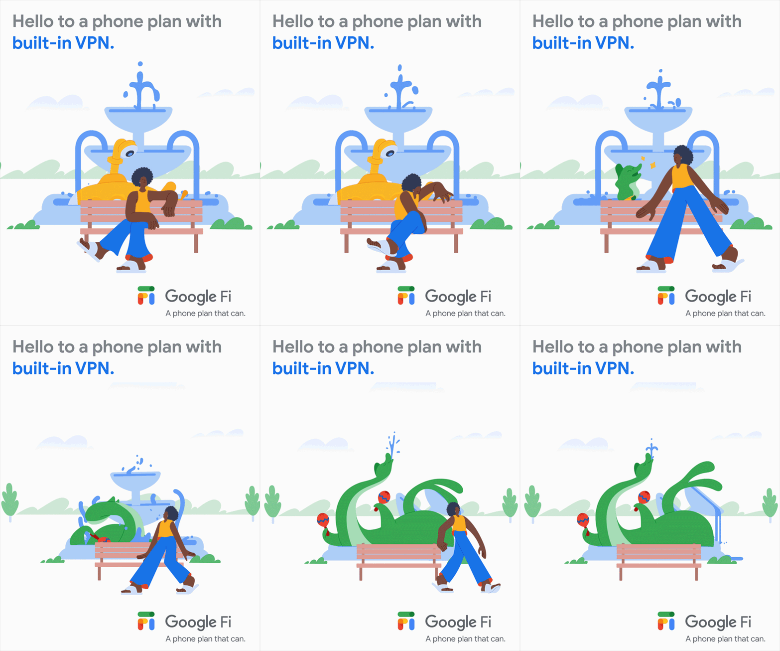
When Anomaly initially approached us with the opportunity, Google Fi had already developed its own distinct illustration style that erred on the side of playful, fun, colorful and simple. It followed the almighty “Google tone” derived from Google’s master brand. Anomaly presented us with a series of ideas, and we worked in conjunction with them to figure out the kinks from a motion visuals standpoint.
While Anomaly was mainly involved in conjuring up scripts for each individual spot, our task was to offer our perspective in how to communicate these ideas visually. Since the initial scripts were so jam-packed, we had to assist in determining what beats to give importance to and how to better portray their ideas in Google Fi’s distinct animated style. The question at the centerfold: How do we visually communicate better WiFi once the characters tether together?

SPACER

THE STORY
We Are Living In An Interconnected World
The theme of the Google Fi spot series was to touch on the various reasons why their phone plan is superior to everyone else’s. “Goodbye to everything you can’t, hello to everything you can.” Our challenge was, in using these themes and scripts, how could we better portray Google’s campaign intentions in a cohesive way?
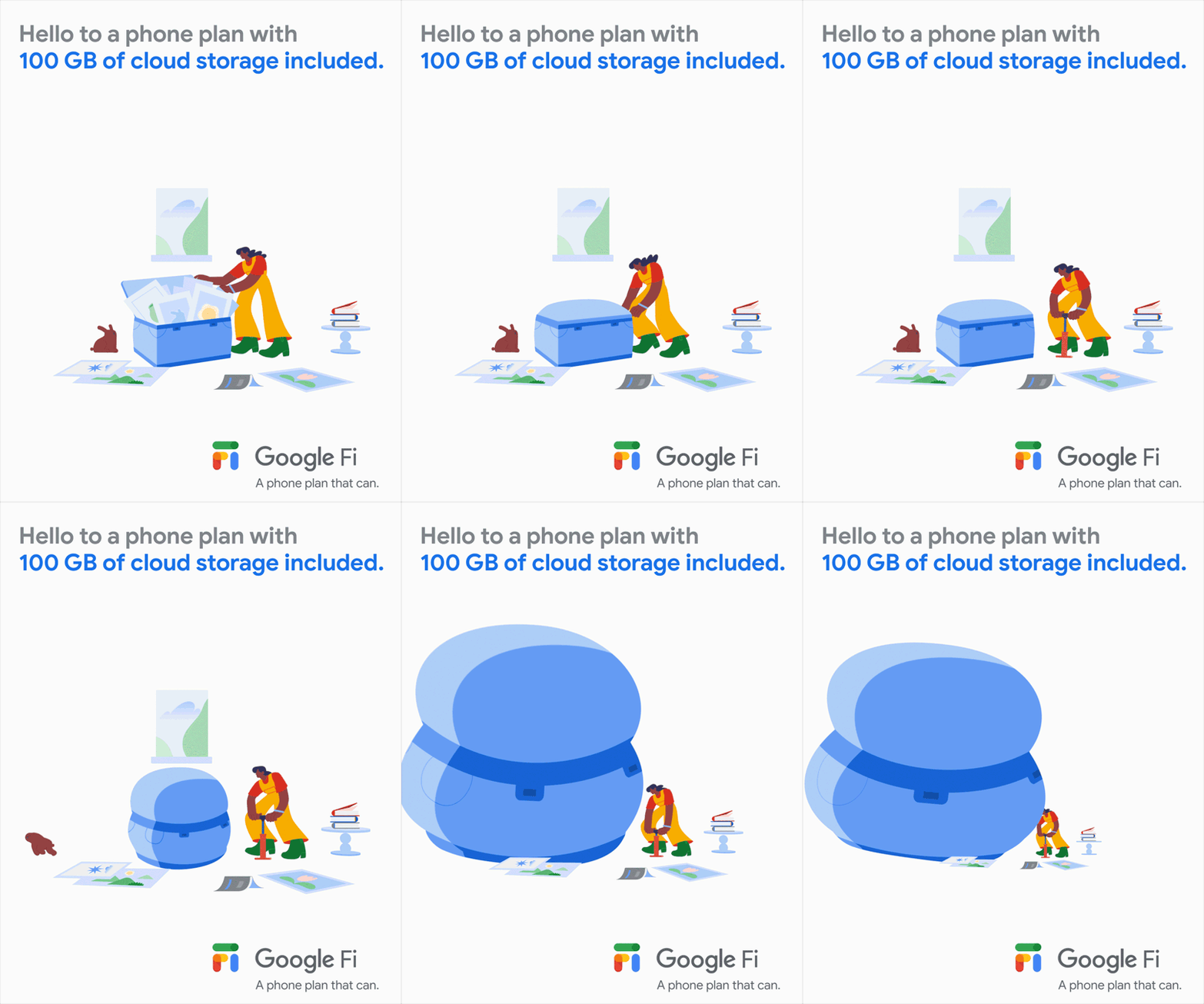
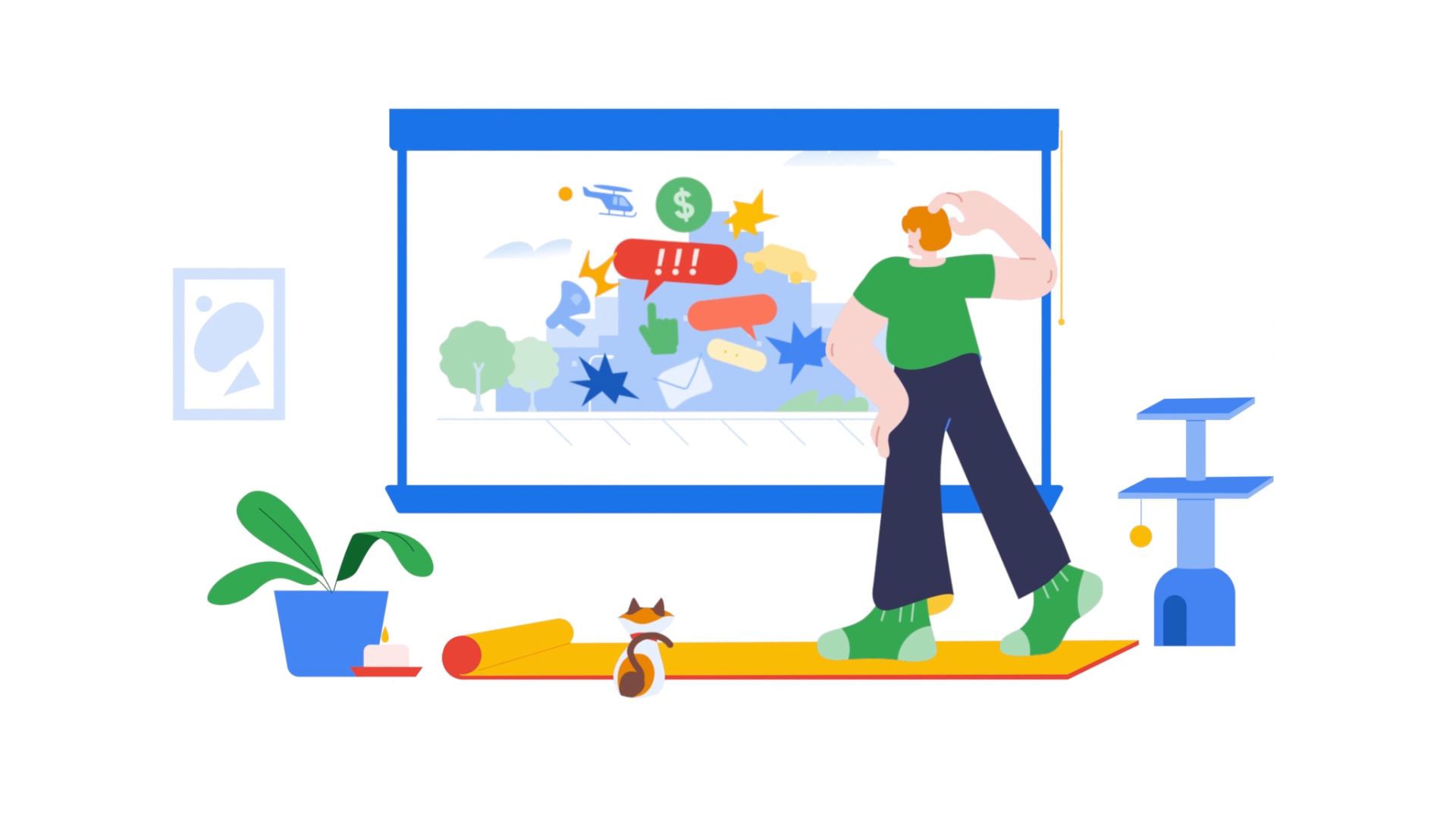
We had to illustrate how customers’ existing phone plans weren’t up to the task, leading them through a whole adventure that introduces the glorious ease at which Google Fi does literally everything. It was a delicate balance of threading in those comedic moments without getting too silly. Everything was unique in terms of storylines, save for a few connecting threads where we pulled in features from one spot into another.
Additionally, we explored the idea that phone plans provide an access point that allow us to dive into new worlds. There’s no necessity to be tethered to long phone plans and bills, because Google Fi ultimately gives you freedom and flexibility.
THE ANIMATION
Don’t Stop Connecting
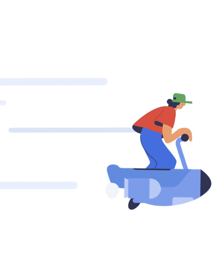
We took the shapes from the Google Fi logo and pulled them into speed lines that would thread in and out of the action across the campaign. Although the look is meant to be clean and modern (within that Google lens), in execution we opted to create a large majority of the elements in 3D. This gave us flexibility in the revision cycle, but also let us flex in transitions where the dimensions would show, giving the spots an extra bit of richness.
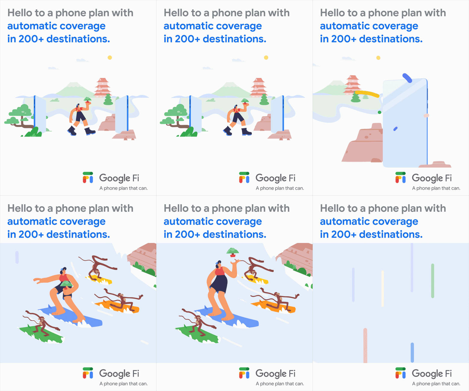
While the spots are rooted in the tech giant’s latest phone plan venture, they had one crucial request: absolutely no depictions of people on their phones. Phones, in their opinion, would have a negative connotation because there’s that delicate line of people getting sucked into these portable devices. (Save for one caveat in which characters use phones as a portal to travel.)
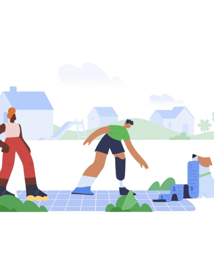
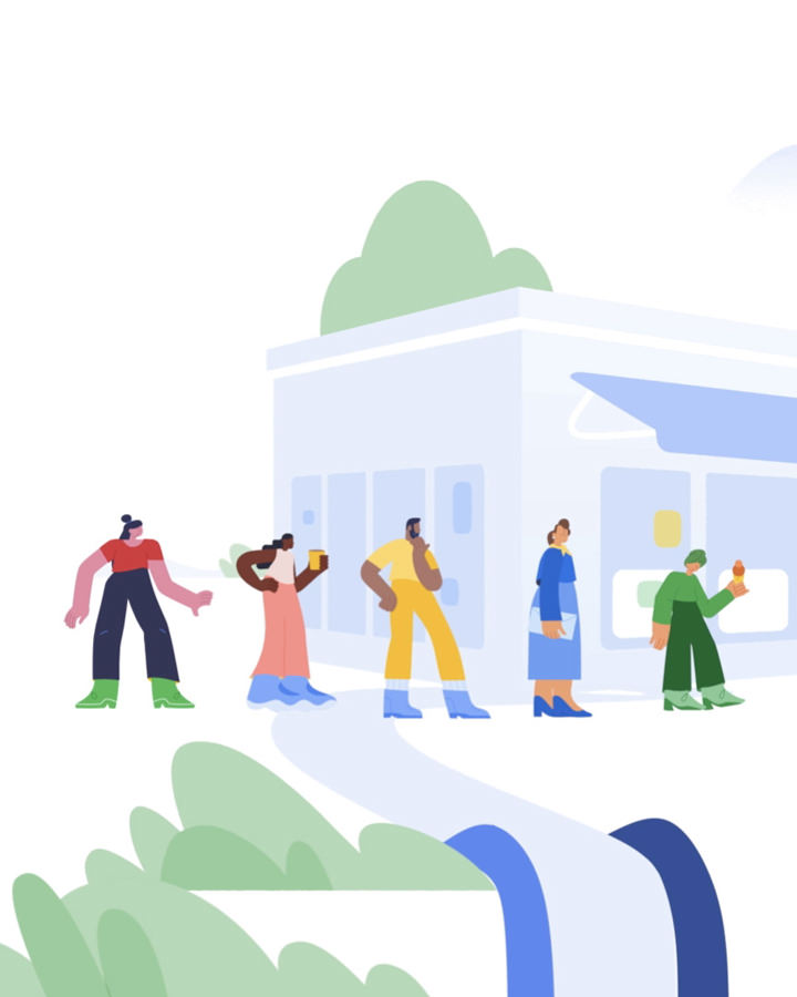
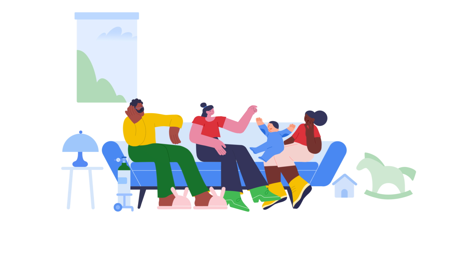
Google also stressed that the spots should be diverse and inclusive. This shone through skin tones, family unit compositions, depictions of disabilities, pets, furniture pieces, and portrayals of urban to suburban locales.

SPACER
SPACER


THE PAYOFF
Peace of Mind
The Google Fi Campaign was, at its core, a big puzzle that we were enlisted to help complete. As Google’s first-ever inaugural phone plan, our obsession with the small details and nuances of the campaign helped in securing their trust in us to bring their original concepts to life. Even the original illustrator expressed her joy in our ability to take her illustrations and push them forward, breathing new life into them as the job progressed. Goodbye Can’t. Hello Can.
