THE CHALLENGE
Crunching the Numbers
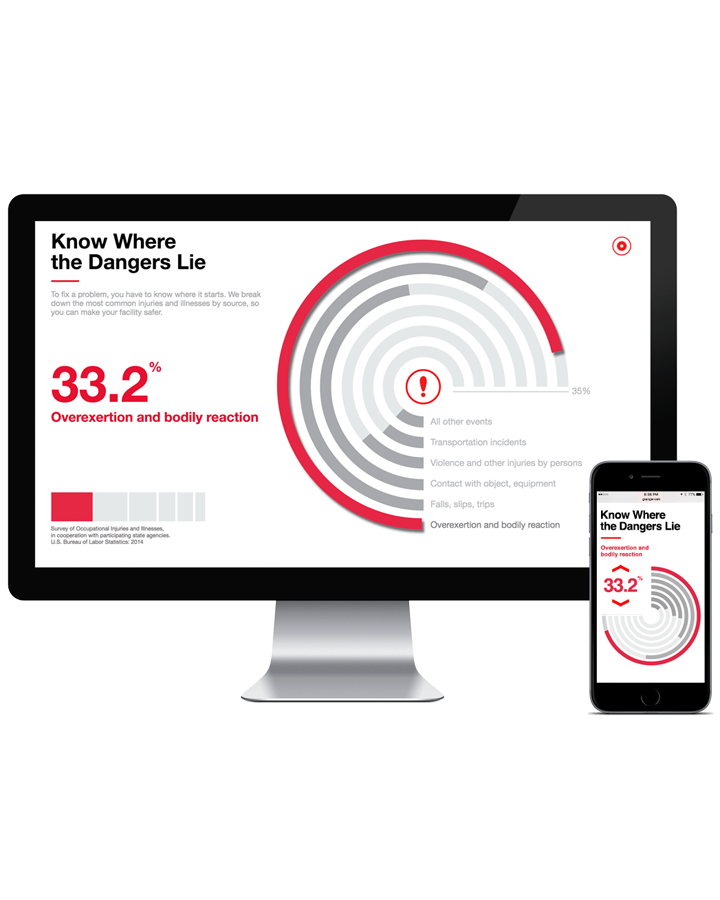
Grainger wanted a series of data visualizations and info graphics to help illustrate complex or obscure business related analytics. How many sick days does the average manufacturing worker take vs someone working at a bank? The answer surprised us and when we started digging a little deeper we found all sorts of interesting perspectives on subjects we’ve all taken for granted.
Who doesn’t love a good pie chart? Or maybe the scatter plot is where your head’s at these days? In any case, we’re suckers for data visualization and have always been proponents of the data narratives buried deep within those criss-crossing line charts. There’s a story in there somewhere, and when Grainger came to us with their data project, we couldn’t say no.
THE APPROACH
Visualizing the Narrative
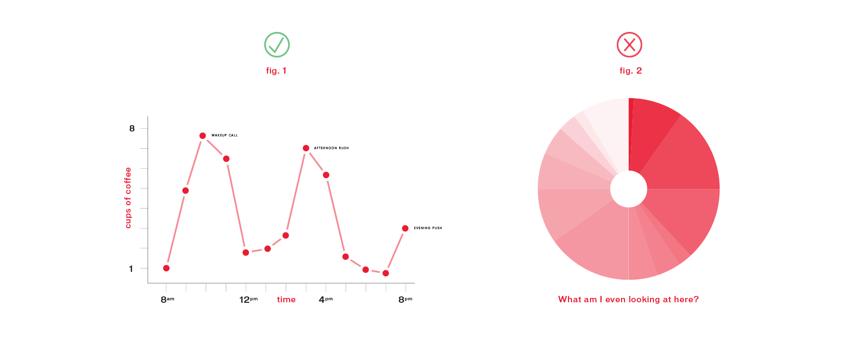
For each chart or infographic, we had to choose just the right visualization method to get the story across. This is more important than we all think. A Line Graph chart works great for comparative analysis of our office coffee intake on an hourly basis, whereas the same data won’t work in a doughnut chart.
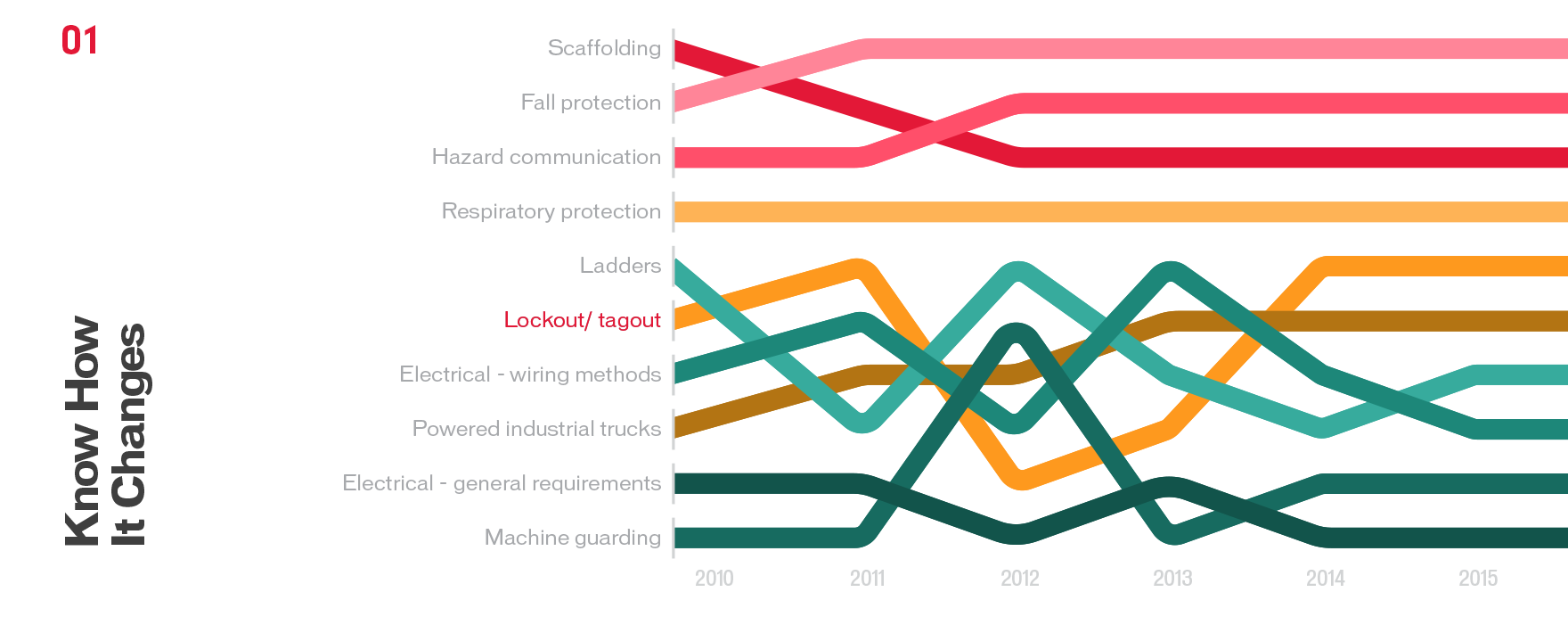
Designing for context in this case means designing a chart that reveals patterns and trends in the data that no one chart would do. It’s like getting a new perspective on a story you thought you knew, until you read it backwards. In Close Encounters for instance, Richard Dreyfuss is really just an alien who gradually forgets his otherworldly past.
Designing the Data
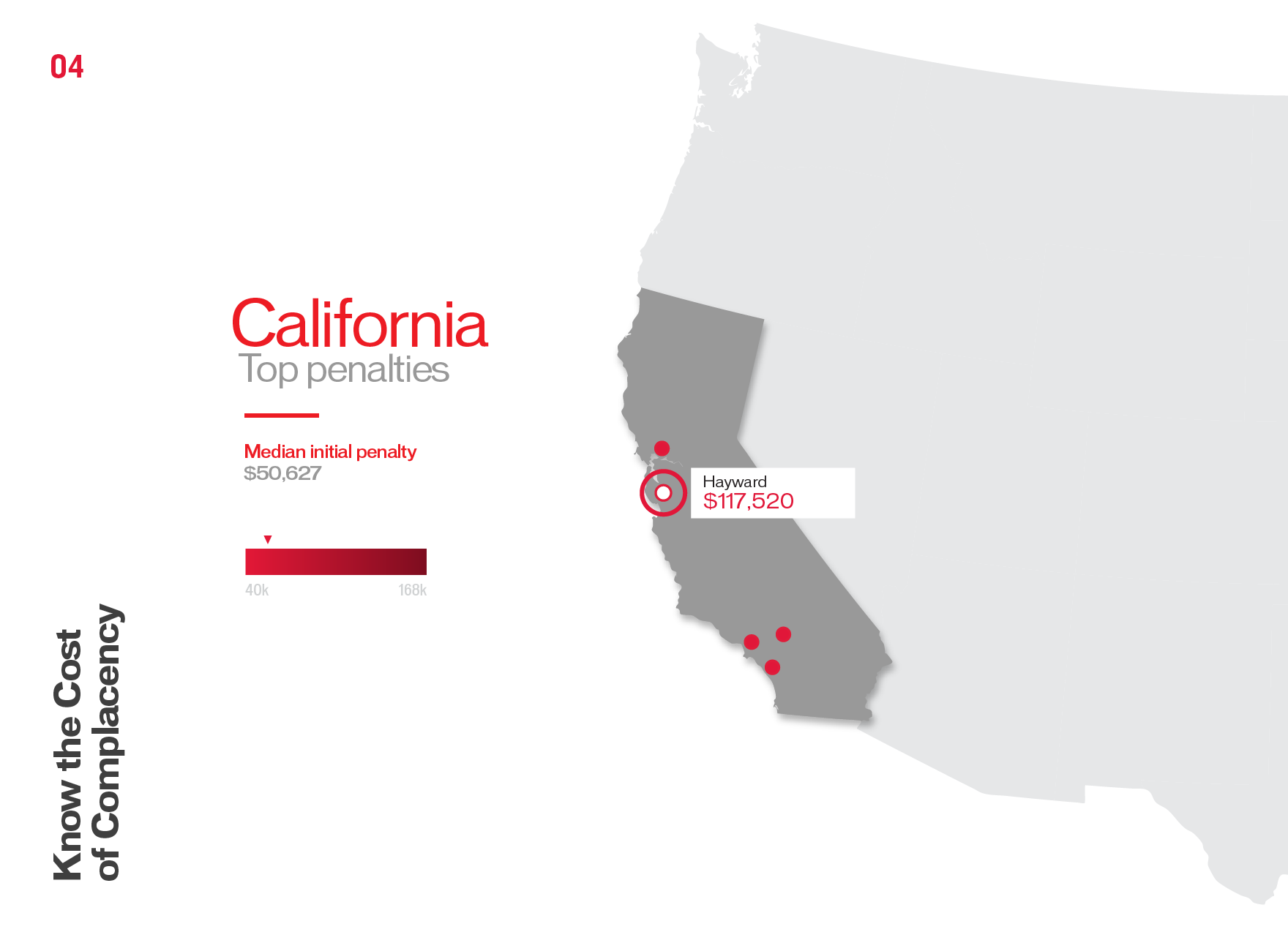
Designing a visually appealing bar-chart is one thing. Designing a visually appealing bar-chart that maintains legibility and foregoes the infamous “chart-junk” trends is a completely different task. Out with the 3D and scrap the textures. These graphs are for the industry professionals who need correlations and answers and they need it fast. Once we’ve taken care of that, then we make it pretty.
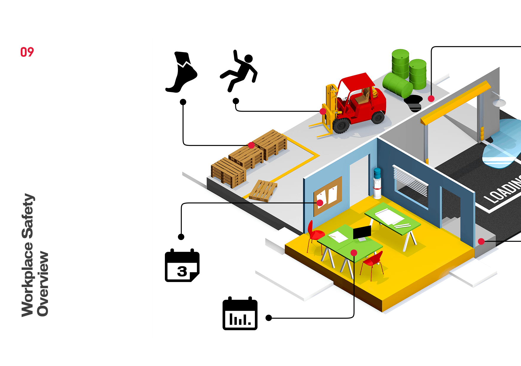
A minimalist approach with a pop of color and subtle depth round-out our design language. We include additional flourishes where they won’t be distracting and precise detailing where it elevates the legibility. In some cases we went super minimal where the data illustrates it all. In other cases, we created entire scenes to help illustrate the context.
THE PAYOFF
A YUMMY INTERACTIVE SITE
At the end of it all, we created 9 interactive data visualizations for Grainger that utilized OSHA data in a much more palatable way. Head over to our demo page below to take each of these graphs for a spin.
