

A Cinematic Audio Drama
Three Seasons.
One Unstoppable Story.
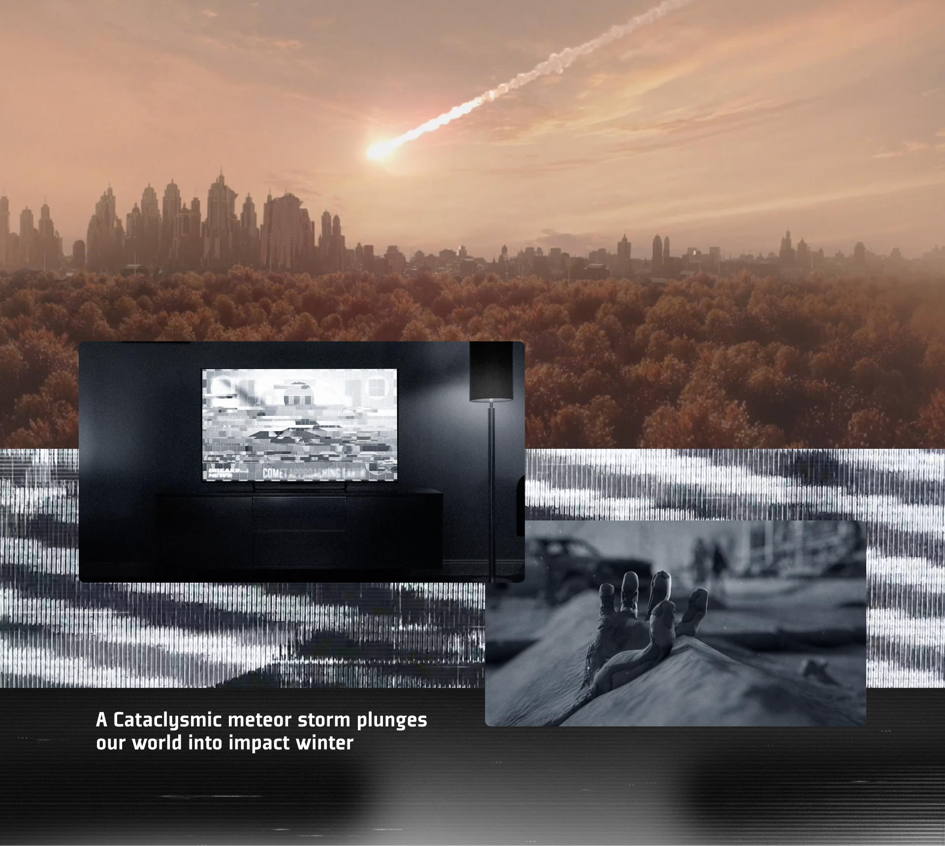
It’s the near future and seven years since a comet hit the earth and blotted out the sun. The world is a dark, frozen landscape. And then, beastly creatures emerge and take over. Can they really be vampires? In the British countryside, a band of survivors forms a resistance in the fallout shelter of a medieval castle. Darcy is a battle-tested vampire hunter who is at the front line leading the charge to save humanity. Meanwhile, her younger sister Hope wants life to return normal so she can go above ground and know what it’s like to live again. And she just might be willing to risk it all.
This is the premise of Audible’s original and groundbreaking vampire-apocalypse series. We’ve been a part of the project since its beginnings in 2021, when Audible approached us with this incredible new title. We’ve worked with Audible to craft dark and compelling marketing campaigns for each volume of the series. Each campaign has spanned the full range of marketing channels from social media to billboards to light-rail wraps. We’ve worked closely with Audible to provide them with a complete set of campaign materials: keyart and teaser trailers, audiograms, and toolkits for OOH and social media.
Season One
An Emotionally
Bleak World
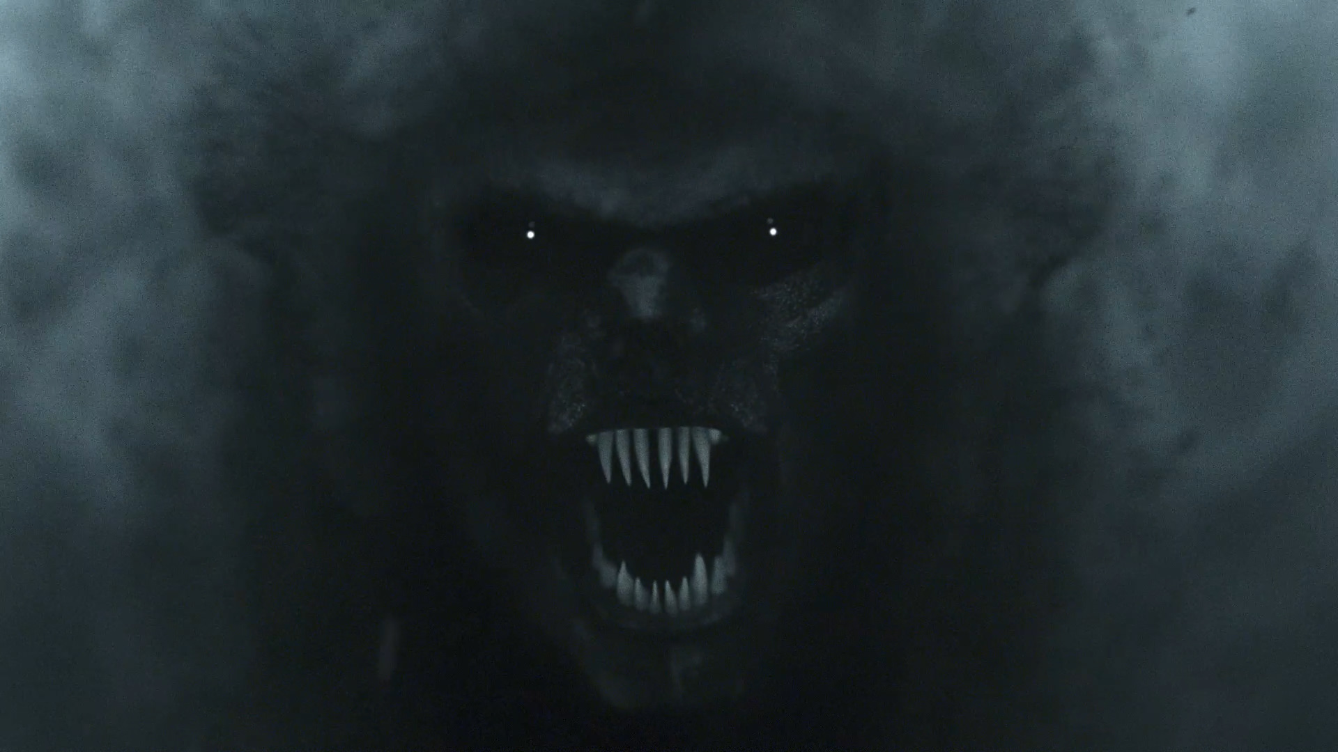
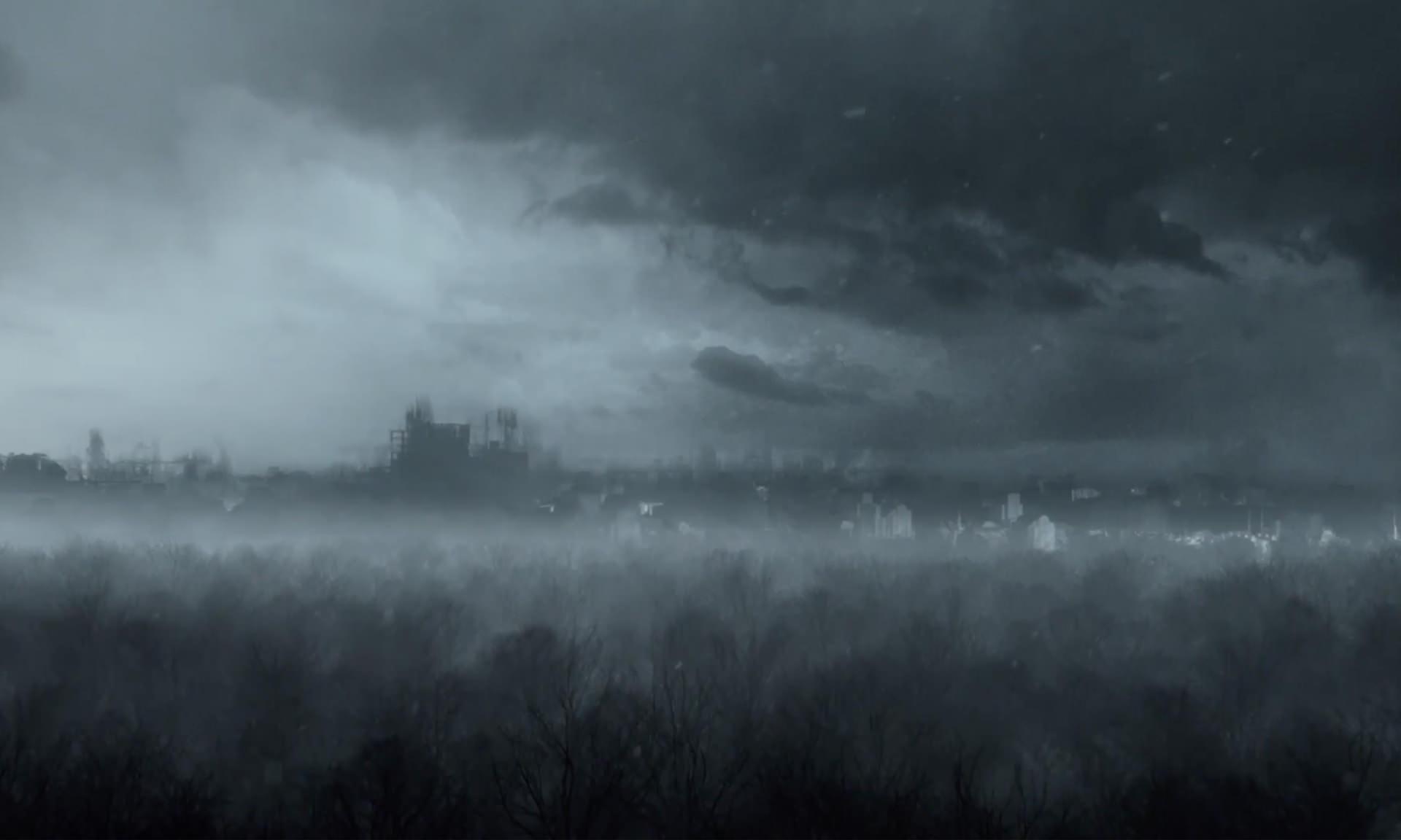
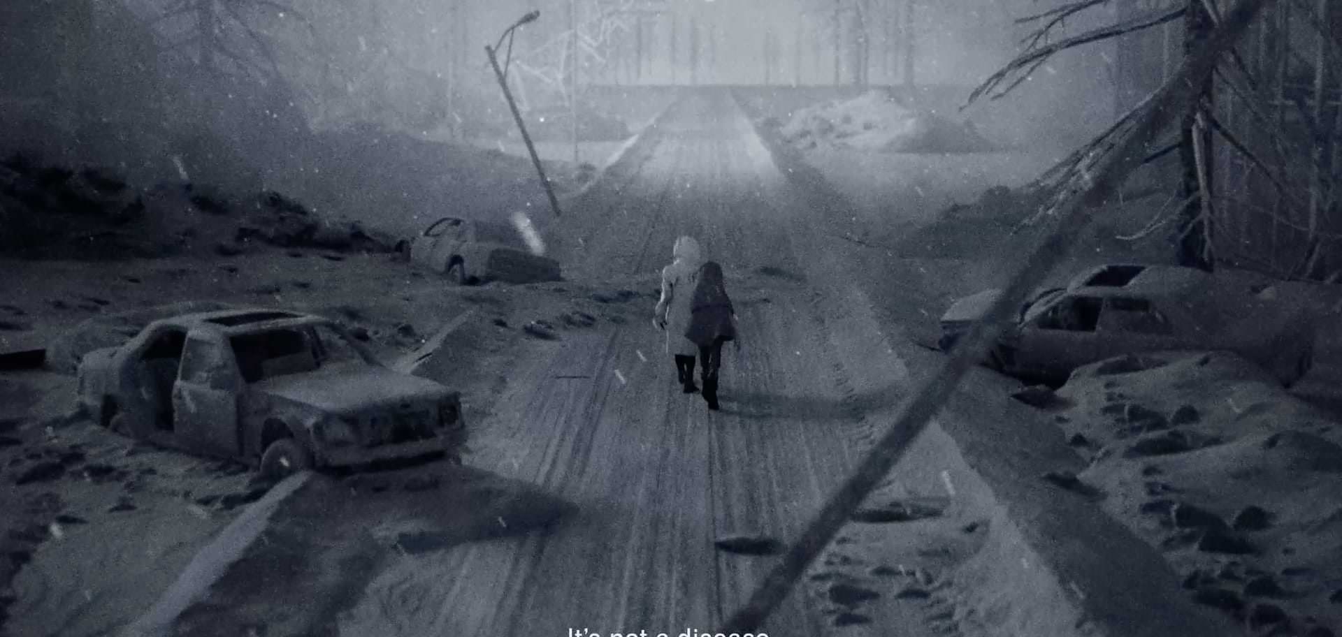
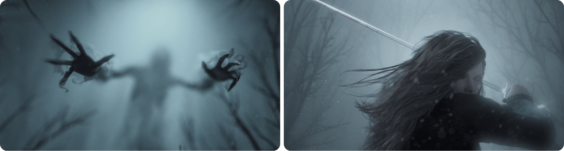
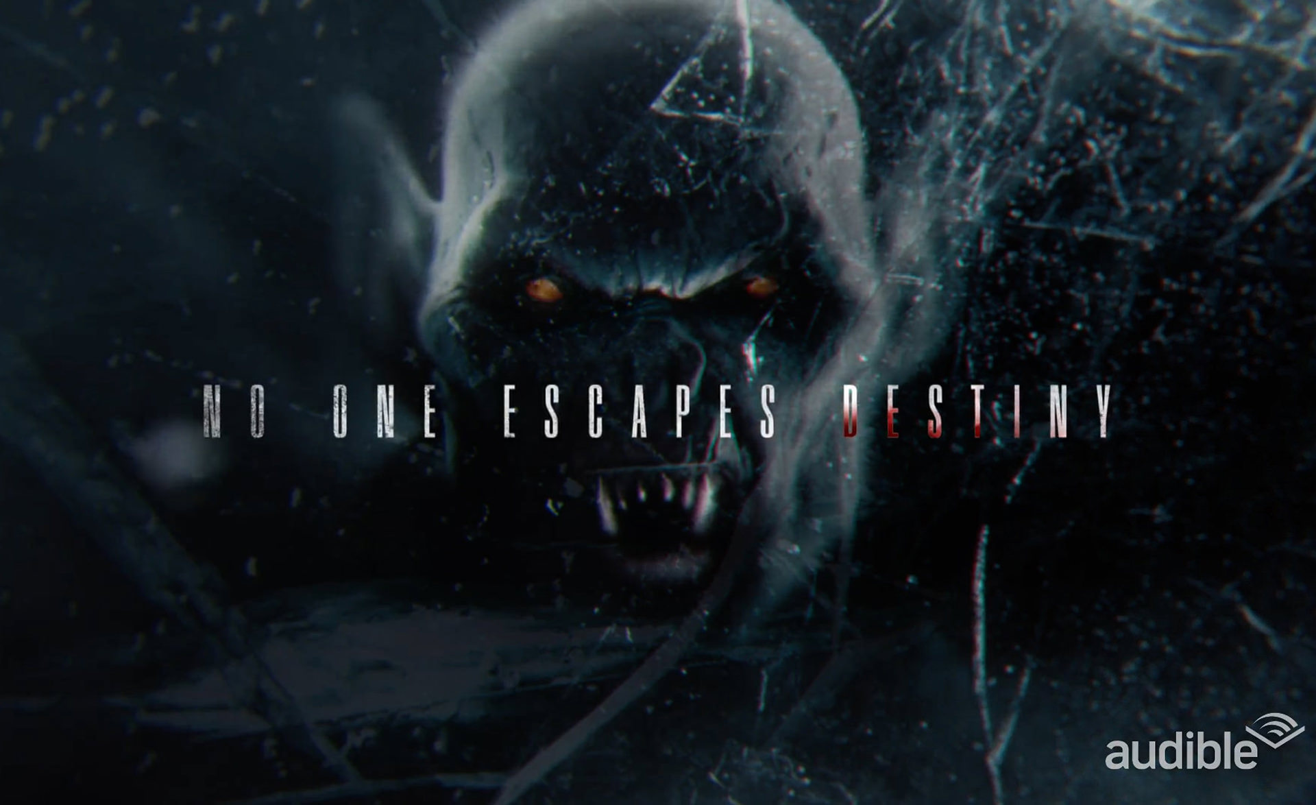
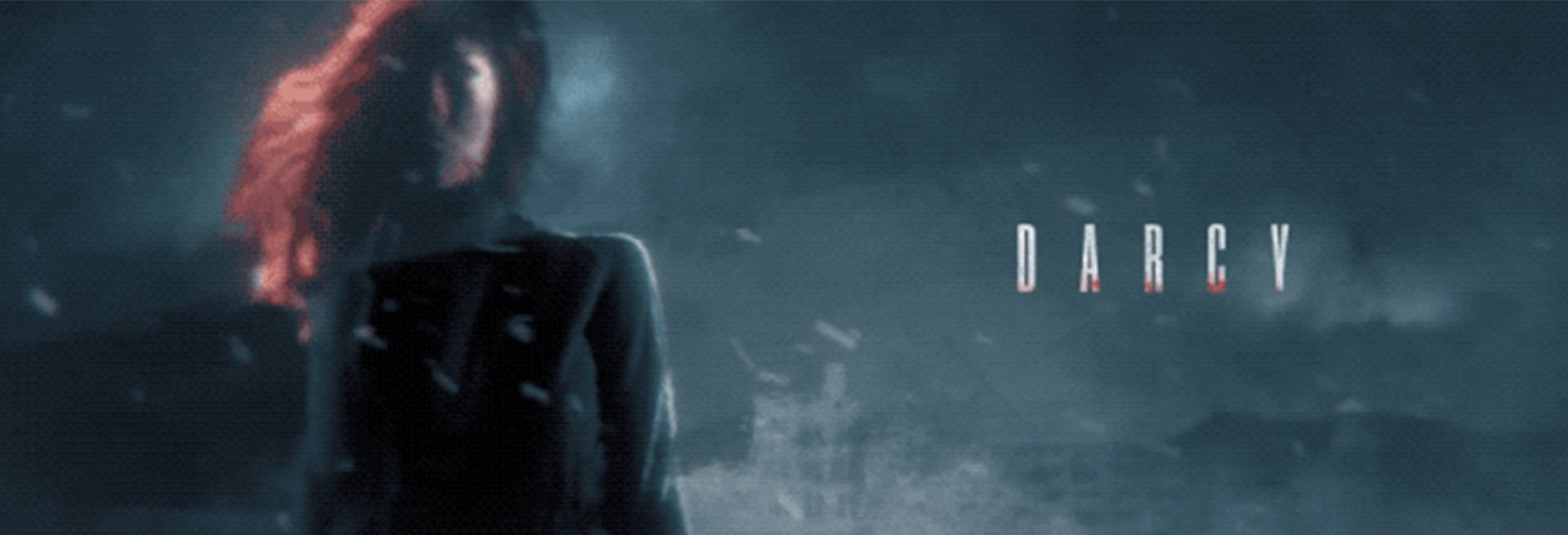
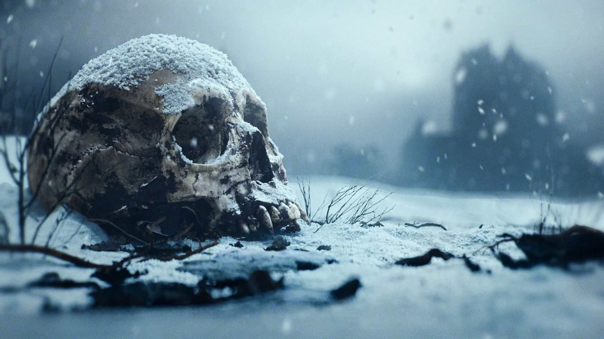
To bring Impact Winter to the world, teaser video content was going to help us set a tone. For an audio drama, we had an opportunity to help define the visual tone inspired by the soundscape created for the show. We created a series of short environmental spots that explored the world and paired with the visceral world descriptions.
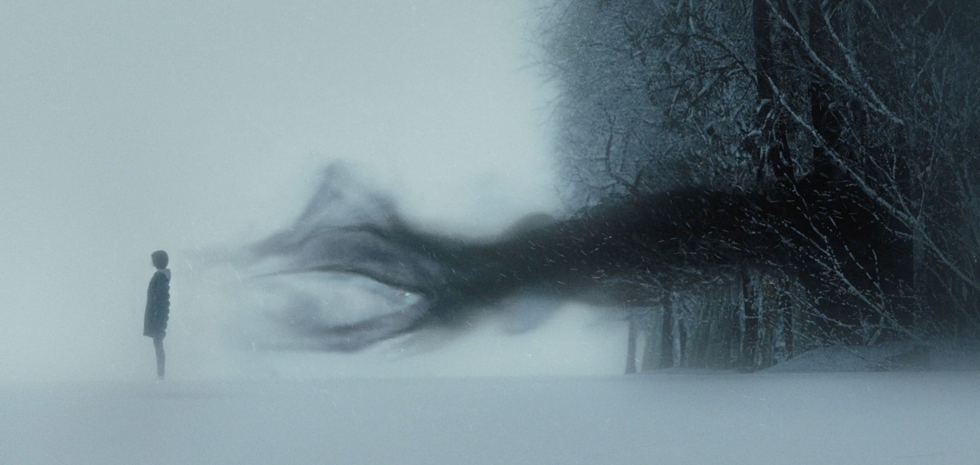
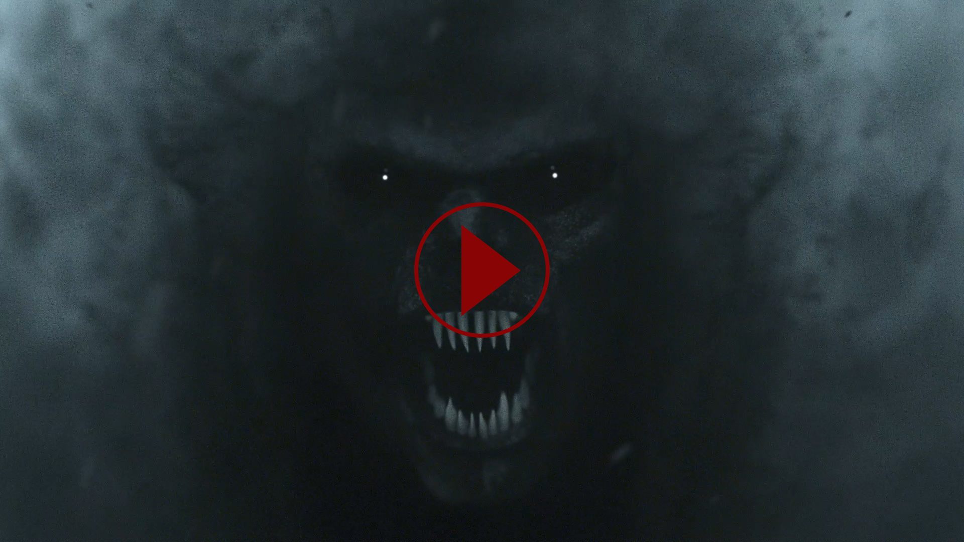
We created a cinematic teaser trailer to establish the world and leading characters within. The visual style defines a bleak world elevating the teaser spots and bringing the vampires to the screen. We designed the trailer to evoke the emotional tone of the show and prime audiences to the world they are about to jump into.

Key Art
Darkness
and Light
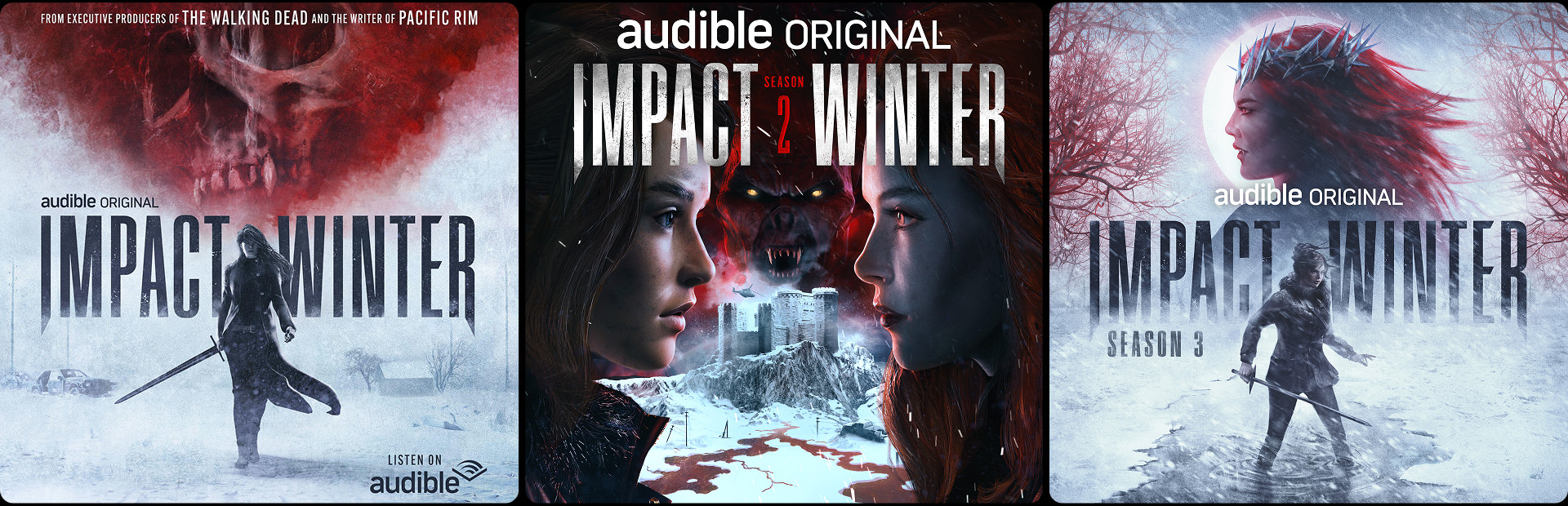
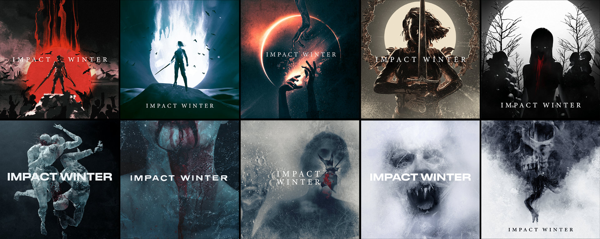
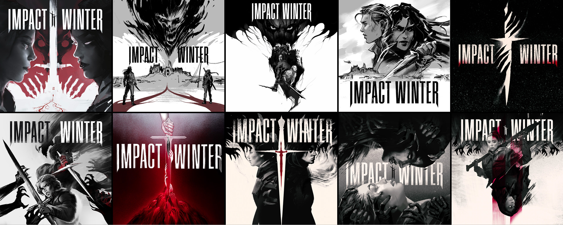
Creating a piece of Key Art for such an evocative and mysterious drama required a thorough exploration process. Our illustration team set out to define the core elements of the season in highly metaphorical scenes. A balance between the real and the figurative was the key here.
The Key Art became an artistic representation of the world juxtaposing humanity with the evils beyond. Our goal was to establish the sinister themes within while still allowing audiences to eventually fill in their own imagined details as they listen to the story unfold.
KEY ART DEVELOPMENT
IMPACT WINTER
SEASON 01
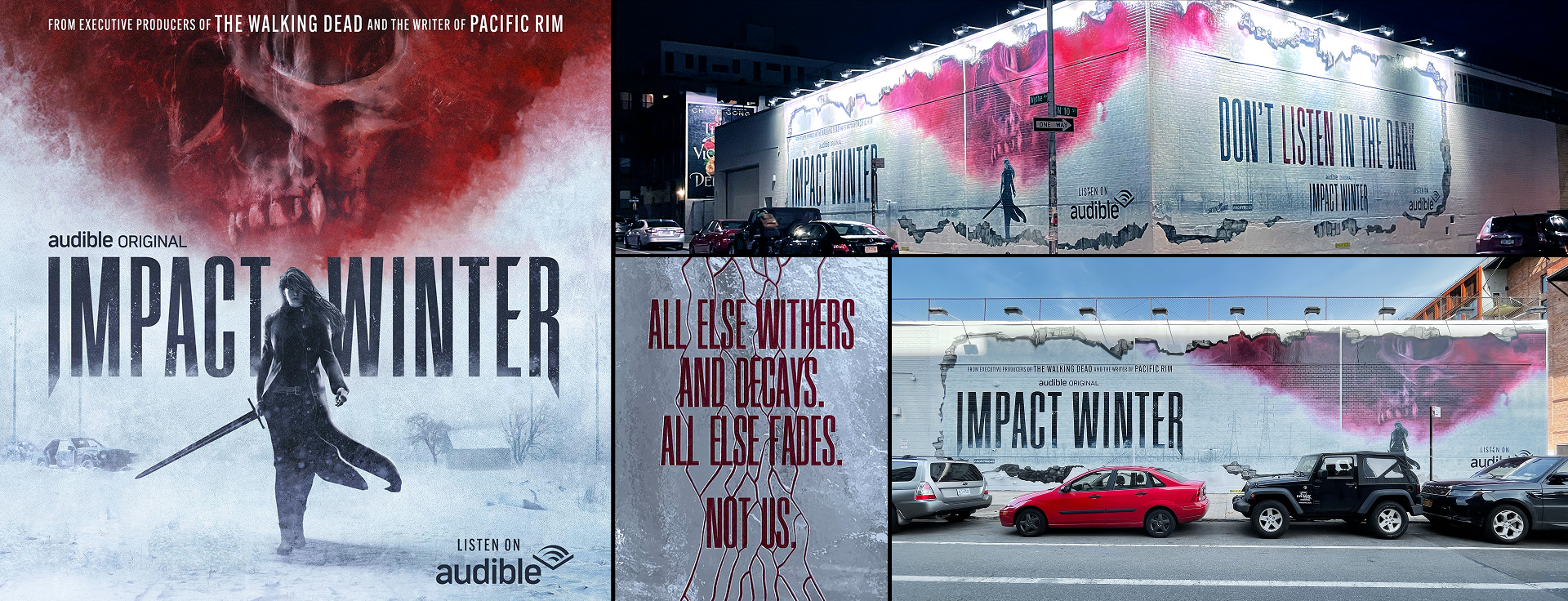
KEY ART • OOH
SEASON 01
Season Two
The Dunraven
Sisters
Six months have passed since the Vampire Queen fell silent, and the world balances on a knife’s edge. Rejoin the courageous Dunraven sisters, Darcy and Hope, as they navigate the vampire apocalypse in a sunless, endless winter that grows deadlier with each passing day.
When Audible returned for Season 2 of their hit apocalyptic vampire series, they requested a campaign that would deliver on their strategic positioning of “a blockbuster for your ears” and “prestige listening.” They also wanted to explore the thrilling story of the two Dunraven sisters, one human, one vampire, and their tangled dual destinies. But honestly they had us at “hello.”
THE APPROACH
COMPELL
AND EXPAND
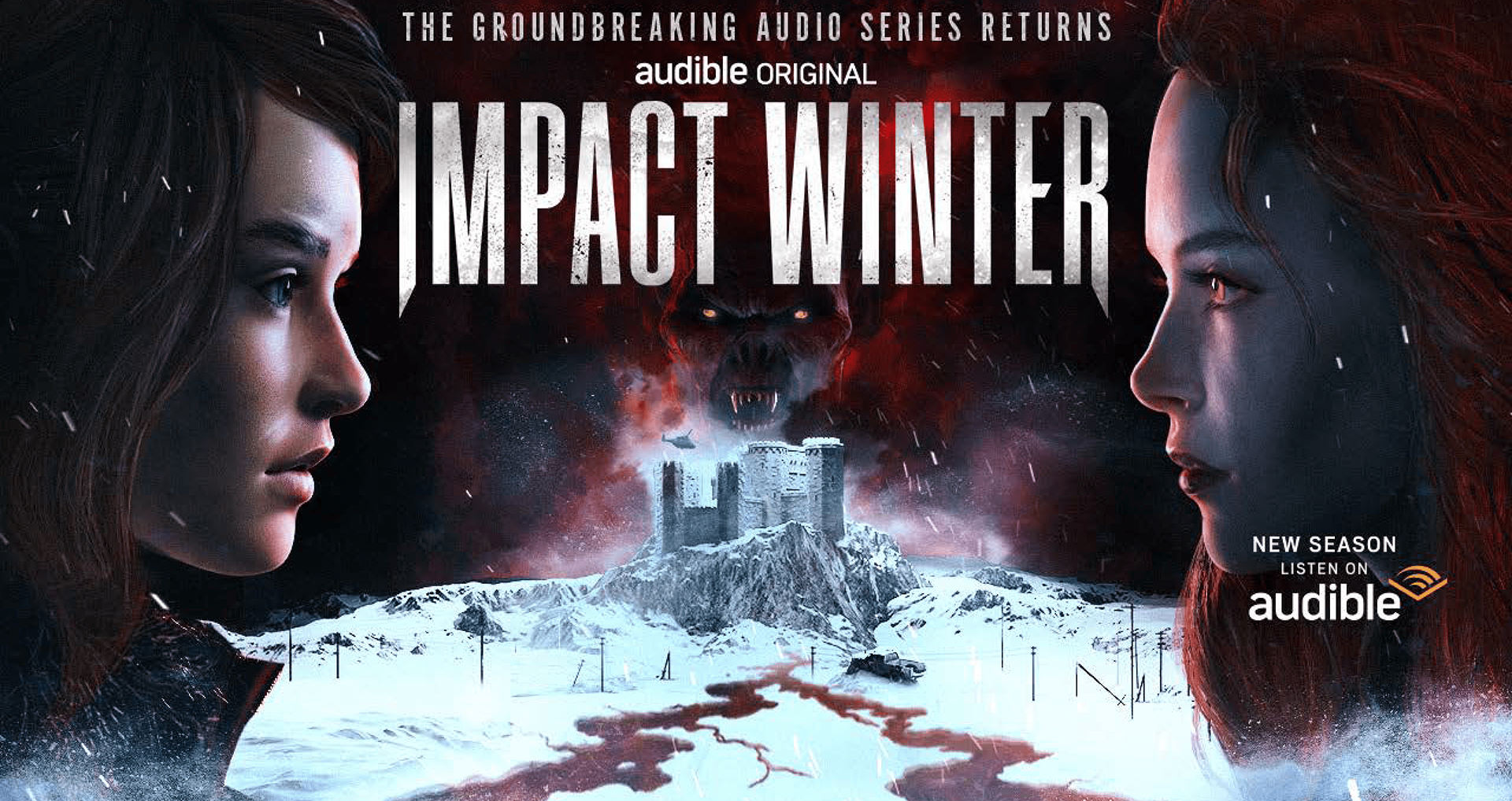
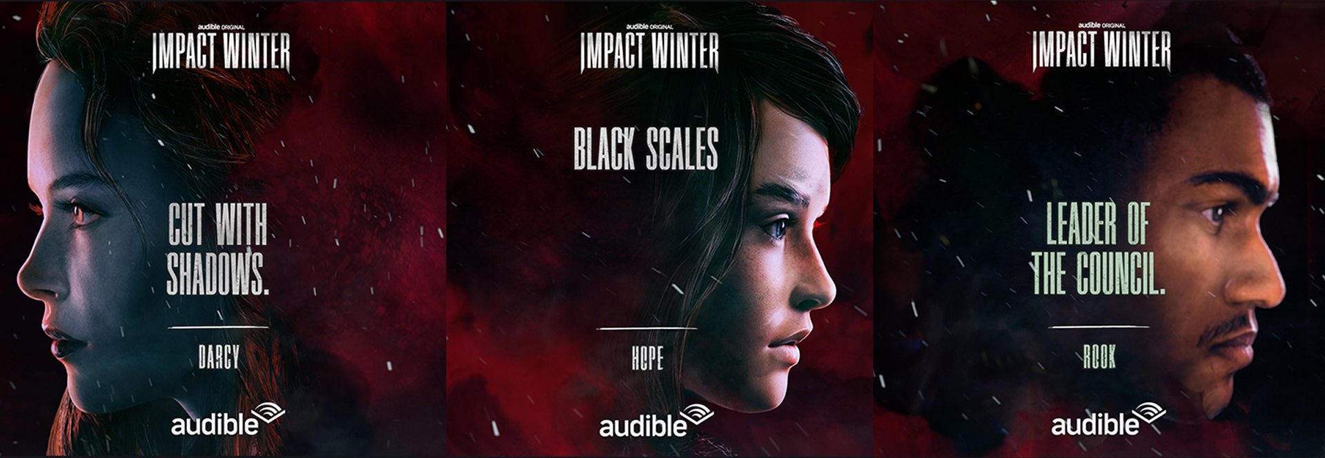
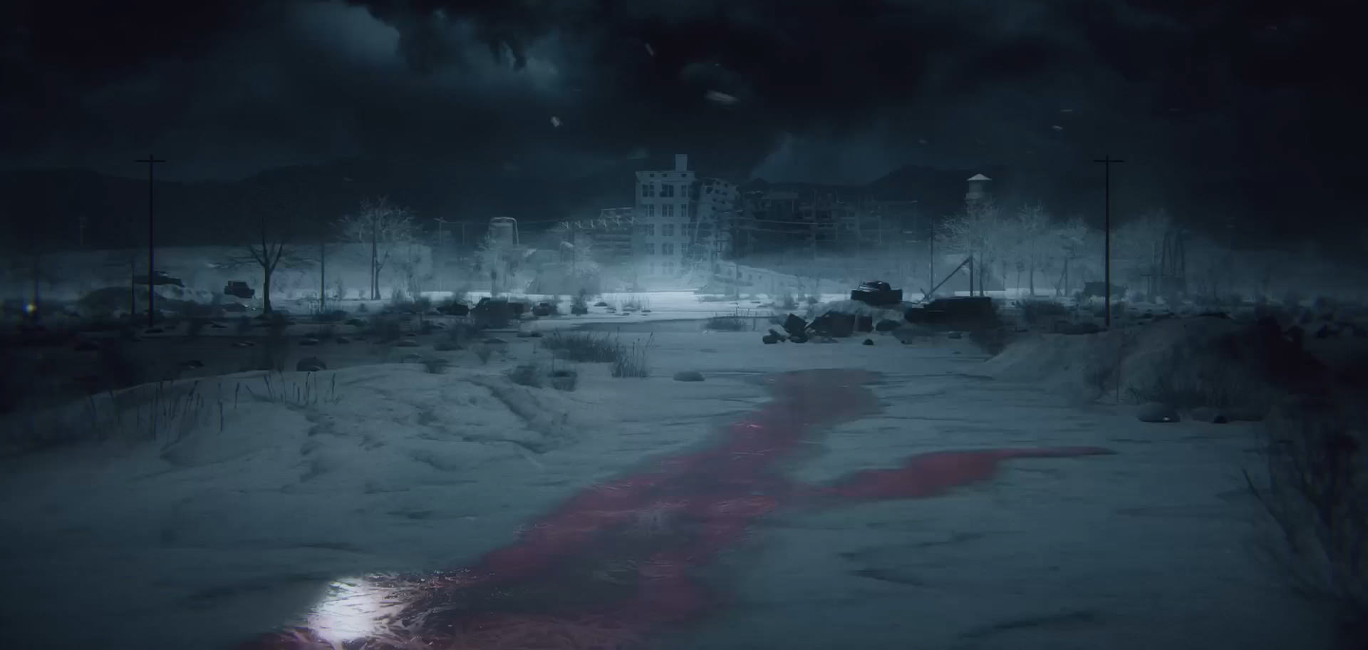
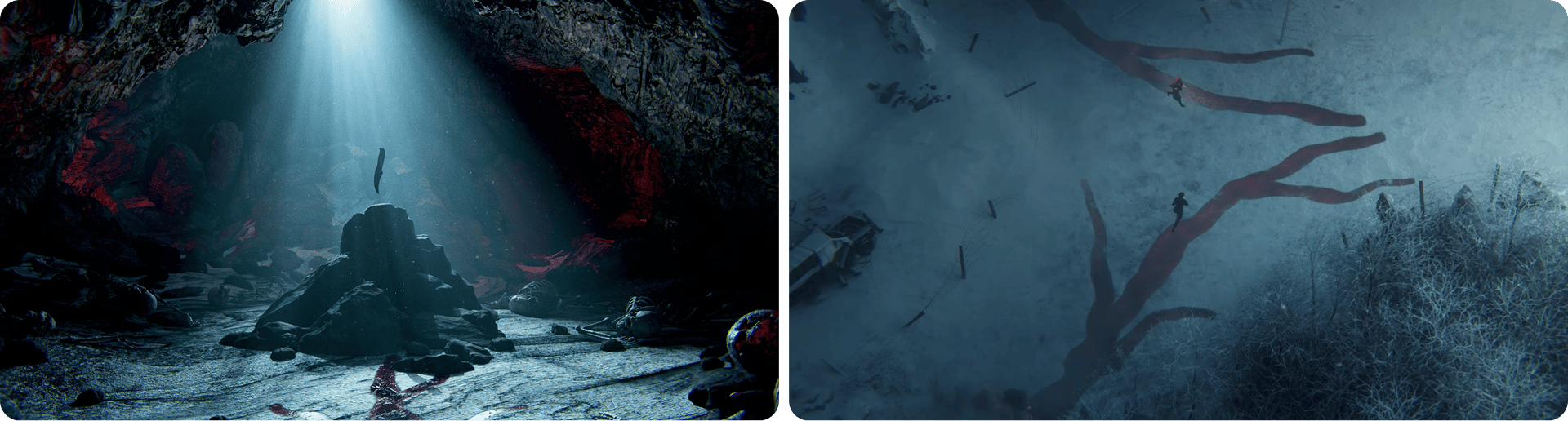
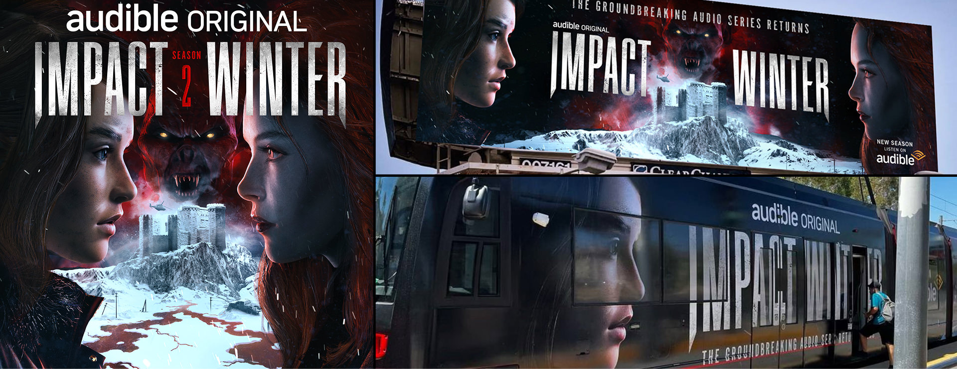
Our approach for Season 2 was to show the contrasts between the two sisters and display the epic scope of their worlds…from a crumbling castle in England, to an abandoned military base in the UK, to the mountains of Dubrovnik where the ancient Vampire council is based.
These worlds are connected through the sisters’ shared bloodlines that serve as roads which reveal each others’ (sometimes unwanted) destinies.
The Payoff
Getting
Out Alive
Ultimately, we created a haunting, moody, and modern gothic aesthetic, rich with elements within the genres of horror, thriller, and the supernatural.
With a look that is both lush, r-rated, and decidedly not for kids, we’re excited to attract potential listeners to the visuals of these reluctant protagonists and their epic battle against evil vampiric villains.
KEY ART • OOH
SEASON 01
Season Three
A Cinematic
Nightmare
The stakes couldn’t be higher. Darcy, who once seemed to be our only hope for surviving the vampire apocalypse, has gone to the dark side—she’s now the reigning vampire queen. Meanwhile, her sister Hope must lead the charge to save humanity—on a path that’s taking her straight to Darcy.
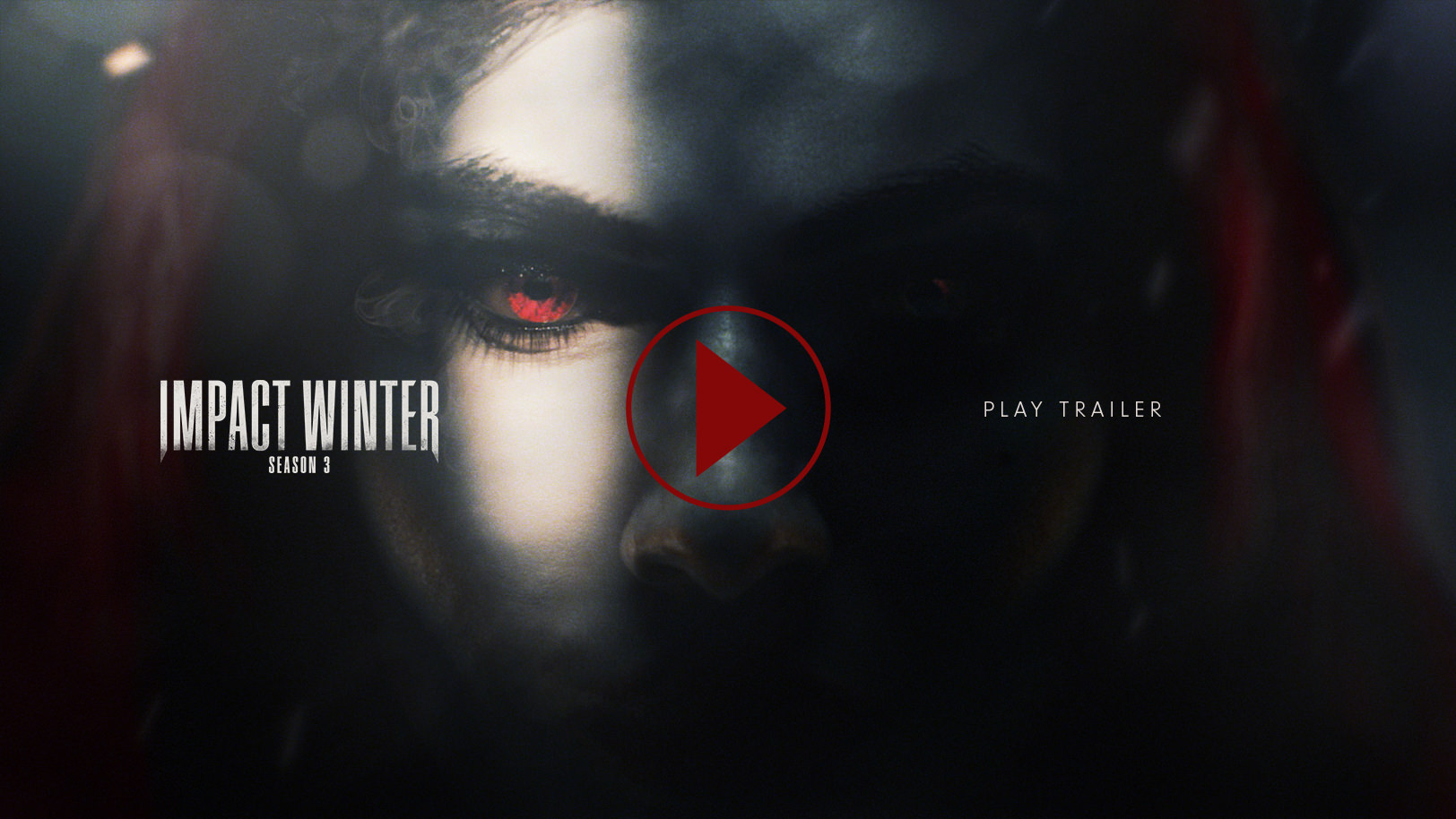
To help promote this world so expertly crafted by show runner Travis Beecham and the talented team at Audible, we were enlisted to help kick off Season 3 with a new trailer, key art, and promotional marketing kit. We enjoyed living in this world for the first two seasons and Season 3 truly raises the bar on all fronts.
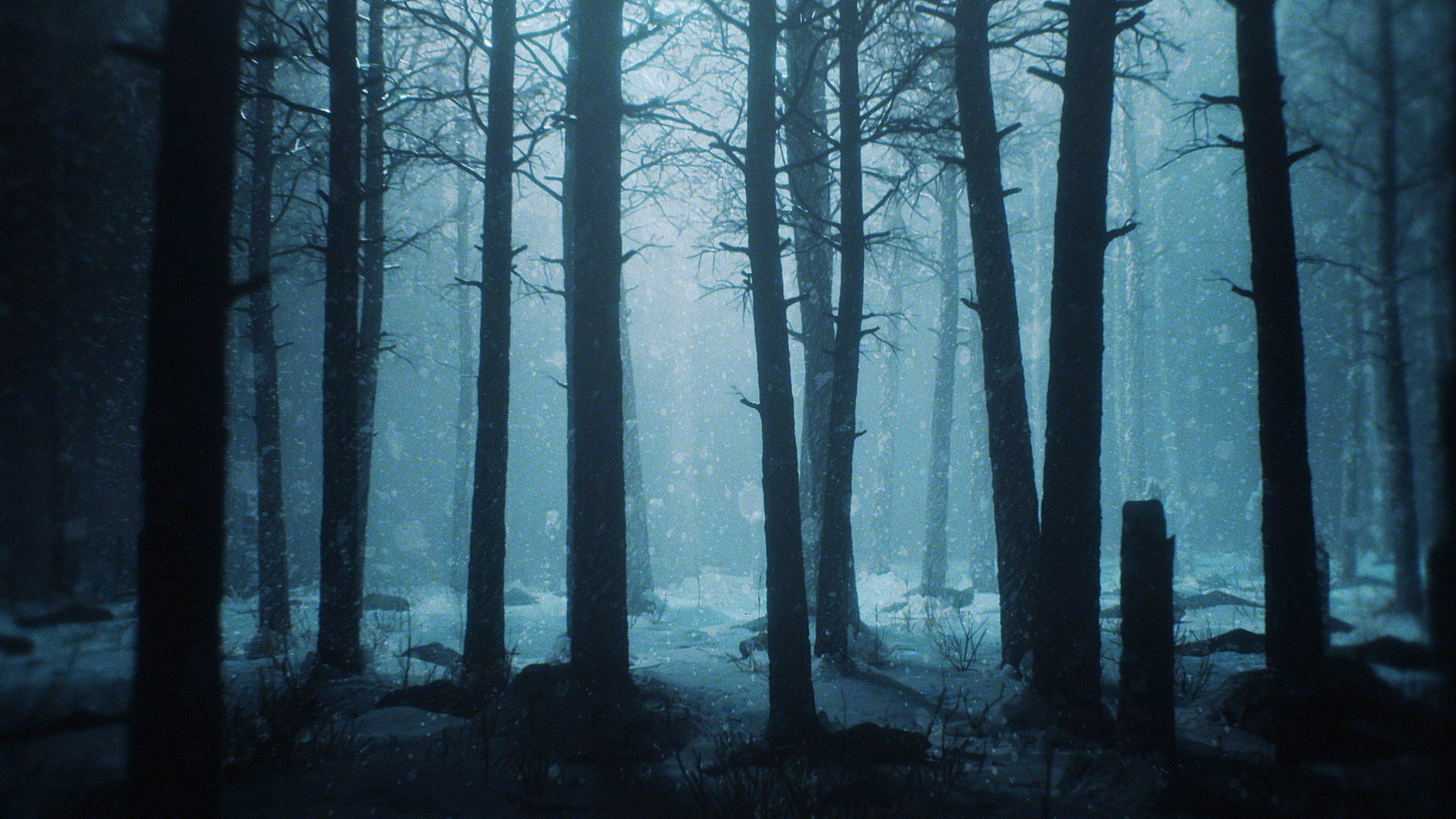
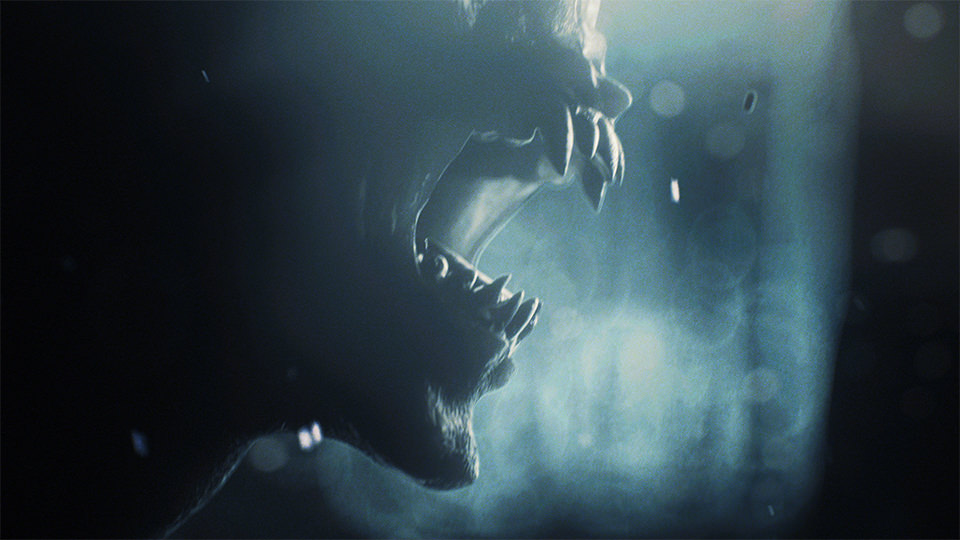
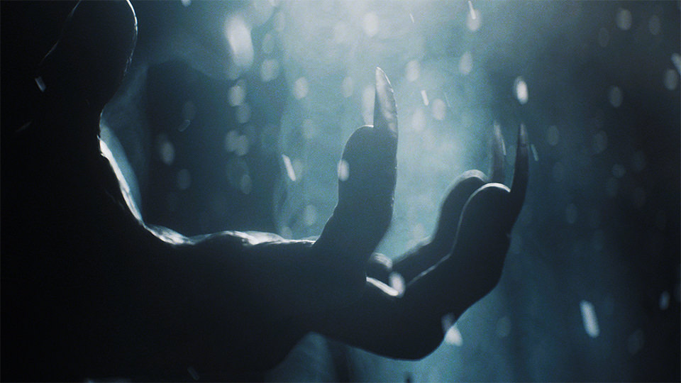
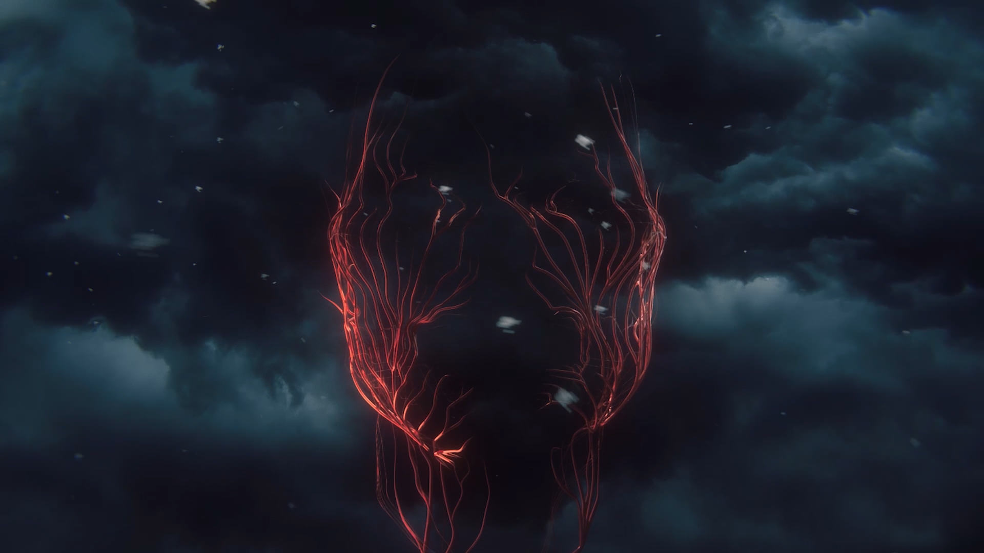
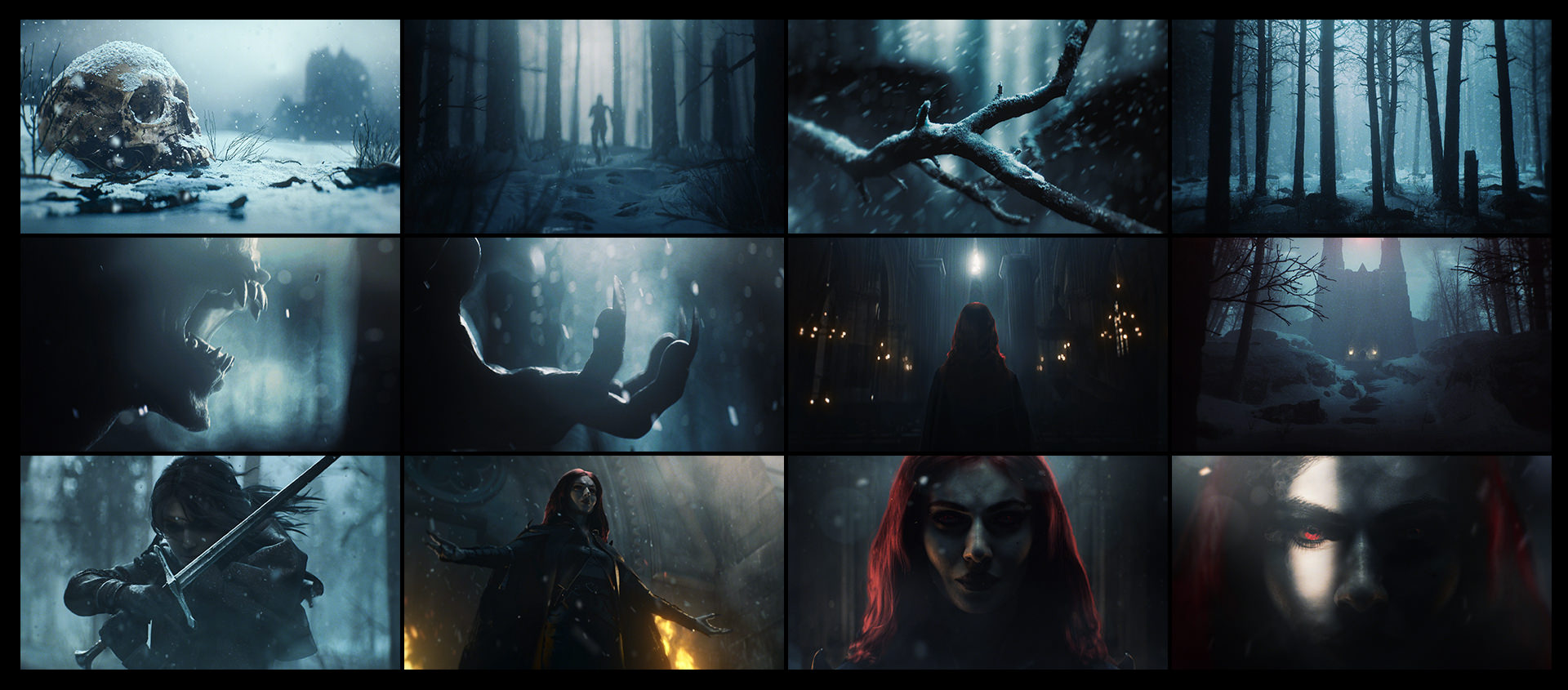
The marketing trailer is a key component of these promotional keys that presents an opportunity to bring the world of Impact Winter to life in a cinematic style. For season 3 we really wanted to raise the bar. We tried to make imagery that would sear the mind’s eye of the viewer.
Every shot is a work of art that can stand on its own. Together, they tell the story of Hope and Darcy’s journey, while setting up the season’s major confrontation.
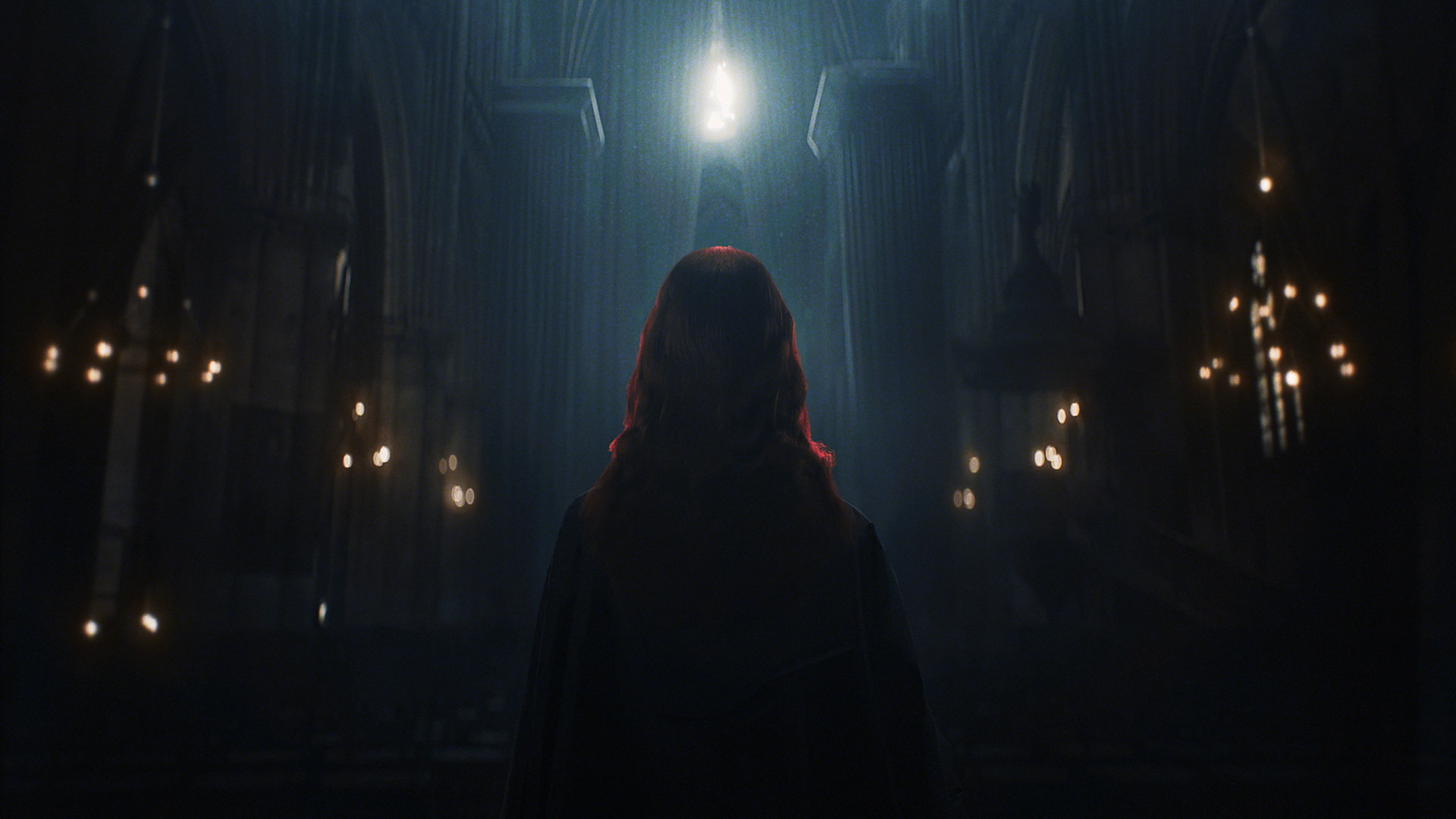
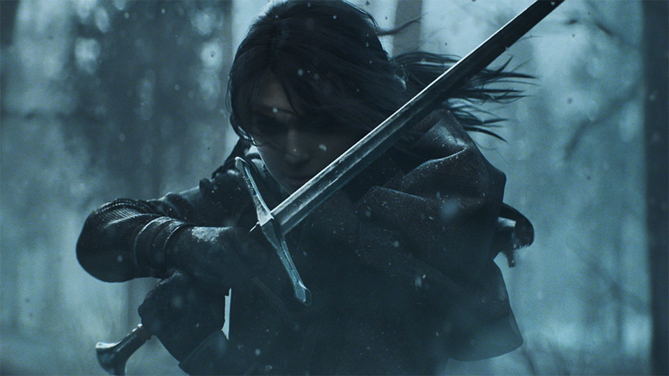
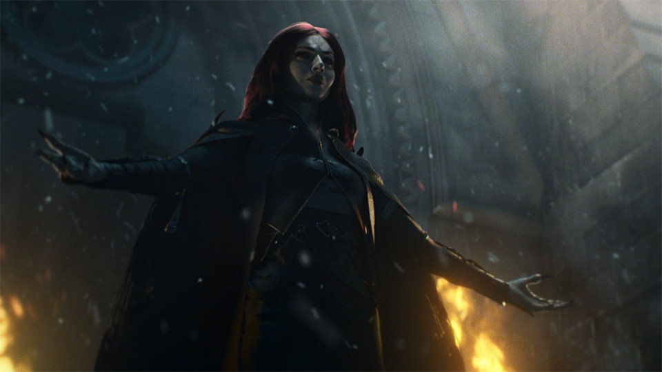
Our approach for the trailer was to keep the scenes metaphoric and dream-like. We showcased the characters of Hope and Darcy without dwelling on the details. Our goal was to create scenes with lasting visual impact. While developing these shots, we ensured that some of them could stand alone, and set up a few for seamless looping assets. These are used in other materials and provided as part of the kit wherever needed. We can’t tell you how many times a looping video asset has come in handy.
Social media was a driving factor from ideation to completion. We ensured that each shot was composed to work at a variety of social sizes. The final piece was equally effective across all social media.
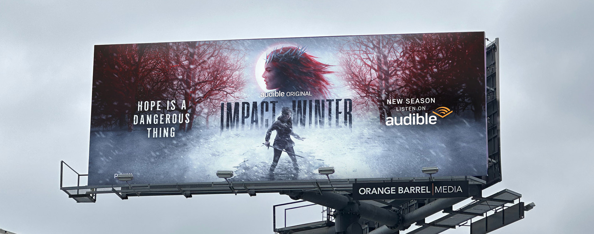
KEY ART & OOH
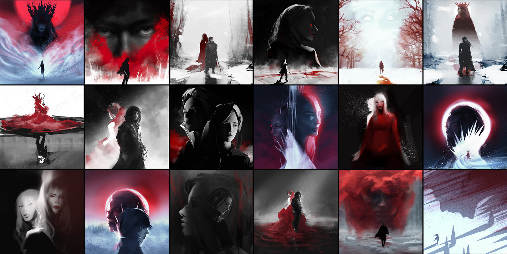
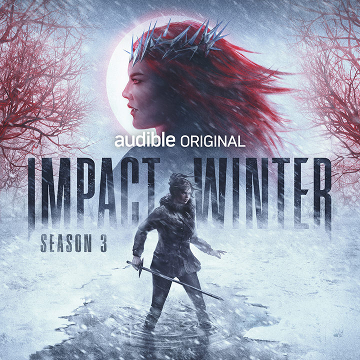
Impact Winter season 3 needed a new Key Art and the team wanted to approach it with a more illustrative eye and a bit of visual poetry. This being the 3rd season, we wanted to find a nice evolution in the style and world while making visual connections back to season 1. When all 3 posters are shown together, a journey is clearly conveyed with lingering questions in the metaphor of it all.
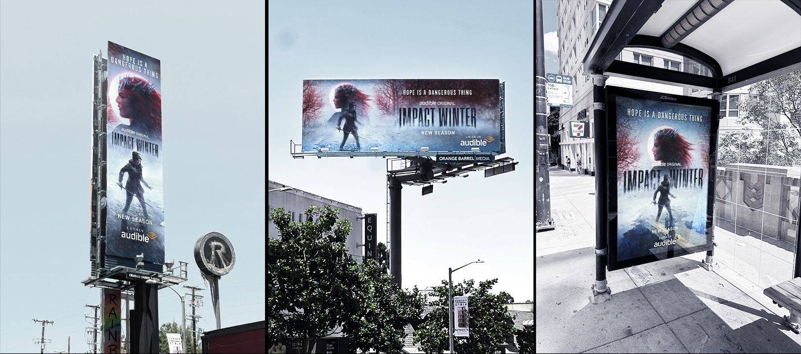
The key art was used across a wide variety of applications in the promo campaign, from building projections to digital signage. As with previous seasons, these assets need to be flexible and enable the marketing department to rapidly deploy and iterate across any new need at a moment’s notice.