Priority Bicycles
Brand Identity
Biking for the masses
Identity, Brand Toolkit, Website Templates
THE CHALLENGE
It’s all about the ride
The world of crowd-funding is an interesting place of potential hits or misses. When Priority Bikes was campaigning on Kickstarter, we were one of their first contributors. The company successfully met their goal, not once but twice, and established themselves as an independent powerhouse for bicycle and design enthusiasts back in 2015. Fast-forward to 2019 when our paths crossed again, only this time it was on us to return the favor by helping evolve their brand to give them a nudge beyond the startup they once were.
Brand Language
Expanding the
Brand Language
The early goal was to unify Priority Bikes branding across all their channels. From point of sale via their website, to the functionality of their newsletter, the level of thoughtfulness in the product design needed to be translated into the brand identity. That started with research, comparing who Priority Bikes found as lead competitors vs. brands we thought they should be competing with. Not all of them biking companies. Our strategy coming out of that process led us to focus on the thoughtfulness the small team at Priority puts into every bike. From the chain-free belt drive system, to the unique rust preventative paint they use on their beach cruisers, the team at Priority is thinking about the consumer every step of the way by making products that are cost competitive and longer lasting.
THE APPROACH
Building an
Evolving Toolkit
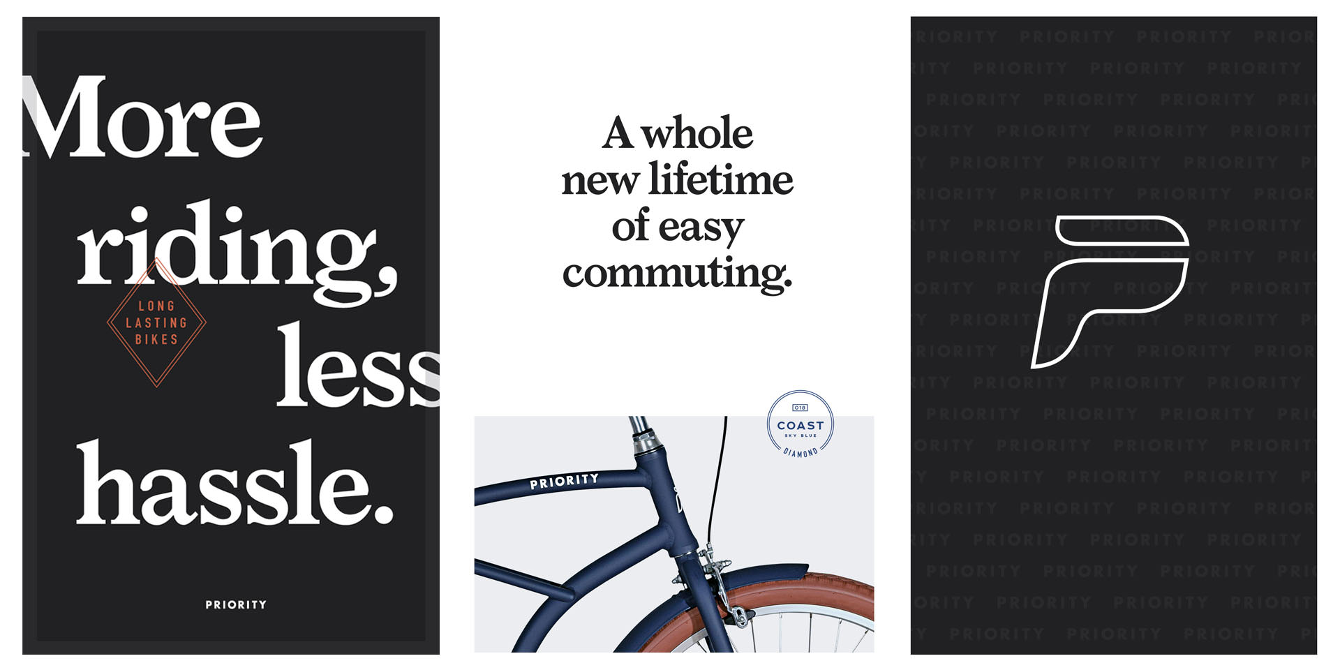
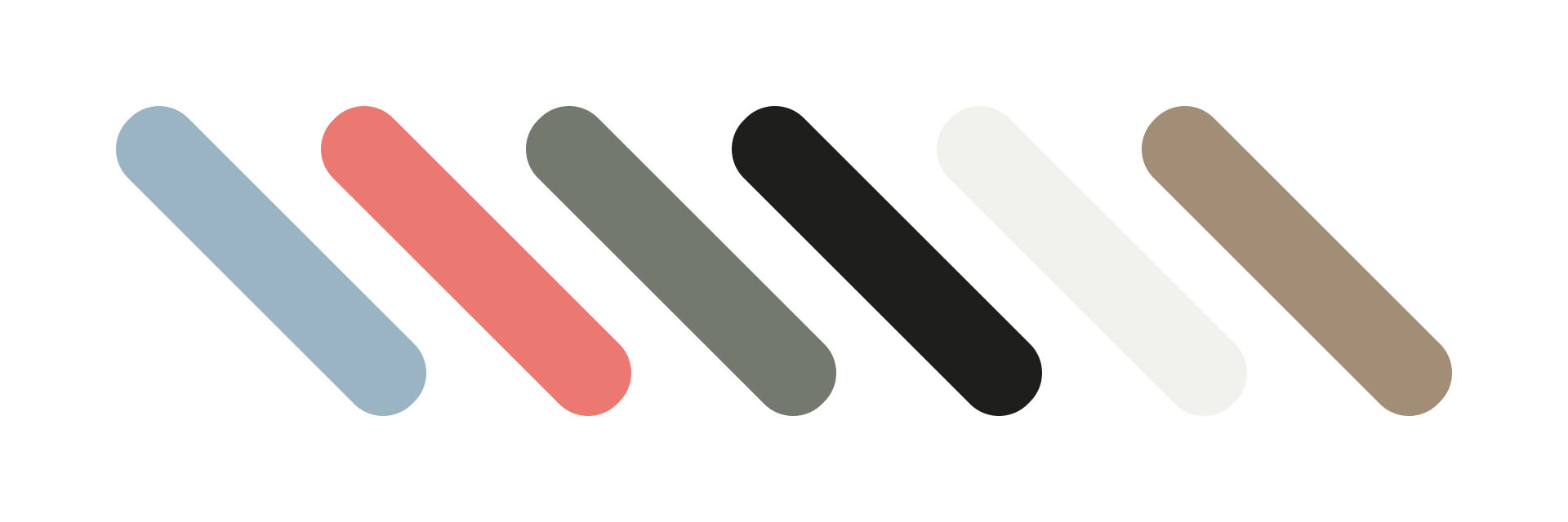
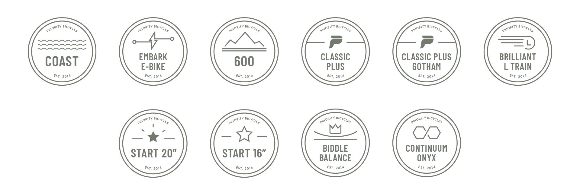
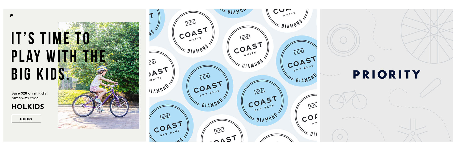
The brand toolkit we created provided the structure they’d need to quickly and easily iterate on daily material they needed to produce, while upholding their brand identity through every touchpoint.
We were also building design systems that could scale as Priority’s digital presence matured. The design spoke to their modern approach in e-commerce and their focus on high quality/ low maintenance bikes. As an online retailer, digital design was critical to conveying the brand’s essence and establishing confidence in their consumer. They needed an identity that lived up to the quality of design of their product and could span all marketing materials, from print ads to fully branded spots.
MOTION TOOLKIT
Elevating the brand
In motion
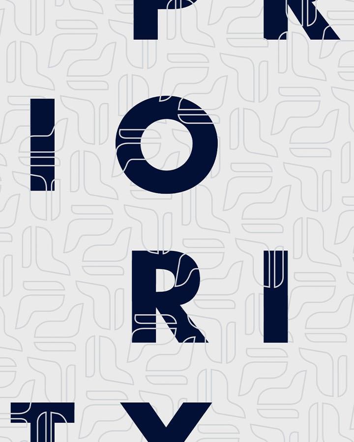
A motion language is critical for any brand looking to expand into social. With this in mind, we designed and animated a full motion toolkit for their marketing spots that included lower-thirds, transitions, headlines, and more. These assets continued in our modular approach and provided the Priority with options to develop over time.

WEBSITE DESIGN
Retooling the
Shopping experience
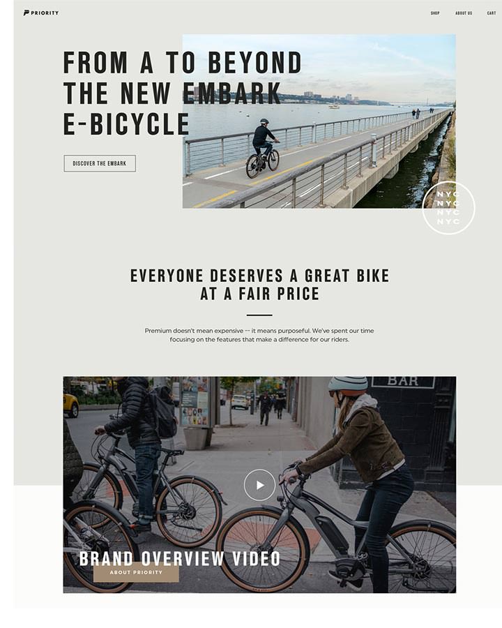
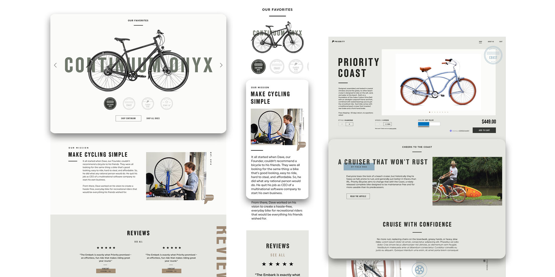
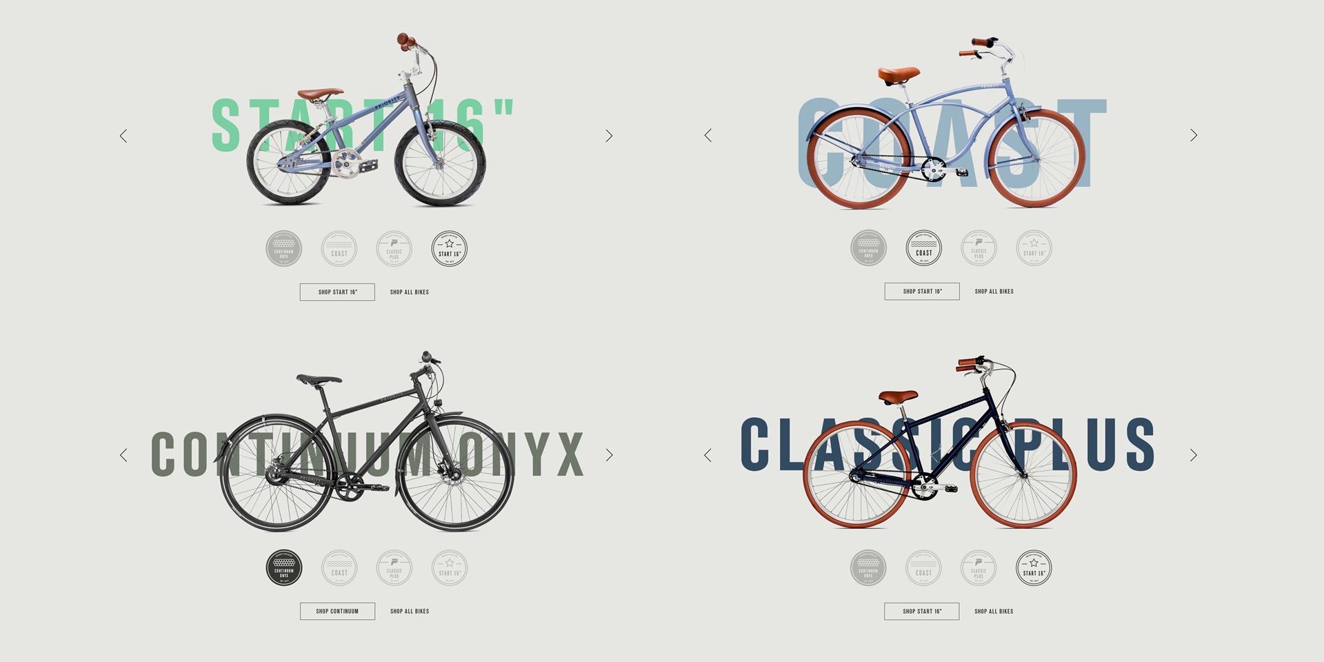
Pulling all of this brand identity and marketing exploration into their shopping experience was the final revamp in the assignment. We redesigned key pages with the new language and provided options that could scale as the brand language matured. Websites are never static and our approach reflects that. With elements that could be added and removed as desired, the toolkit became a study in modularity.
PRODUCT DESIGN
OH, We also helped
Design a bike
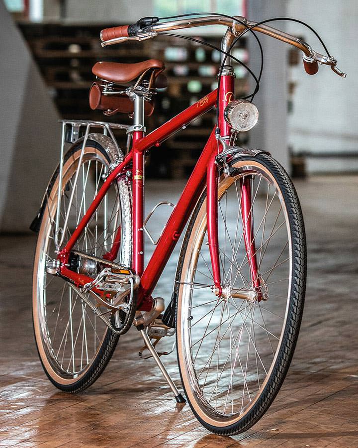
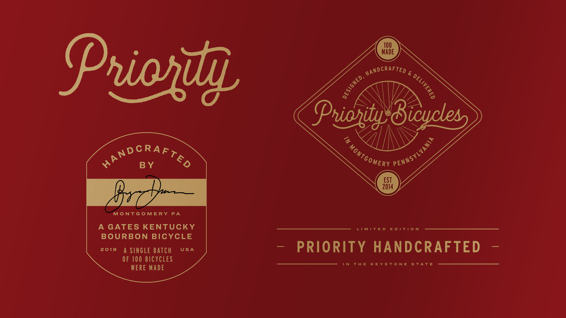
To help launch a limited edition bike, Priority asked us to design graphic elements for a one-of-a-kind bike. They called it “The Proof”, a limited edition bike made in Montgomery, PA, that honors the brand’s heritage. Our designs mirrored this lineage with carefully crafted details for the head tube, down tube, seat tube, and crossbar. We love design challenges and helping Priority bring a product to life with a custom design language was the perfect expansion on our brand study with them.
THE PAYOFF
Gearing up for
The future
By developing a robust brand toolkit, we helped enable Priority to reach their audience with the fluency of a well placed message and the impact of their next big product launch. We’ve armed them for future where they can focus on continuing to make the best bikes around with the confidence of a brand style that mirrors their love of the bike. Even those mailers need to look good! When it comes to brand design impact, we get it.
