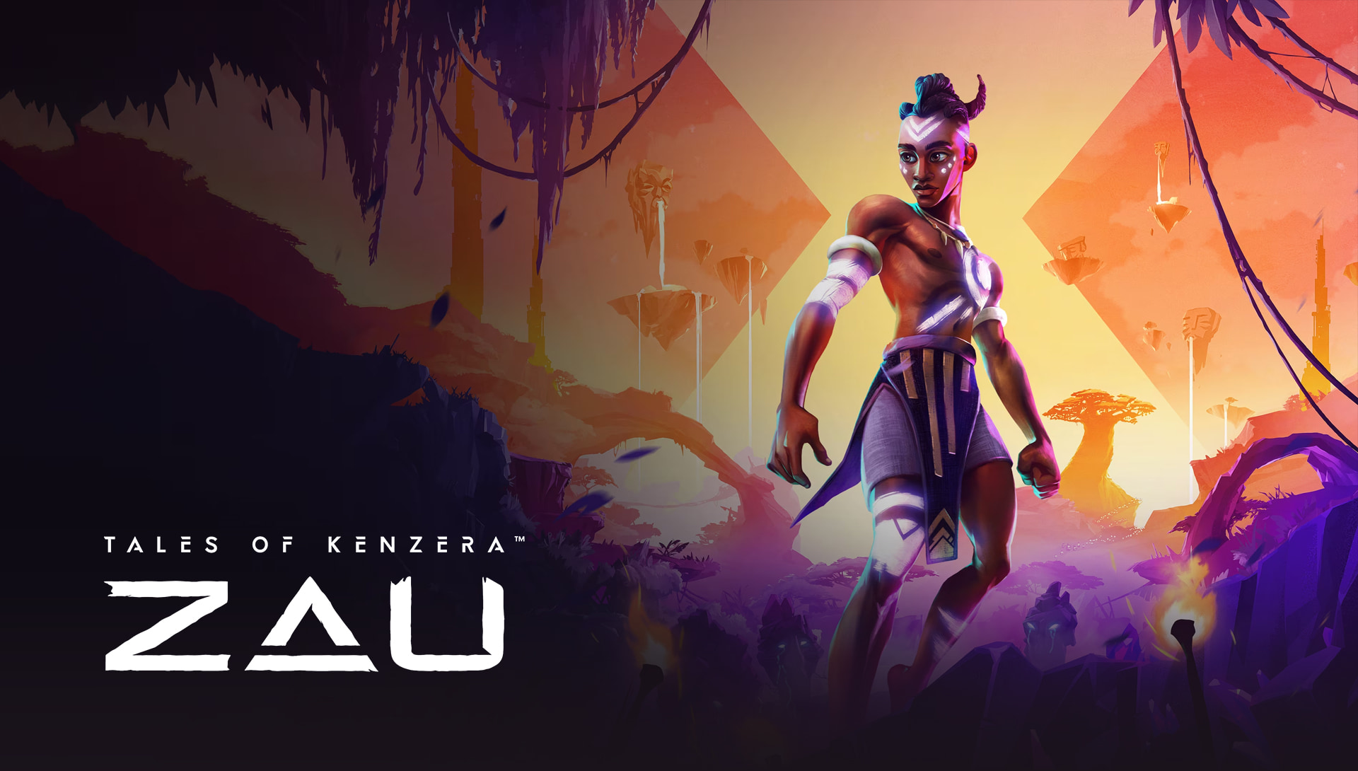
EMBARK ON
AN ADVENTURE
EA has been producing AAA games for decades and is a well-established name in the industry. We’ve had the privilege to work with EA and their various companies over the years to create marketing for big titles and
in this case, a smaller title with a big heart.
ZAU captures the nostalgia of a classic metroidvania-inspired platformer game and brings it into modern sensibilities with a beautiful art style and captivating story. EA brought us in to brand the game complete with Logo, Key Art, brand kit, and marketing assets.
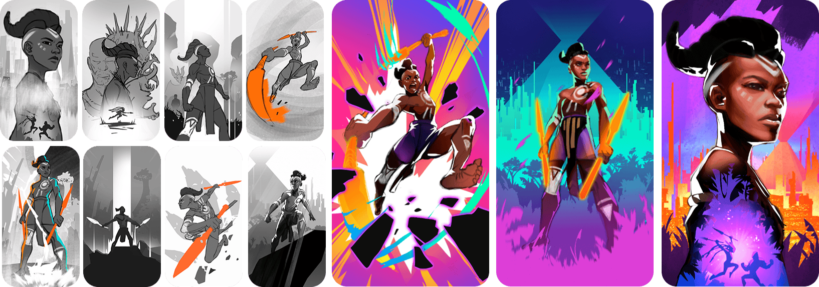
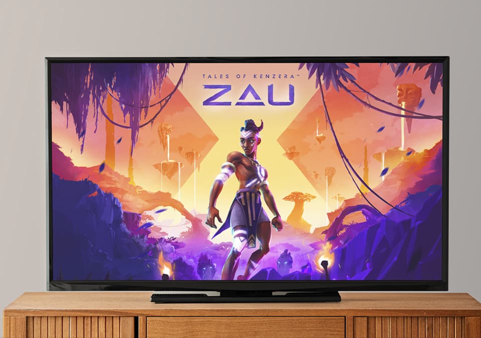
KEYART
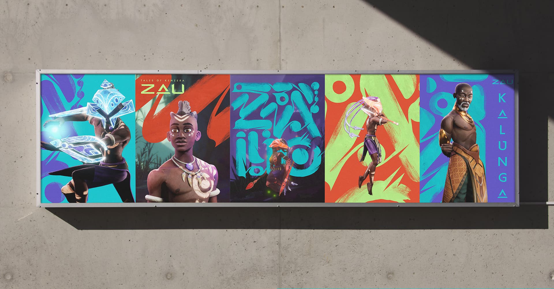
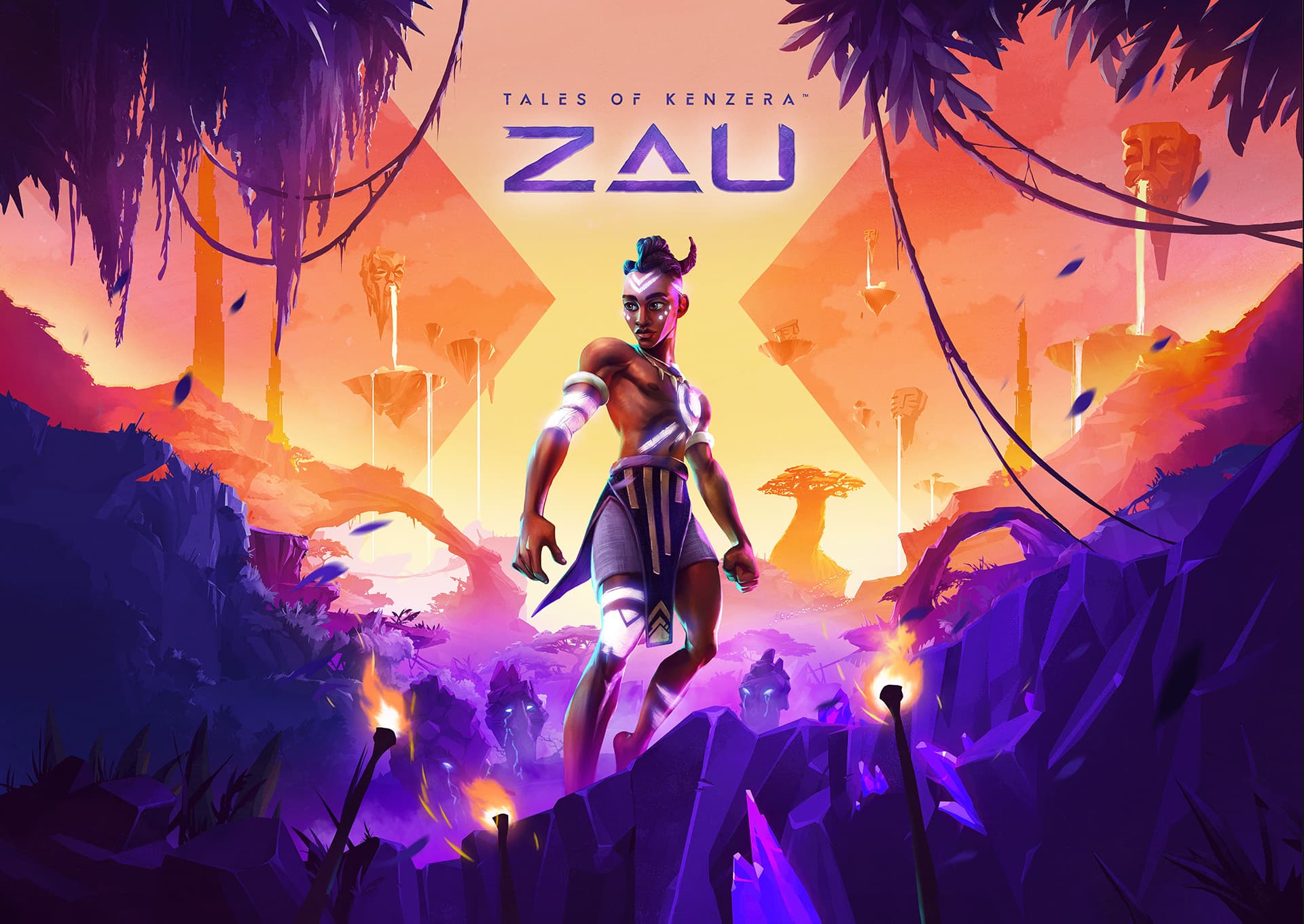
Always a big part of any game launch is of course the Key Art. We love taking on these assignments because they let us flex and explore striking design and illustration all paired with a carefully considered brand kit. For ZAU, the Key Art is indeed very striking with the main character front and center surrounded by symbolic placement of their world and culture. The colors are rich and the illustration style is an embellishment from the games graphic style and the brand style. A blending of both worlds to bind it all together.
Building a Fluid
Design System
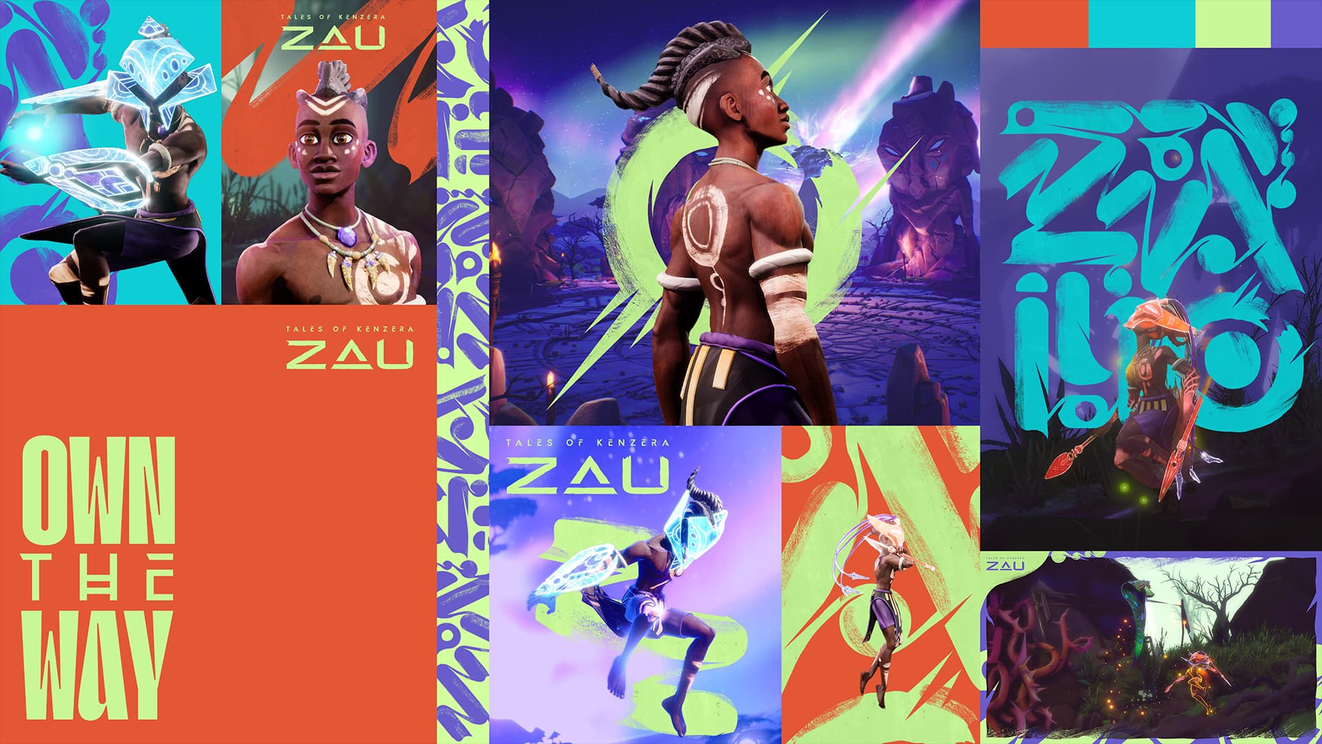
When branding any game, the most important aspect is to develop a robust design system that provides marketing teams with plenty of variety and assets to create in a fun brand sandbox. We loved creating a kit for ZAU that embraced a vibrant color pallet pulled from the game and pushed the marketing sensibilities with expressive design elements like brushstrokes and symbolic iconography.
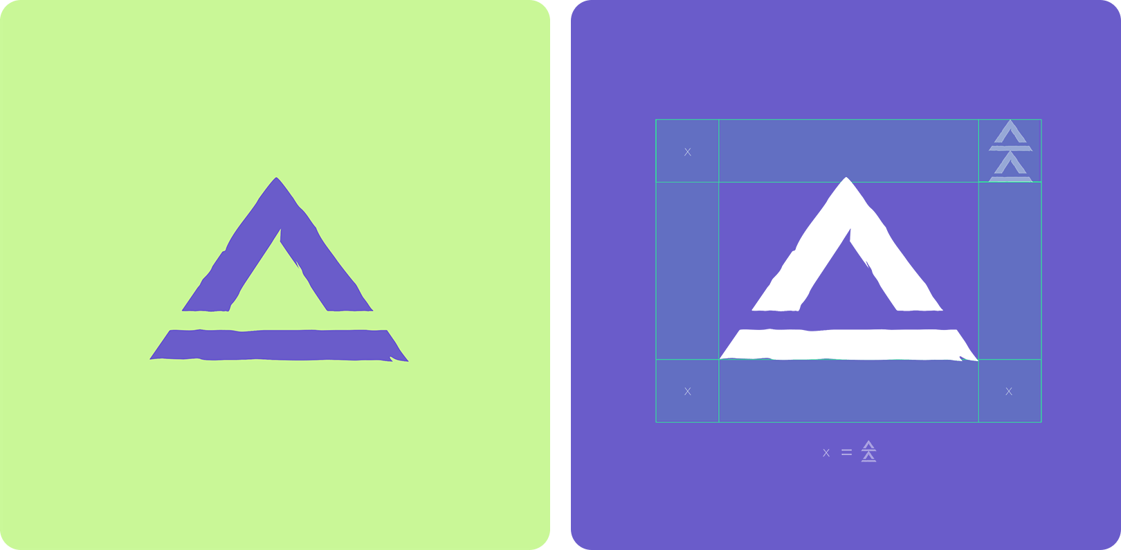
The logo embodies the main character both in name and visual characteristics with a hand-done style in keeping with the game’s visual vernacular. The “A” channels a double meaning by utilizing the “power” symbol from the game as an iconic reference.
COLOR PALETTE
& TYPOGRAPHY
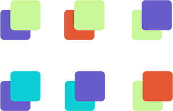
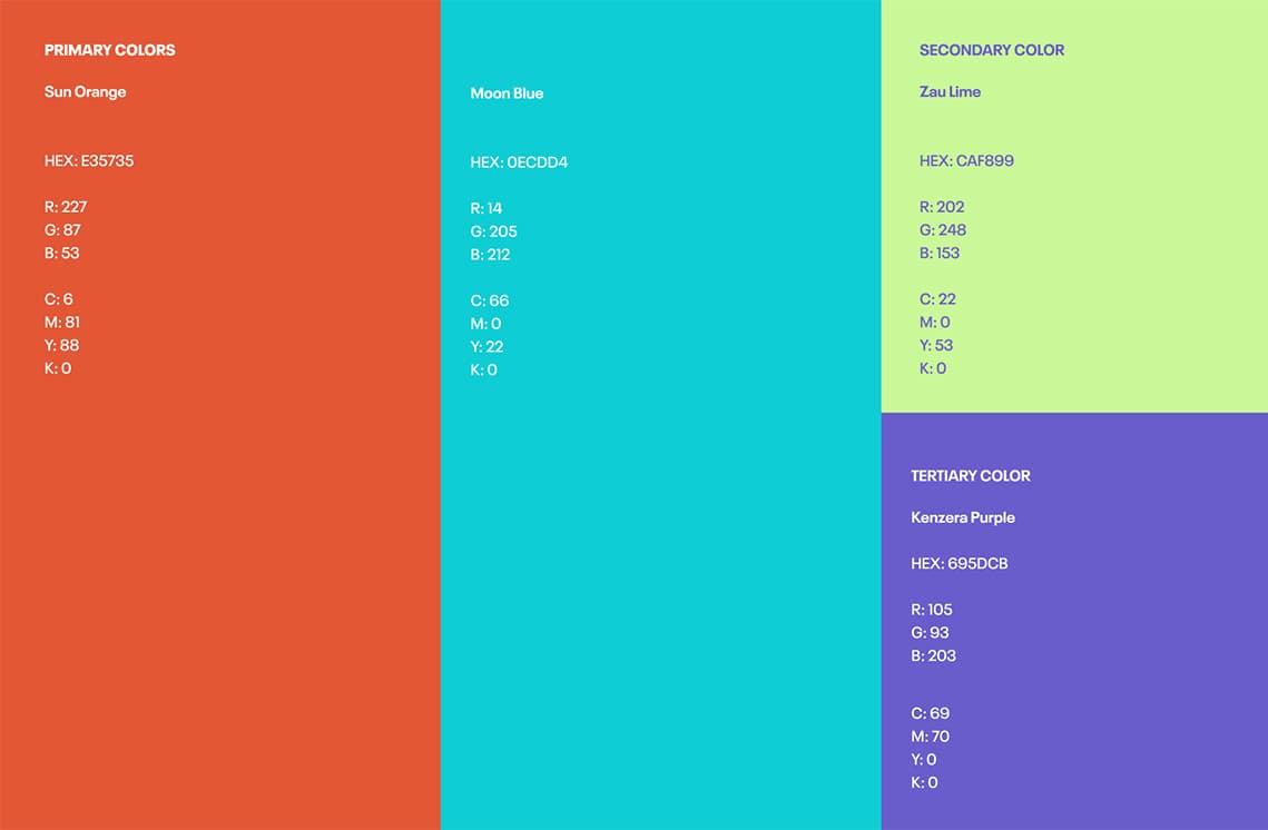
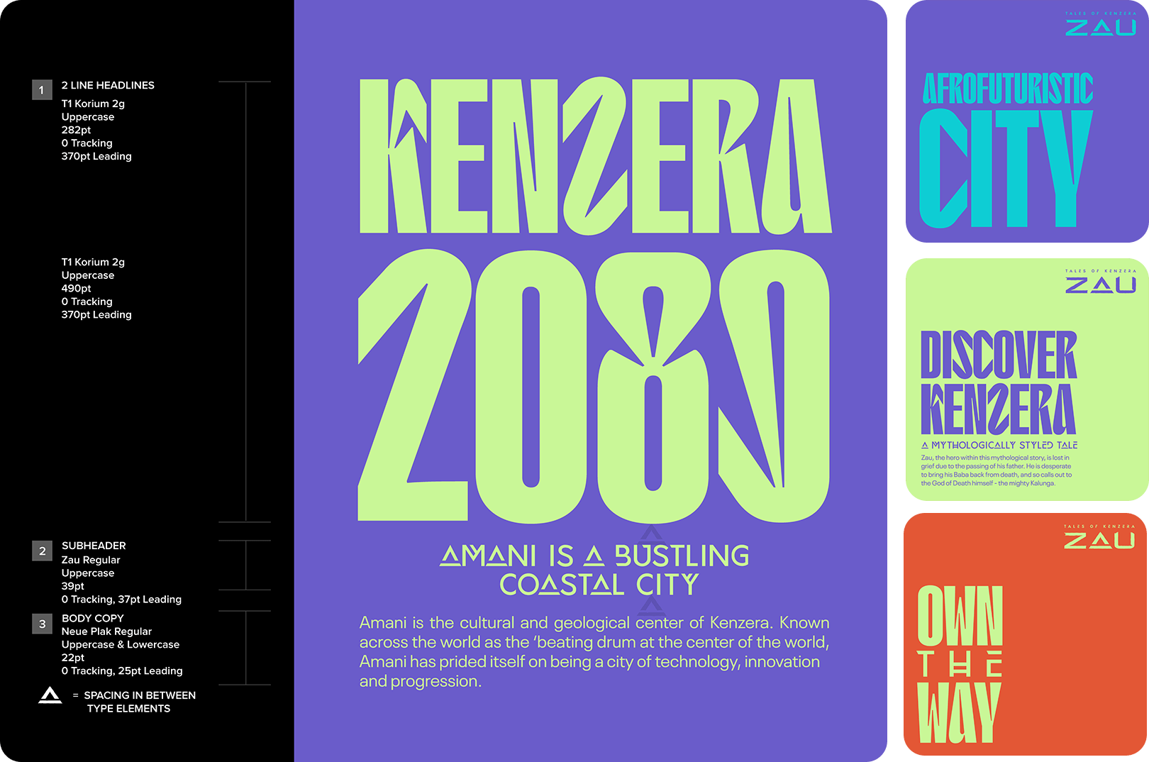
We designed a color palette inspired by Zau’s Sun and Moon Masks, incorporating secondary colors from the vibrant lands of Kenzera. For typography, we used the in-game UI font ZAU and paired it with the modern display font T1 Korium. This combination provided excellent contrast and impactful messaging at large scales.

TEXTURES &
ICONOGRAPHY
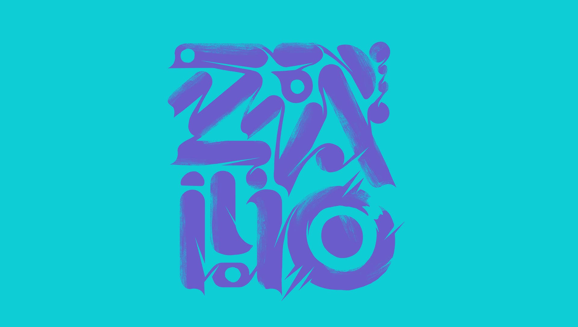
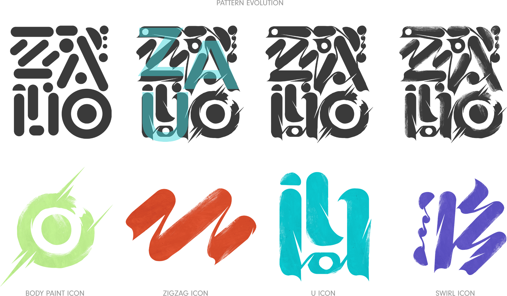
Texture and brush strokes are used to convey a human element to the brand and bring the world forward. The rich history and narrative context in the game provided a visual metaphor that is channeled through with the expressive elements. We developed these assets as graphic symbols in both a clean state, and a more textured hand-done rendering. This brought variety to assets that utilize these elements in exciting new ways.
LAYOUTS & CTA’S
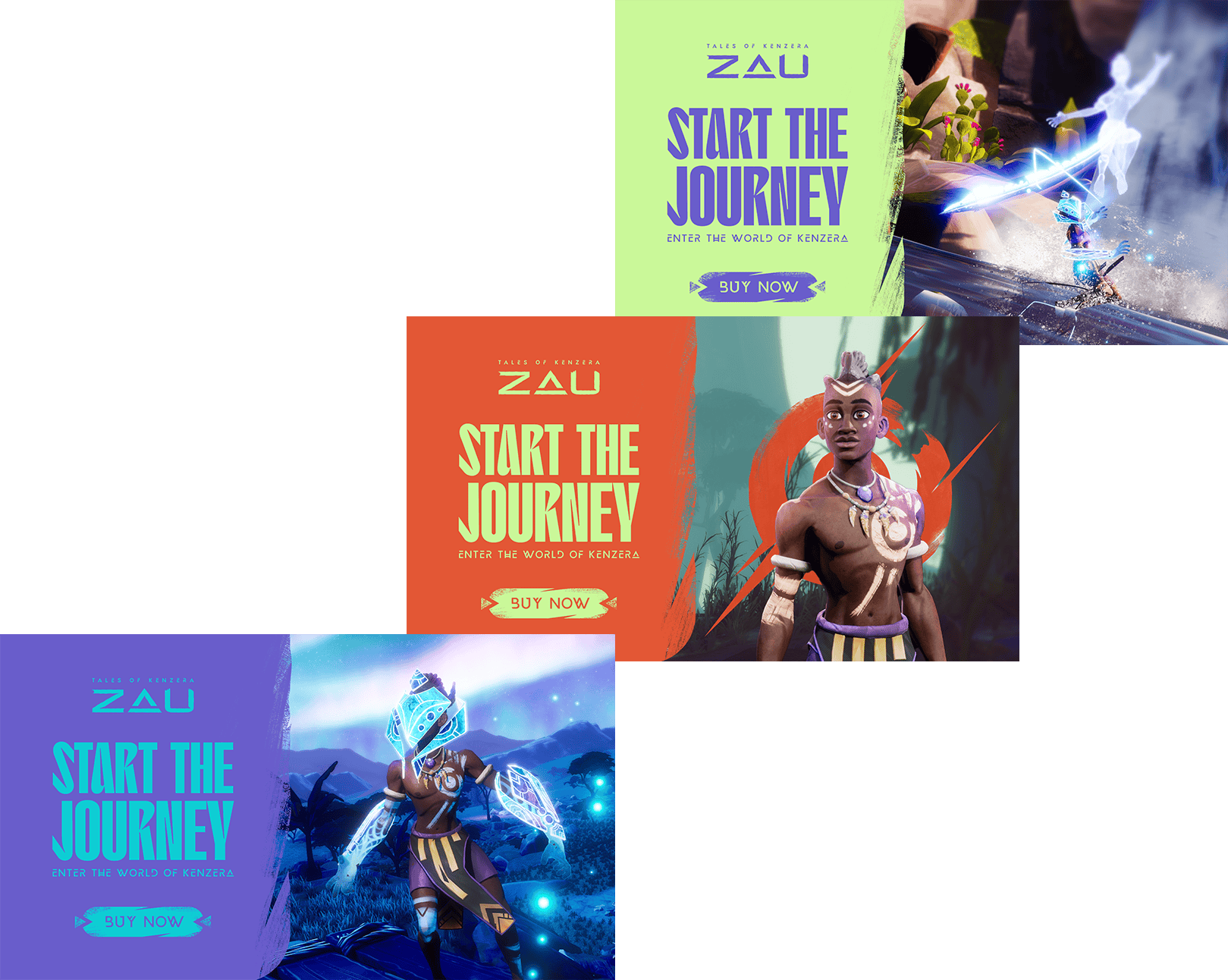
Our layouts were thoughtfully designed to create a seamless and visually captivating user experience, effectively separating art from copy. We integrated textures, patterns, and typography to unify the design, and strategically placed call-to-action buttons using bold colors and concise text to encourage user interaction and drive conversions.
KIT USAGE
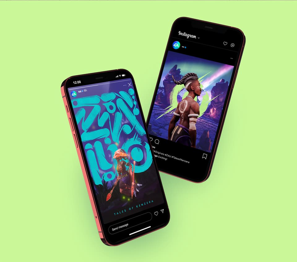
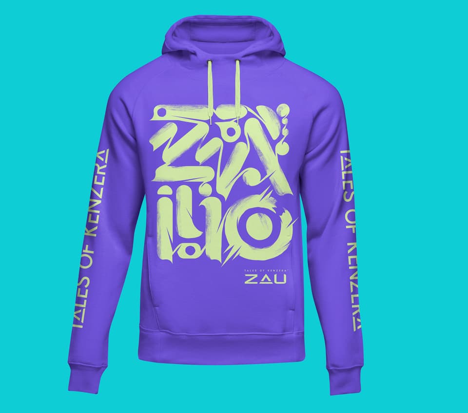
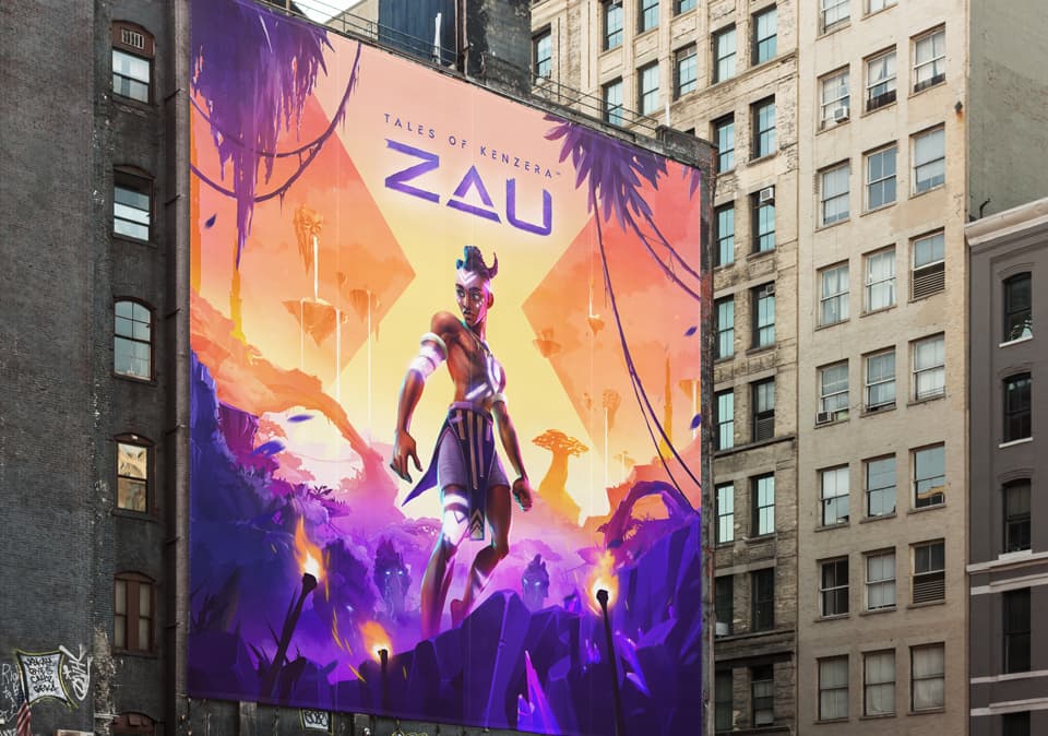
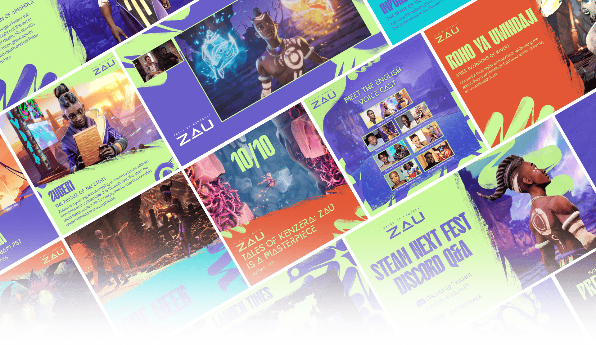
Here is a small preview of some of the kit in action. It was a thrill to see our designs out in the world as EA used them to create original content. From social media posts to sweepstakes products, it was incredible to see the kit expand and make an impact.
APPLICATIONS
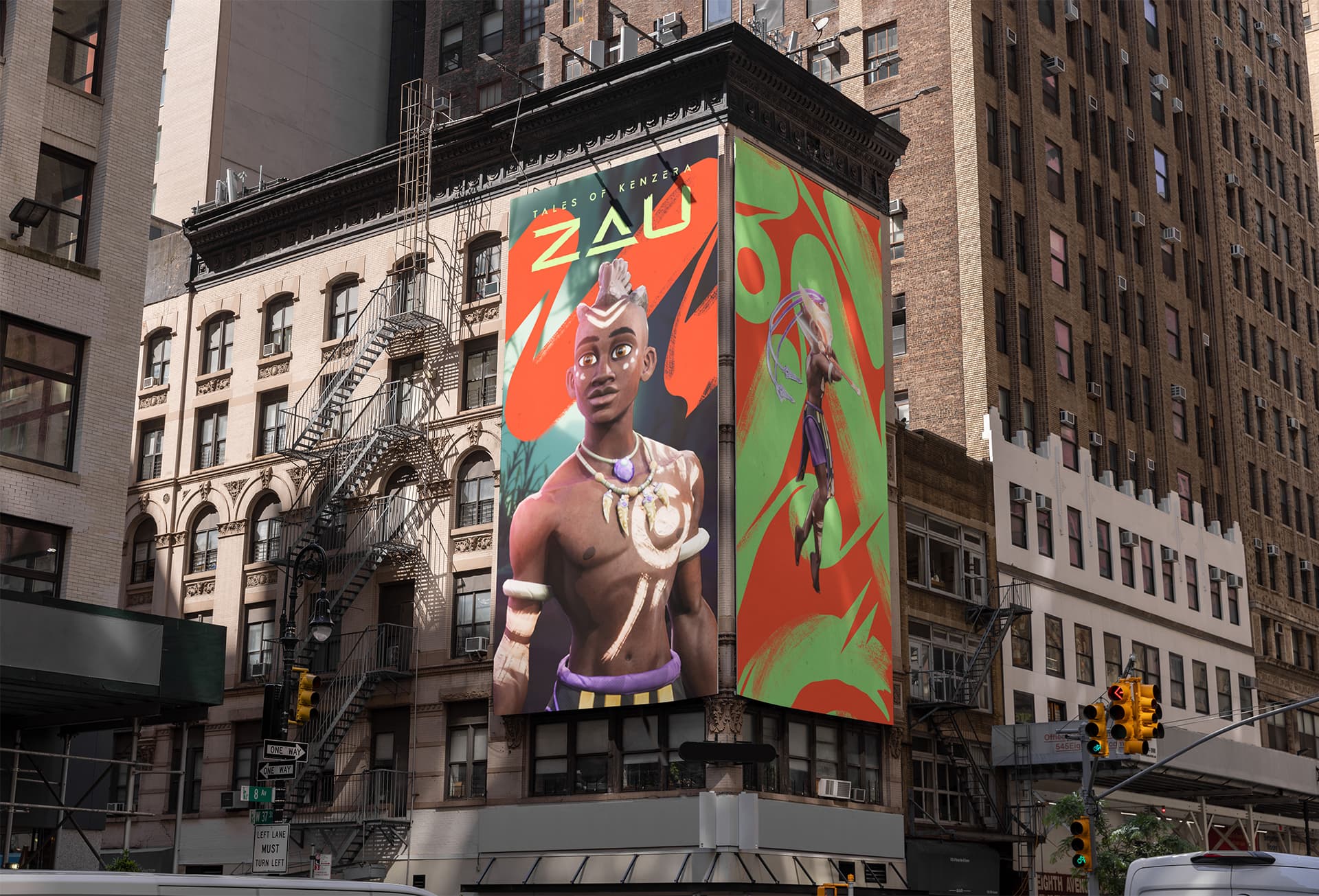
The kit truly shines when we bring all of the elements together to showcase the versatility and strength in the system. Color, patterns, typography, and imagery all work in concert for a punchy style that can also reduce down for clarity and focus. Marketing assets were set up in a wide variety of templates to showcase the flexibility. By embracing the system rules, these assets could take on even more permutations over time.
