Riot Games
VALORANT North America Champions Tour ’21 Last Chance Qualifier Campaign
North American Domination
Logo, Teaser Trailer, Show Open, Broadcast Toolkit, Social Content
SPACER
SPACER
THE CHALLENGE
Winner Takes All
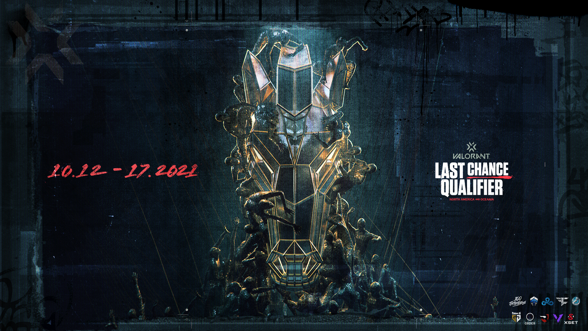
Post-apocalyptic chaos, tooth and nail survival, a battle to the death overlooked by rulers. No, we’re not delving into our obsession with the Mad Max franchise… we’re referring to the madness that encompasses the latest campaign for VALORANT Champions Tour North America Last Chance Qualifiers.
With LCQ serving as a wild card within the larger VCT tournament flow, Riot strove to break the mold of VALORANT’s expected polish and go hard with a spectacle that would get fans riled up and talking. With their insanely inspiring reference points for exploration, we shifted our engines into hyperspeed to inject some really frenetic imagery into a visual system comprised of a hype piece, identity toolkit, and broadcast package for the live event.
SPACER
SPACER
SPACER
SPACER
THE APPROACH
One Shot at Glory
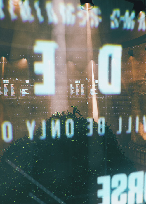
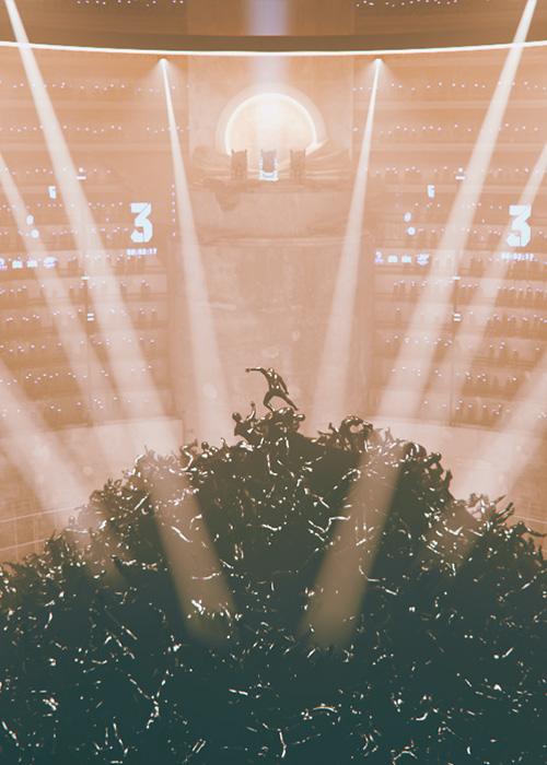
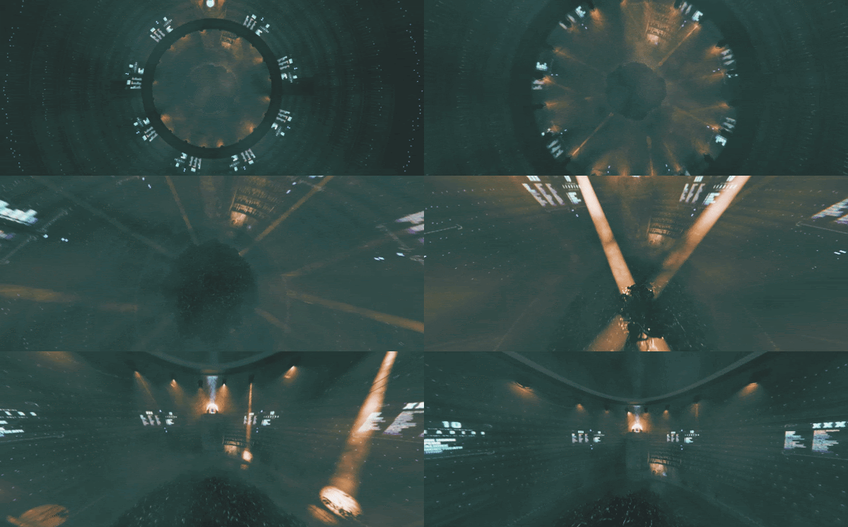
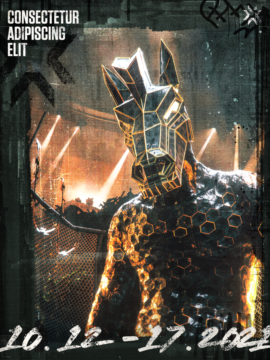
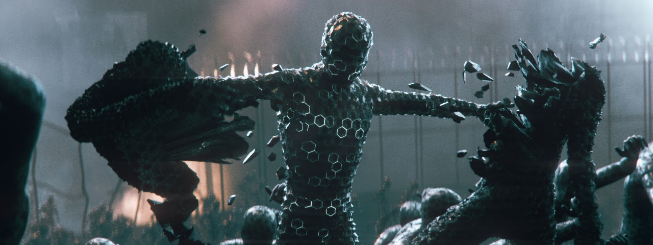
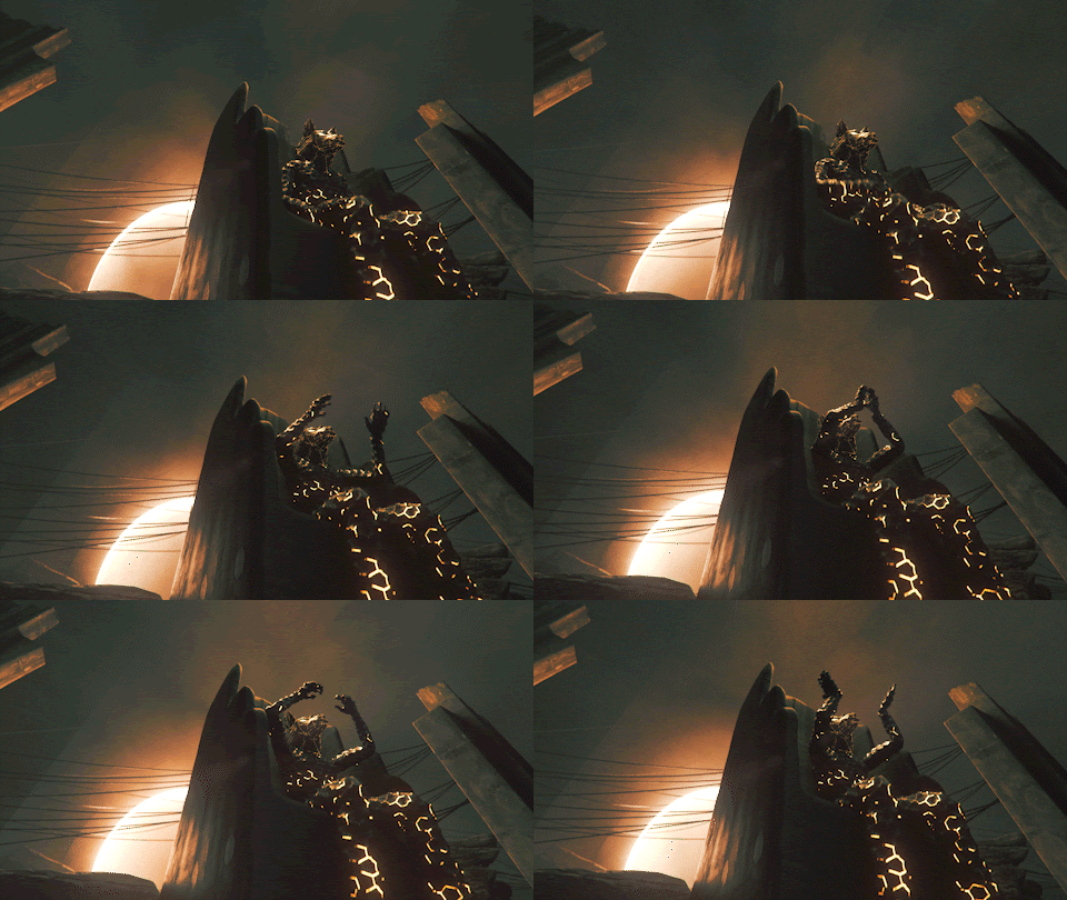
Inspired by those do-or-die moments á la Mad Max: Fury Road, Fight Club, and Twisted Metal, we injected that sense of dystopian vacant landscape with an arena at the helm. The arena, which was actually built out twice, was initially more geologically inspired: a deep subterranean cave, carved out by hand to create a deranged battlespace. As the work progressed, we gravitated towards a battlespace where a “last-man-standing-battle-royale” could take place and allow for a more robust narrative.
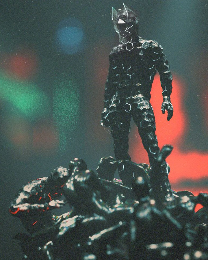
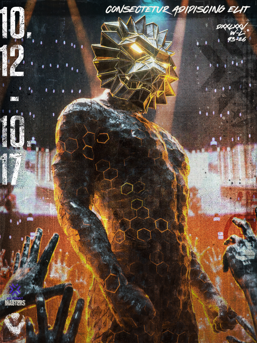
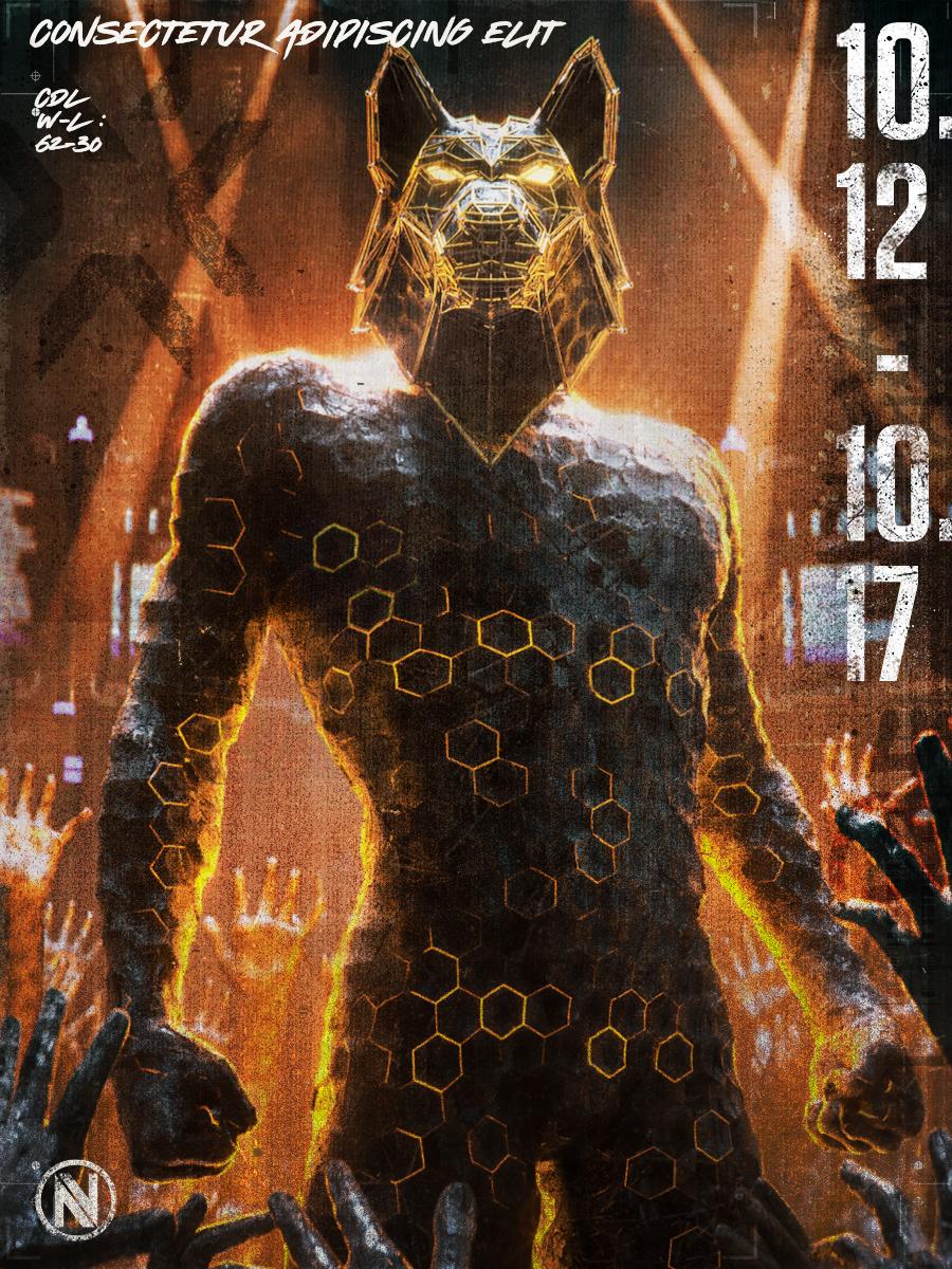
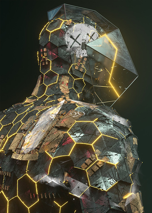
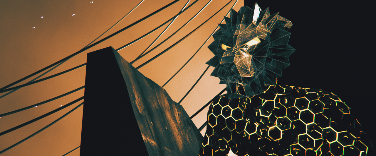
Aiming to convey those grimy DIY vibes found across many sci-fi landscapes, we favored handbuilt over digital wherever possible. This meant character designs grounded in earthen textures and tactile grit. While more designed and structural in its final form, the arena was stripped of any ornamentation, tagged with graffiti, and wrapped with razor wire. Brand elements operated as minute details: whether it was a logomark spray-painted onto an interior wall or briefly seen within a graphic transition, we kept them intentionally low-key to focus our viewer’s attention on the chaos.
SPACER
SPACER
THE ATMOSPHERE
Seasons in the Apocalypse
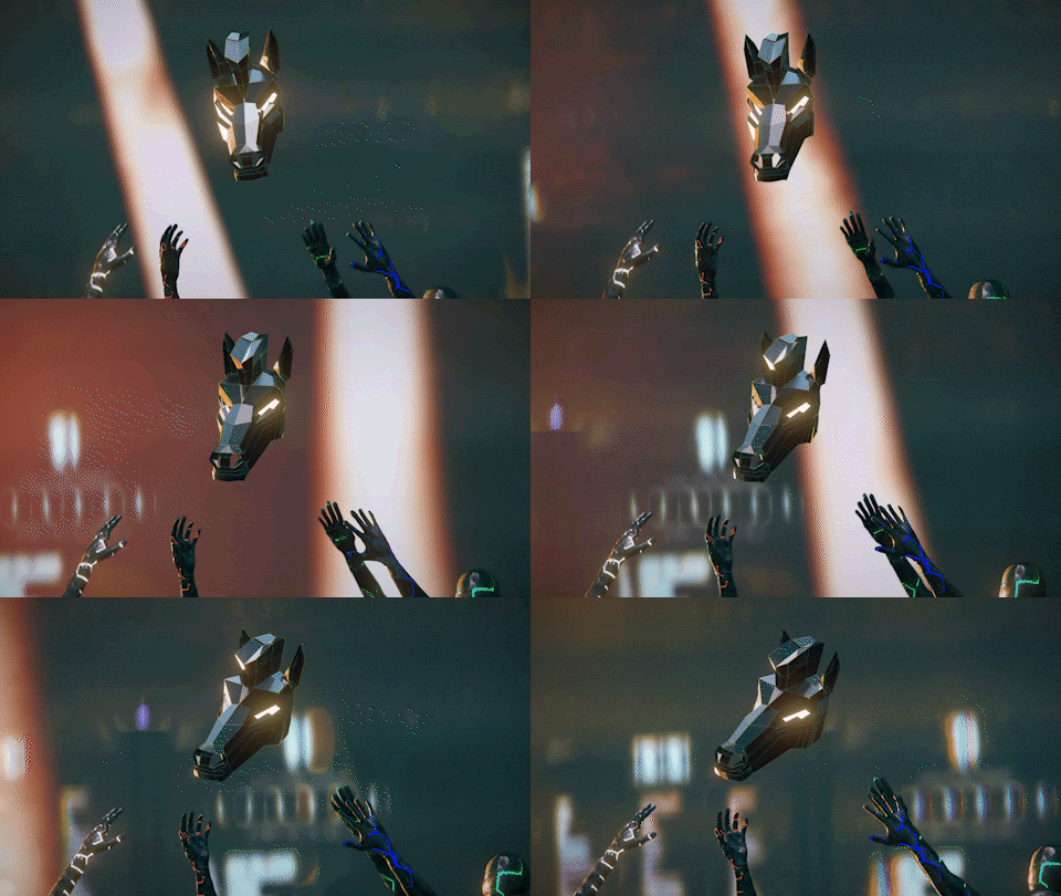
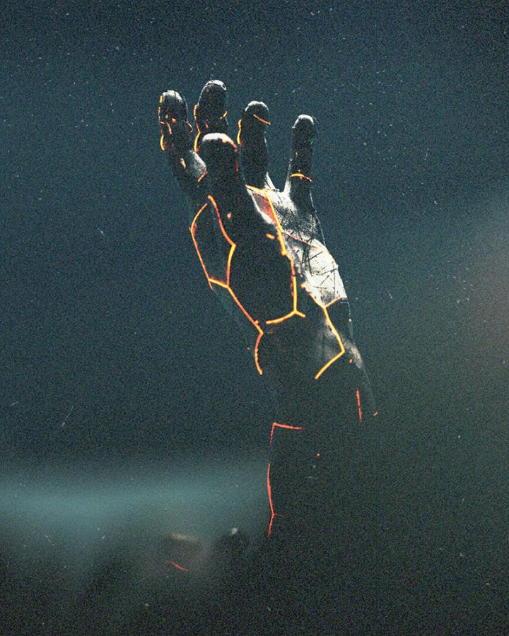
The spot takes viewers on a turbulent joyride of insanity to rouse hype for the LCQ tournament. We amped up the intensity by building out the lighting rig in a way that mimicked explosive light programming that is seen in tour productions from immersive world tours for artists who sell out stadiums, such as Kanye and Drake. It’s a constant pulse of manic energy within the spot that helped to guide the frenzied nature of the cut.
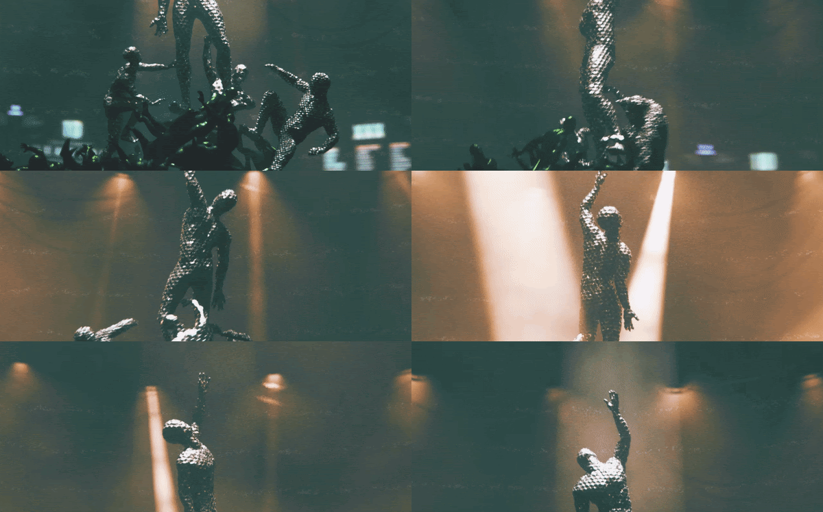
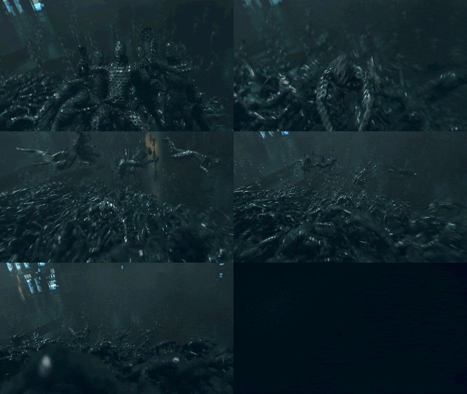
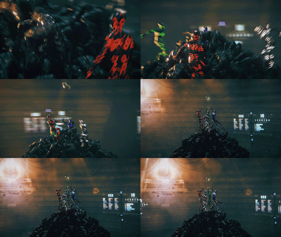
The world needed to be a balance between a vicious imagined CG hellscape and a near-future, real-world apocalypse. We weaved in live-action elements to help ground the environment and offered true IRL texture necessary to create that balance while simultaneously blurring the line between real and created. The live-action elements, plus the massive pile of writhing bodies, the heroes viciously clawing their way to the top, the Gladiator-inspired “throne-room-VIP-booth,” all added different levers for us to pull on and tweak until we had dialed the madness just right…
THE PAYOFF
Louder than Hell
The VALORANT North American team’s high level of inspiration and enthusiasm fueled our confidence in the outlandish result of our work, and ultimately achieved their intention of getting non-watchers to convert to fans by maxing out on the spectacle of NA. Our creative working relationship with Riot went a little like this: the team at Riot pulled up in a Ferrari, asked us to get in, scooched over into the passenger seat, handed us the keys, and asked that we drive as fast as possible. What a wild, octane-fueled ride it was.
