Wells Fargo
Transparency Campaign
Keeping Banking Relatable
Commercial Spots


CAMPAIGN VIDEOS
Itinerary

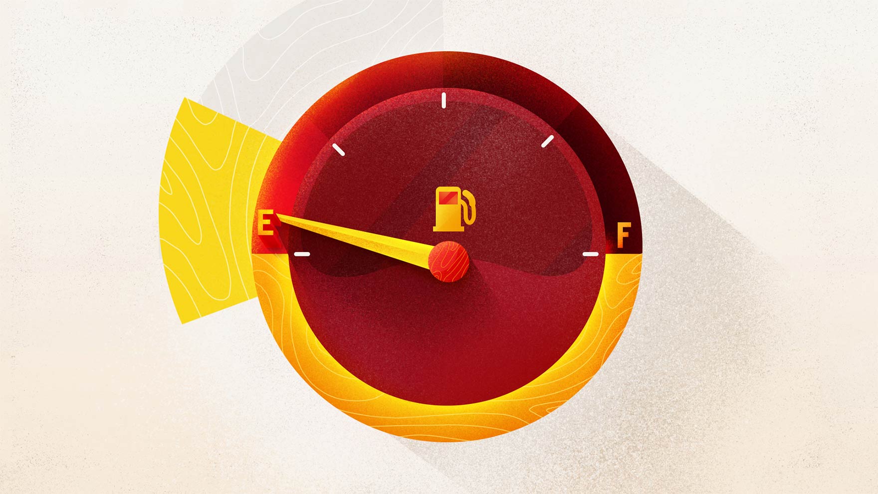
Gas

Lunch

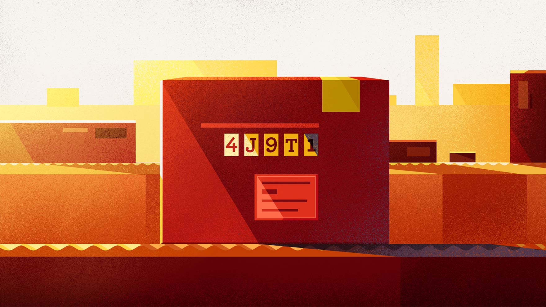
Tracking Number
THE CHALLENGE
Demo the Benefits
To be honest, banking wasn’t our strong suit growing up (hence, a degree in the creative arts). We only knew the money in our account was locked away, never to be used for the latest AC/DC album. Statistics and the fine-print features of bank accounts can make many people’s eyes cross. Wisely, Wells Fargo and BBDO wanted to band together for a series of spots that would explain the benefits of their services in a quirky, story driven way that captures the imagination of banking.
Turns out, bankers have imaginations too.


OUR APPROACH
Finance Meet Feel-Good
We’re often tasked with creating a product demonstration without actually showing the real interface. Luckily, we love animation, and that allows us to simplify the UI in an easy-to-understand way with shapes of color in place of blocks of text. They’re sophisticated promos featuring simplified silhouettes, but with a relatable, hand-shaded feel. Complex but lively transitions allow the shapes in one scene to bleed into the next–all stitched together with a little well-placed day-to-day humor.


THE OUTCOME
As Smooth as a Used Car Salesman
Here, we pushed the boundaries of simplification into something streamlined, elegant, and fun, but still informational. The fluid language of the animation carries the viewer through at a brisk pace. They’re four spots jam-packed with as much design, info, humor and storytelling as we could muster. Getting us that much closer to our lifetime goal of wedging a feature film into every 30 (or 15) second animation we get our hands on. And generally up-leveling our banking prowess.
