SPEC OPS
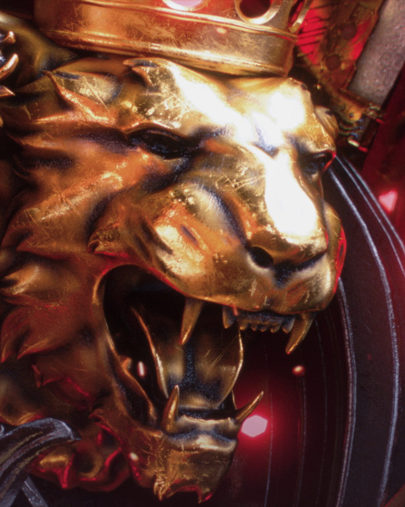
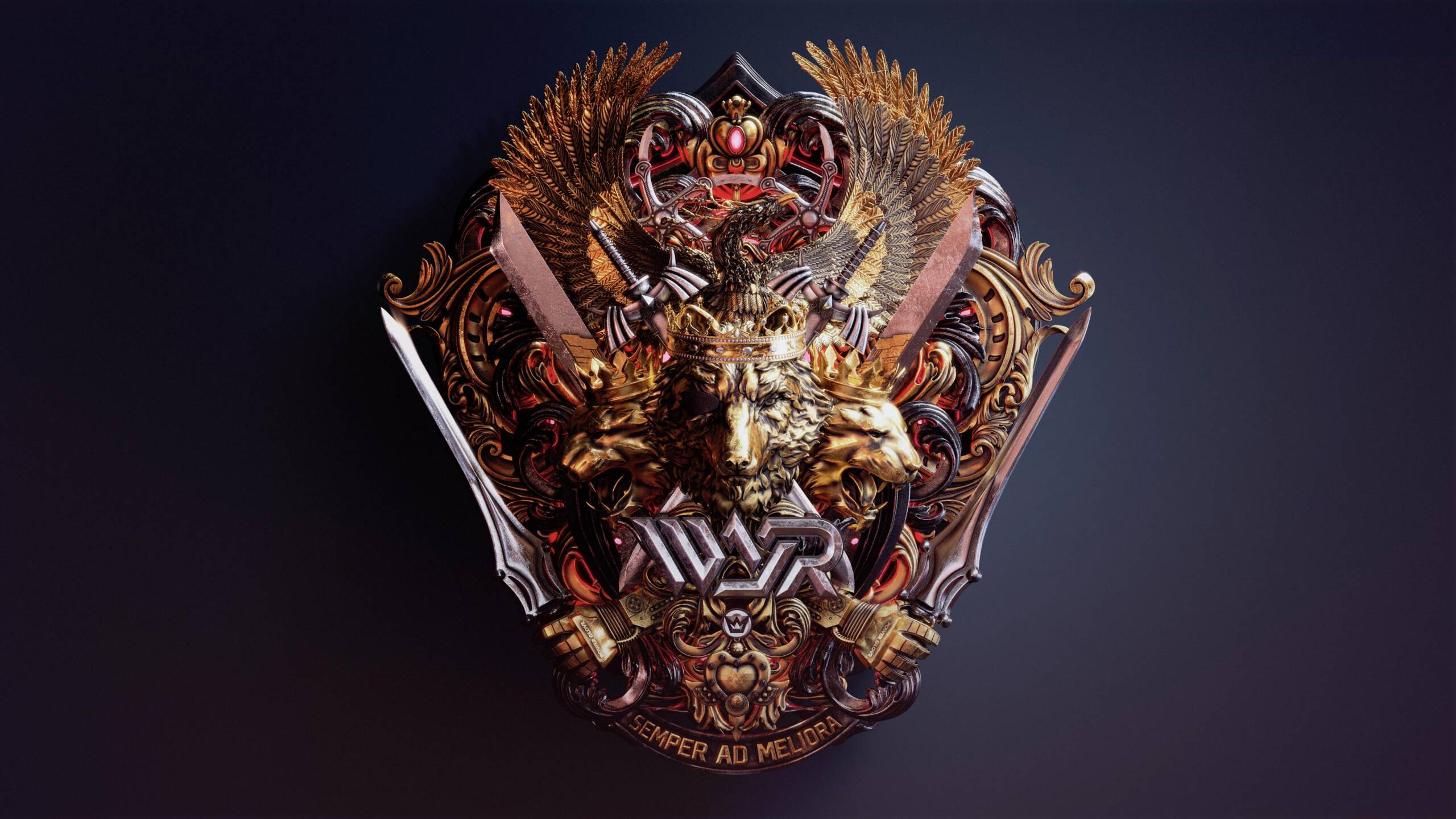
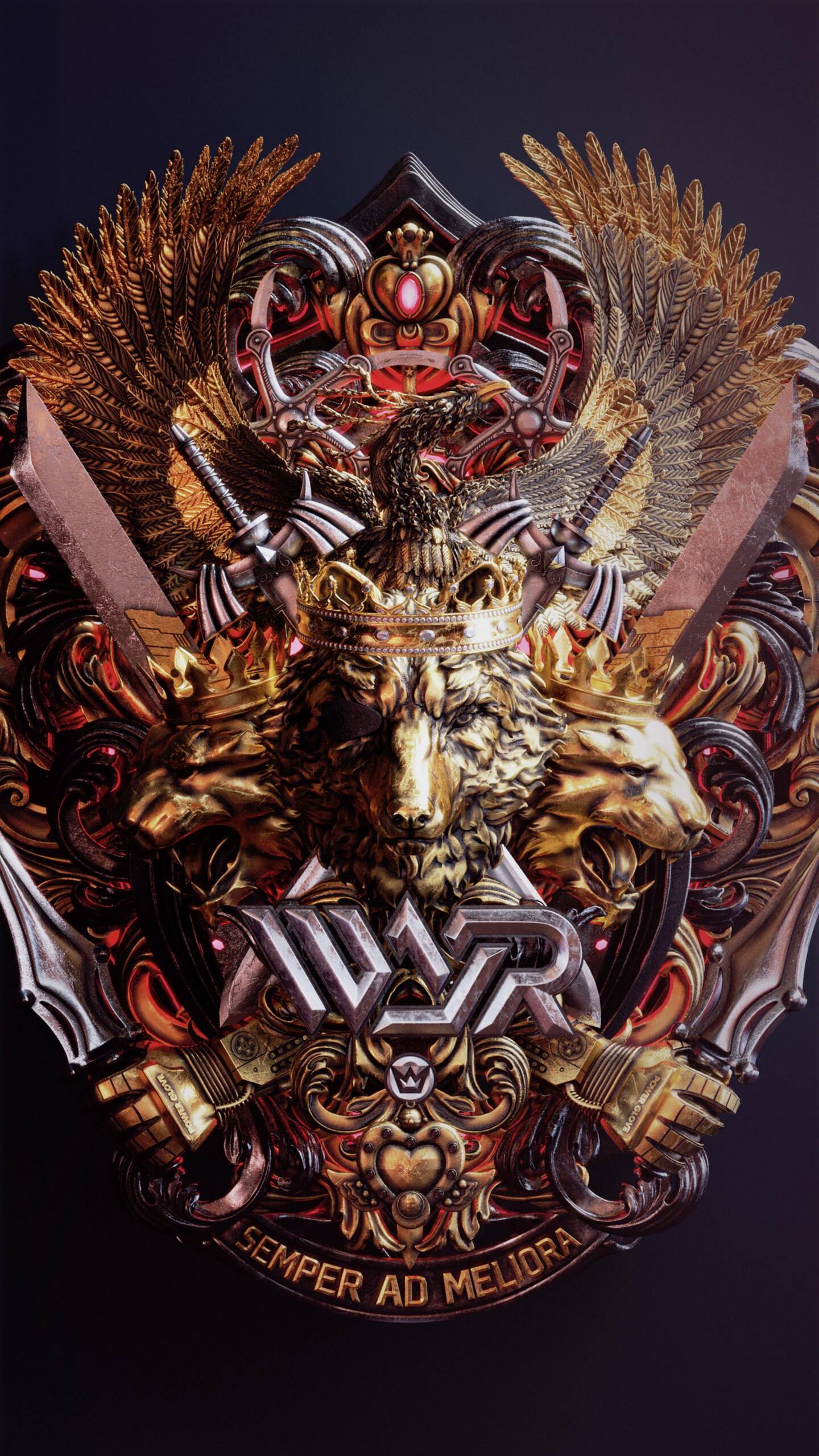
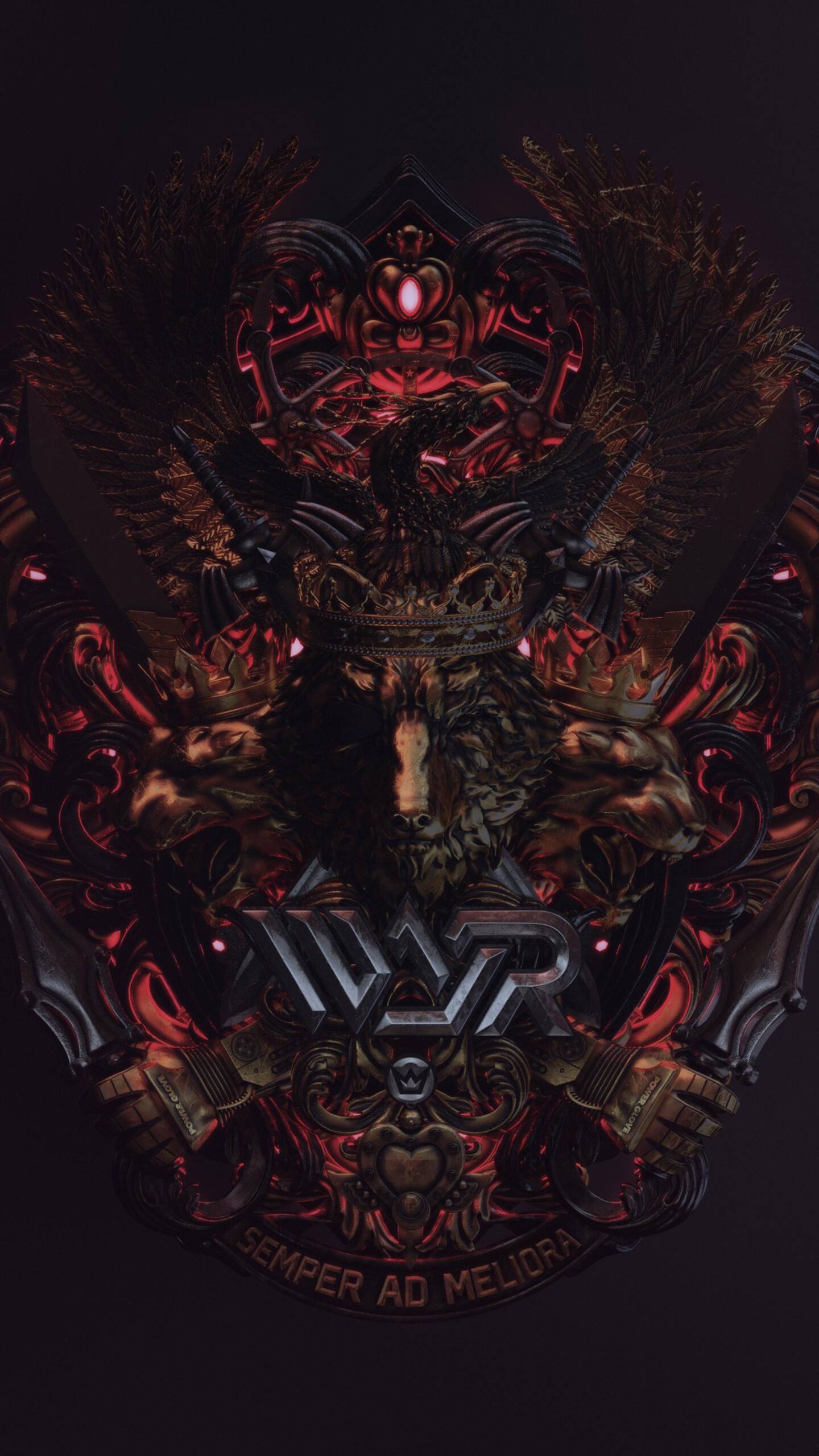
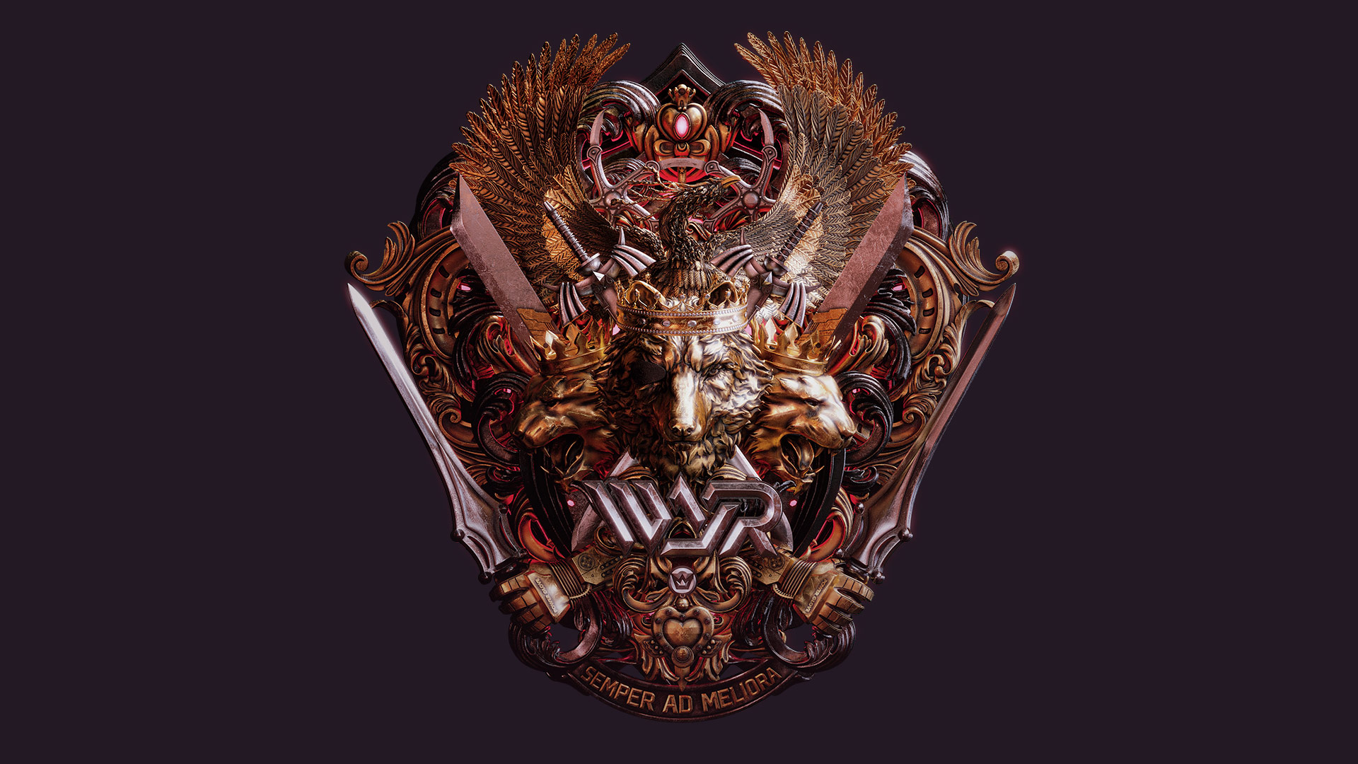
WAR Coat of Arms
Semper Ad Meliora.
Always For the Better.
Special shoutout to CG Extraordinaire Billelis for the collaboration on this one. Check him out here.
THE CHALLENGE
Evoking the Shielded Crests of Yore.
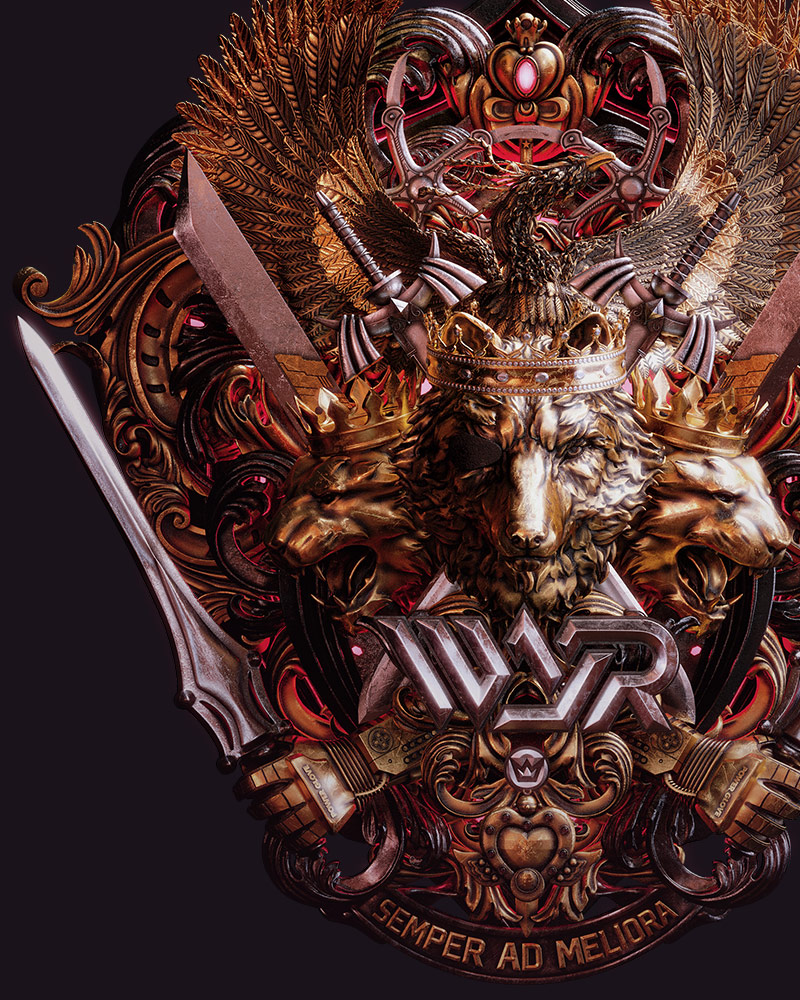
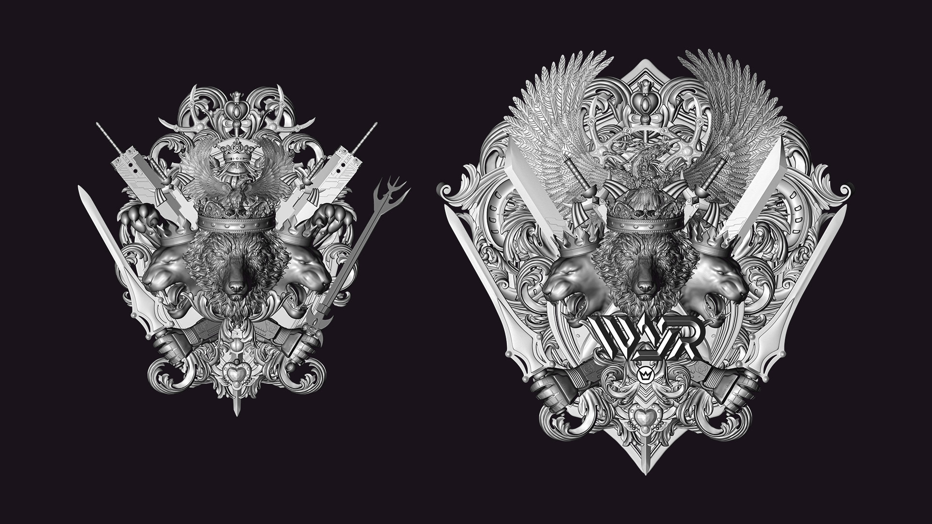
We’re no strangers to refreshing brands – we do it for a living. But to turn our eye onto our own brand is a different, and somehow more precious thing. Our clients have affectionately referred to us as WAR for years now, and it’s a moniker we’re just now embracing. With that, came a need for a symbol to rally behind, a crest of our own dedicated to our diverse personalities, intricate obsessions, and quality of our craft. We needed a Coat of Arms.
THE APPROACH
Devil in the Details
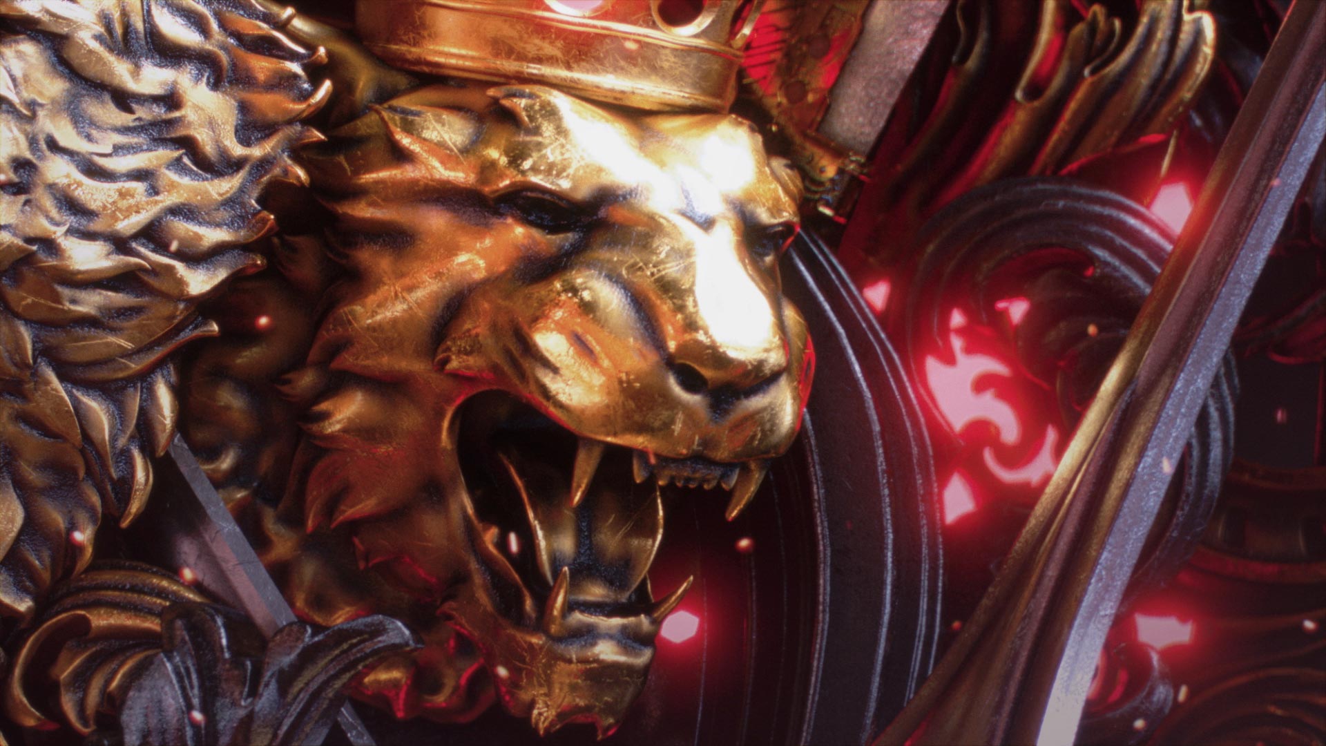
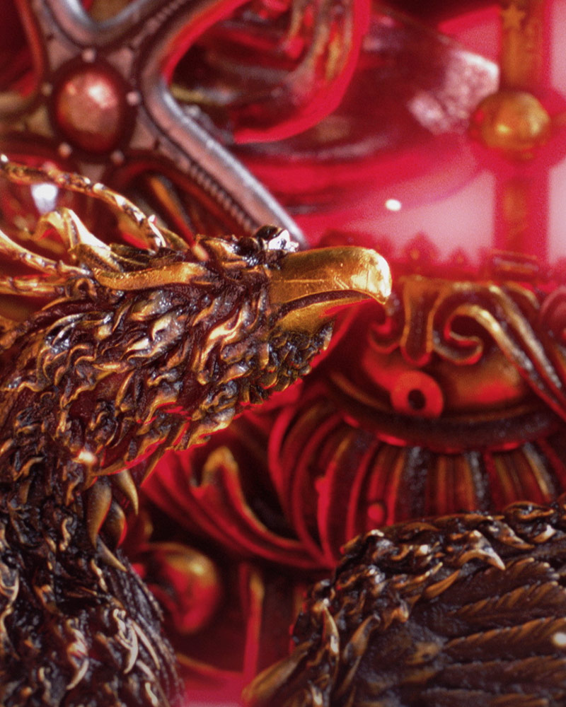
We’re a diverse studio, with a diverse range of artists all working together to make everything we do shine. How that translated to our Coat of Arms was in density. We knew this had to be a dense fabrication, with 2nd and 3rd reads of symbolism throughout. A lot of what’s hidden here are nods to our nostalgic past – but they represent the tools our childhood heroes used to do good. That’s our mission, and our drive. To always do better. The latin you read everywhere in our brand echos that statement: Always for the Better.
THE PAYOFF
From our home, to yours.
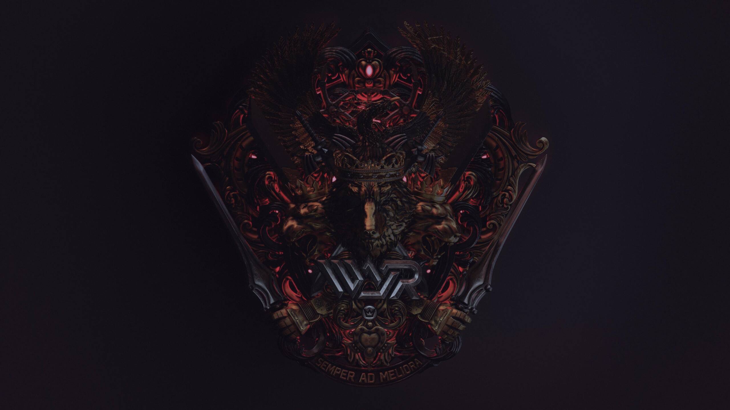
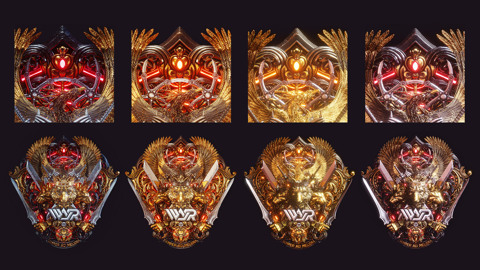
We have a thing now, and we plan on expanding upon it as we go. The Coat of Arms is our symbol – but we extend it to our friends and fans as their own. Bellow you can download some wallpapers for both desktop and mobile. We’re also in the process of fabricating the Coat of Arms for both studios to enshrine on the walls of Seattle and LA. Building a branding device is always a tricky endeavor, but this one might go down as one of the most rewarding ones we’ve ever put our minds to.
Special thanks to 3D Illustrator Billelis for the collaboration on this one. Check him out here. He’s a masterclass of a human being, making some remarkable things happen. It was a pleasure to work along side him to bring this to life.
